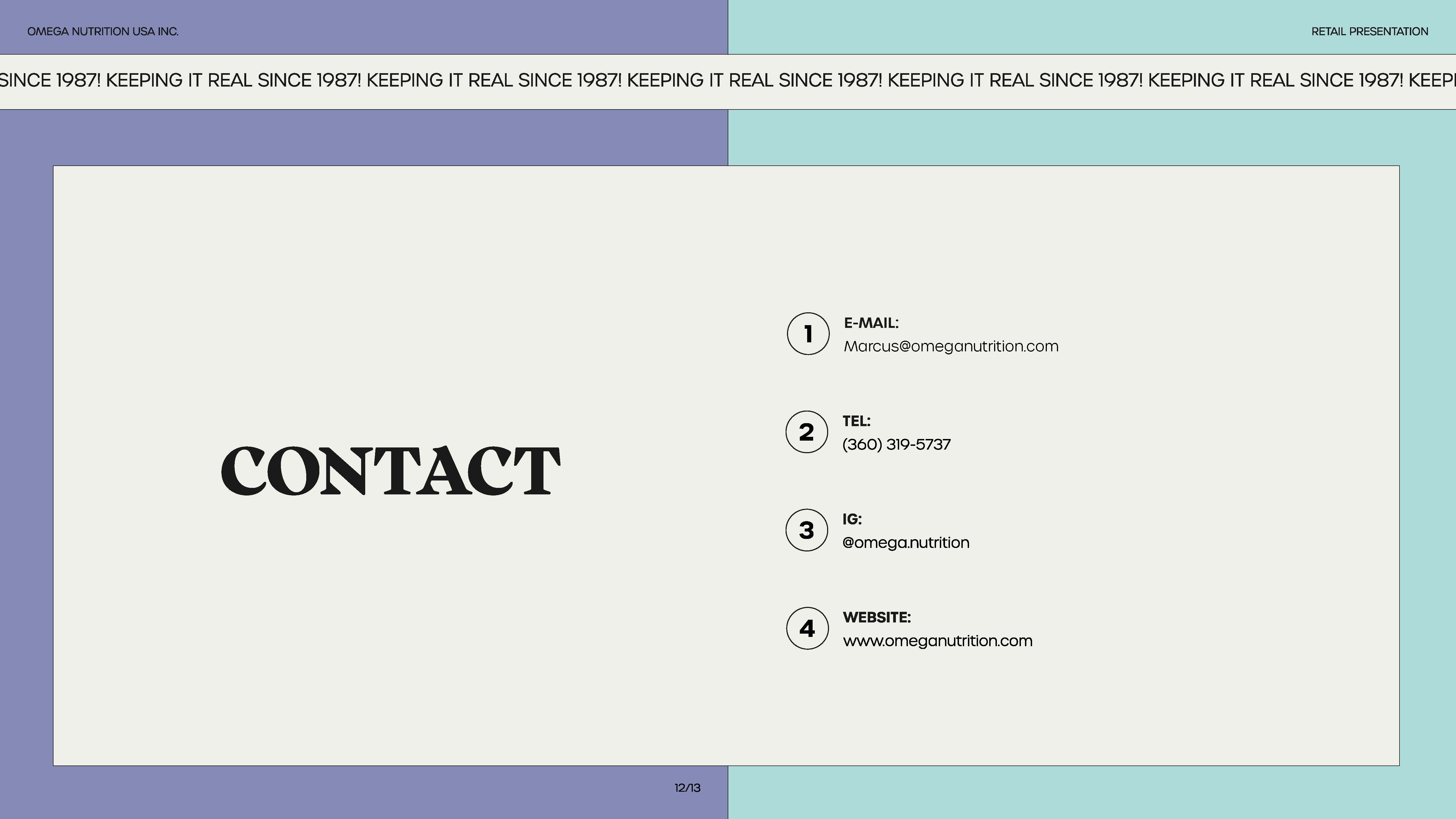
Role:
In-House Designer
Promotion: Art Director
+ Art Direction
+ Packaging
+ Print Production
+ Labels: Eng & Fr
+ NFT Design, Genesis
+ Copywriting
+ Photography
+ Videography (content & facility)
+ E-commerce product photography
+ Web Design (UI & UX | Shopify)
+ Social Media
+ Content Design
+ Presentations
+ E-mail Marketing (Klaviyo)
Company:
Omega Nutrition
USA & CA
Year:
2021 – 2023
Omega Nutrition
USA & CA
Year:
2021 – 2023
Collaborators:
1. Mykal Machon: Web development
2. QuickFire: Marketing Agency
3. Jacknife: Branding Agency
4. Globe Printers: Collateral Prints
5. Great Little Box: Label Prints
5. Nik Ferrario: Designer Intern
1. Mykal Machon: Web development
2. QuickFire: Marketing Agency
3. Jacknife: Branding Agency
4. Globe Printers: Collateral Prints
5. Great Little Box: Label Prints
5. Nik Ferrario: Designer Intern
Essence: Keeping it real since the 80’s!
We’re in it for the long haul. We’ve been there from the beginning of the plant based movement and we know what it takes to create high-quality products that actually work. From our production practices, to the ingredients we use, to the quality of our products, we’ve never wavered. That’s what we’ve done for over 30 years and that’s what we’ll continue to do.
Keywords: Legacy, holistic, heritage, trust, integrity, honesty.
Tone: playful, bold, confident, unexpected, direct.
Welcome to Omega Nutrition’s case study presentation. Throughout my two-year tenure at Omega Nutrition, I undertook the formidable task of spearheading the company's brand transformation, often operating with limited resources and, more often than not, working independently. The contents below provide a glimpse into the substantial scope of my contributions. This experience filled with ups and downs provided me with many learnings which I am forever grateful for.
I eagerly anticipate witnessing the brand's continued evolution, as we endeavour to embody and mirror the principles of equity, a dedication to continuous learning, and inclusivity within our organizational culture.
01
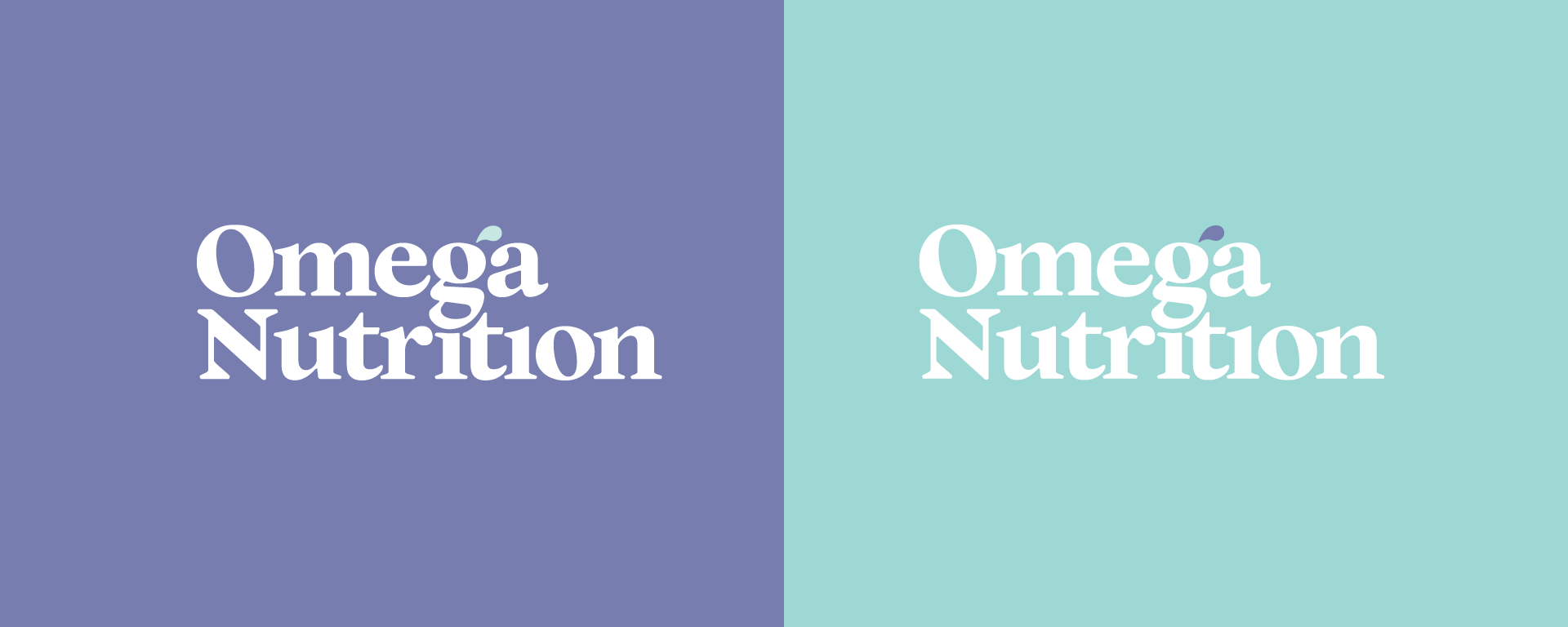
Custom Wordmark
A modern serif with natural flourish that reflects the plant-based qualities of the product.
A modern serif with natural flourish that reflects the plant-based qualities of the product.

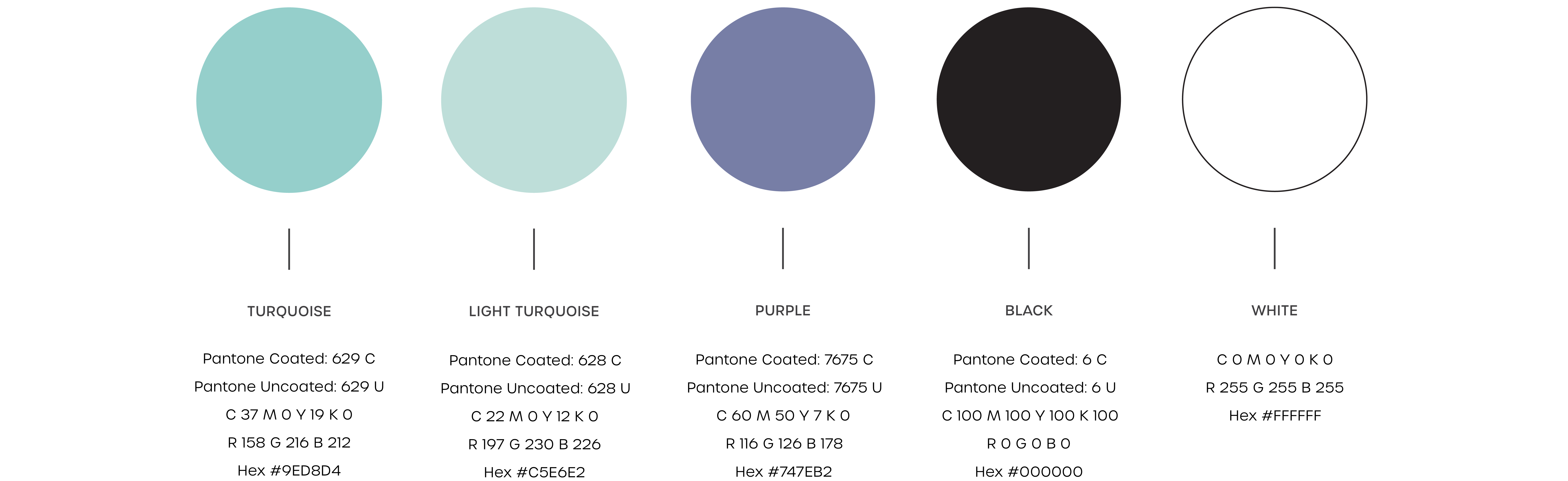
Brand Colours:
02
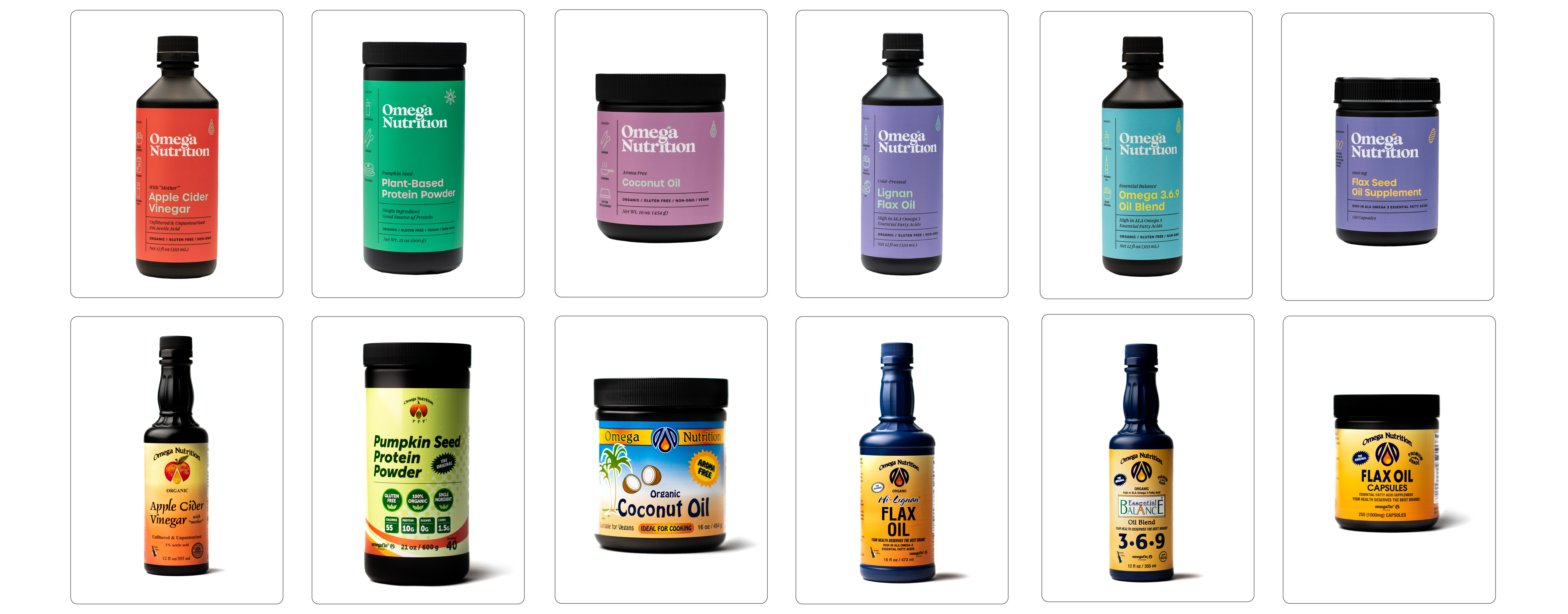
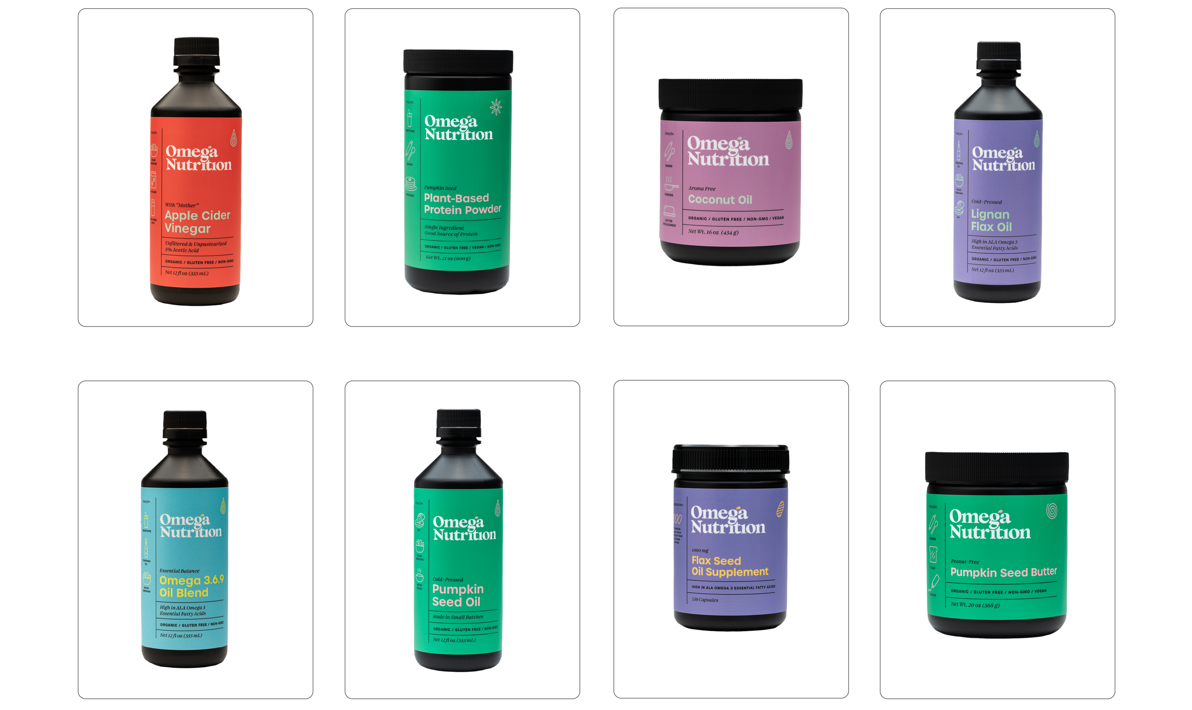
Packaging Design
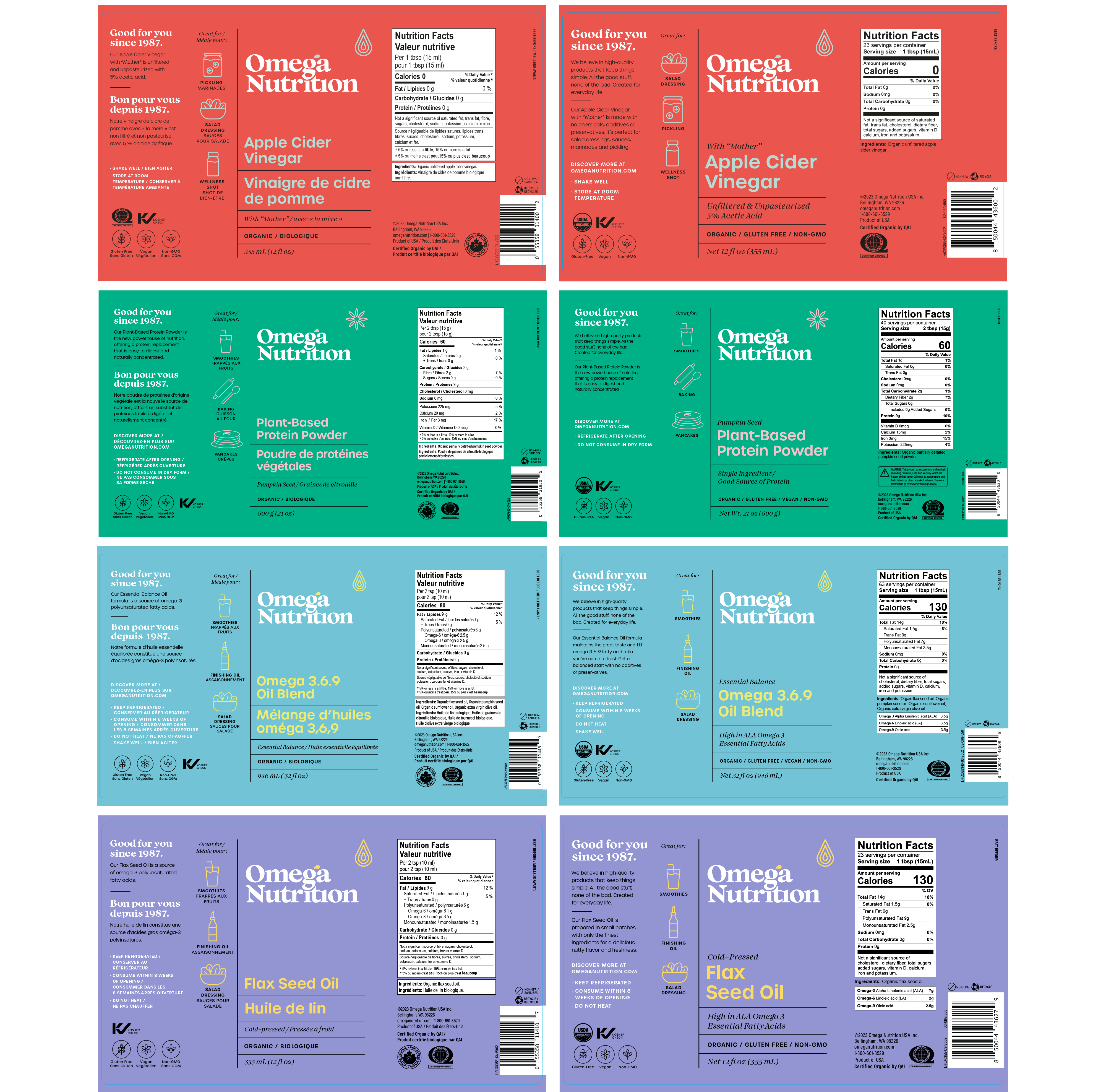
A design system that unifies the brand but expresses the key flavours and ingredients of each product.
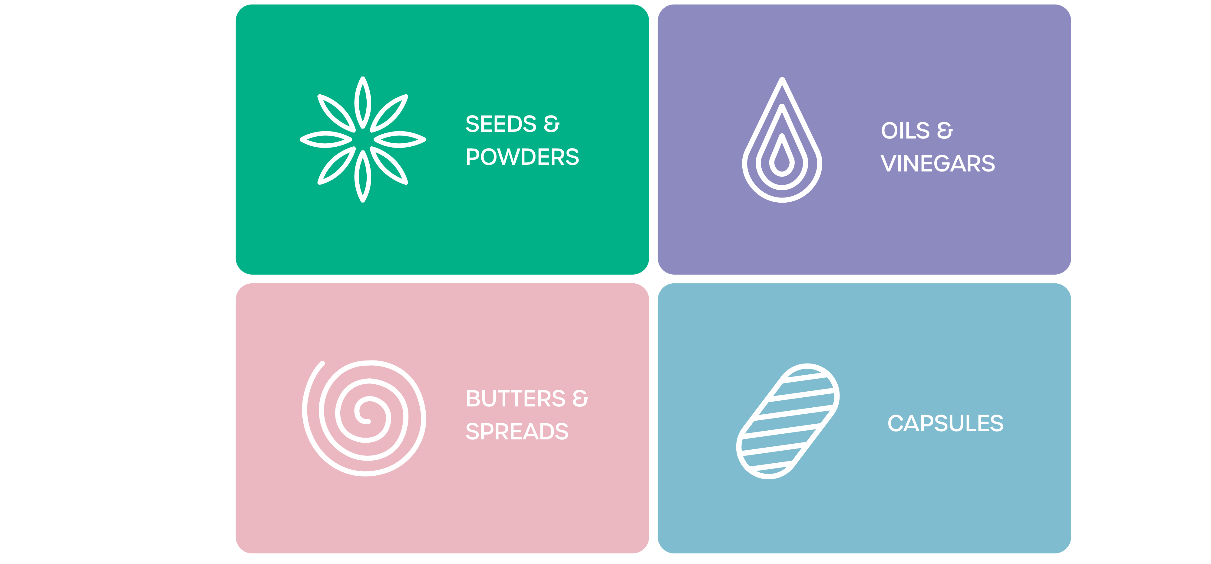
My design strategy aimed at creating packaging that seamlessly harmonizes with both the US and Canadian markets, recognizing the unique preferences and expectations of each. This involved a meticulous approach to meet the specific requirements of French regulations, Health Canada, and the FDA, showcasing my adaptability to diverse regulatory environments. A key aspect of my task was establishing a robust branding identity system capable of accommodating the continuous expansion of Omega Nutrition's product line, currently boasting 14 SKUs and counting. Striking the delicate balance between cohesion and avoiding repetition, my design approach seeks to convey a sense of unity across the diverse product range, ensuring a visually compelling presence on the shelves.
A design system that unifies the brand but expresses the key flavours and ingredients of each product.
My design strategy aimed at creating packaging that seamlessly harmonizes with both the US and Canadian markets, recognizing the unique preferences and expectations of each. This involved a meticulous approach to meet the specific requirements of French regulations, Health Canada, and the FDA, showcasing my adaptability to diverse regulatory environments. A key aspect of my task was establishing a robust branding identity system capable of accommodating the continuous expansion of Omega Nutrition's product line, currently boasting 14 SKUs and counting. Striking the delicate balance between cohesion and avoiding repetition, my design approach seeks to convey a sense of unity across the diverse product range, ensuring a visually compelling presence on the shelves.


Packaging Design Elements:
Both the English and bilingual (French+English) labels adhere to a consistent design with identical elements. The inclusion of illustrations serves a dual purpose: not only do they effectively compartmentalize information, but they also establish a dynamic interplay of shapes and words. This intentional design not only aids consumers in comprehending product details but also inspires them to explore creative applications and recipes.
Both the English and bilingual (French+English) labels adhere to a consistent design with identical elements. The inclusion of illustrations serves a dual purpose: not only do they effectively compartmentalize information, but they also establish a dynamic interplay of shapes and words. This intentional design not only aids consumers in comprehending product details but also inspires them to explore creative applications and recipes.
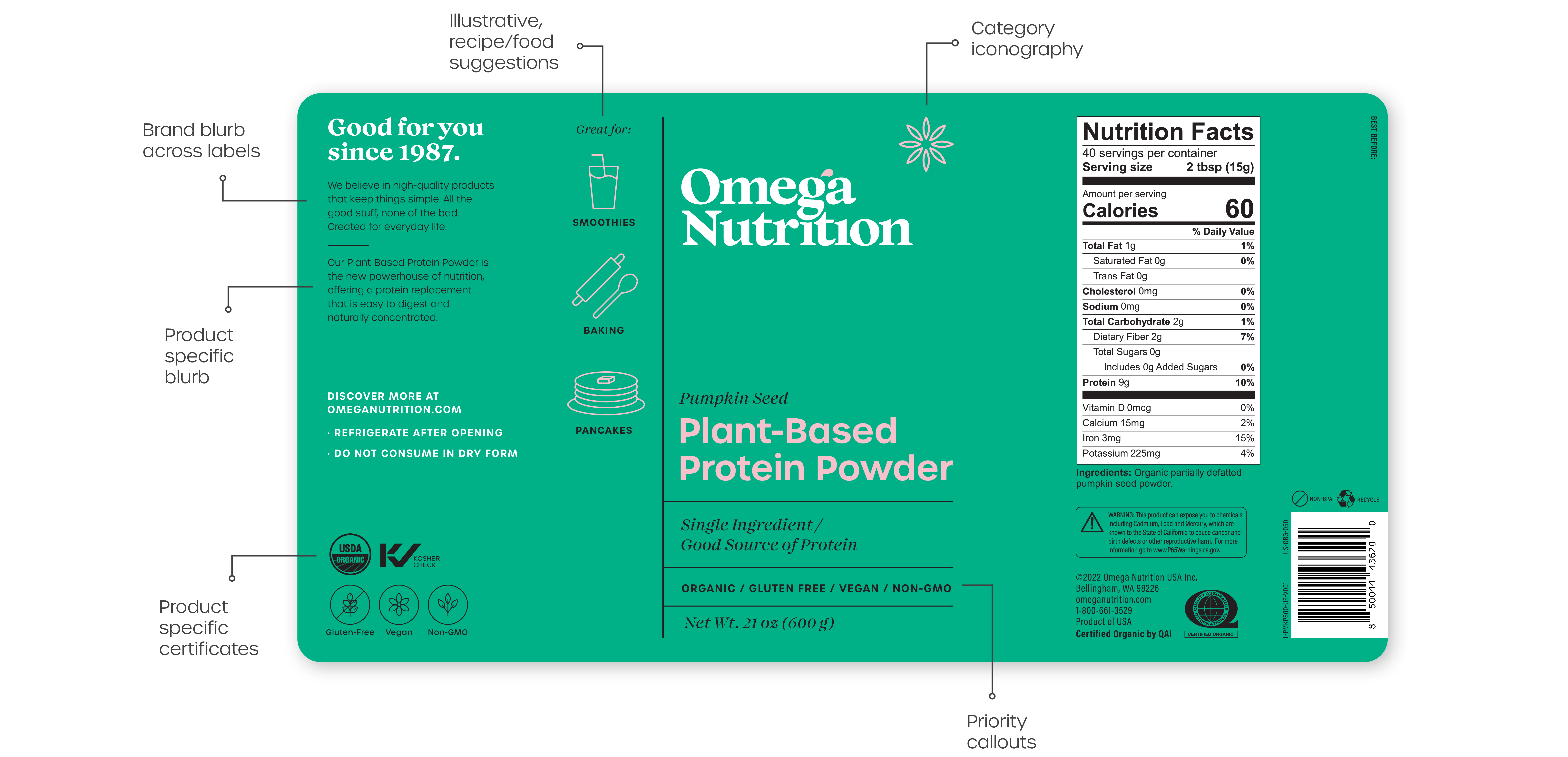
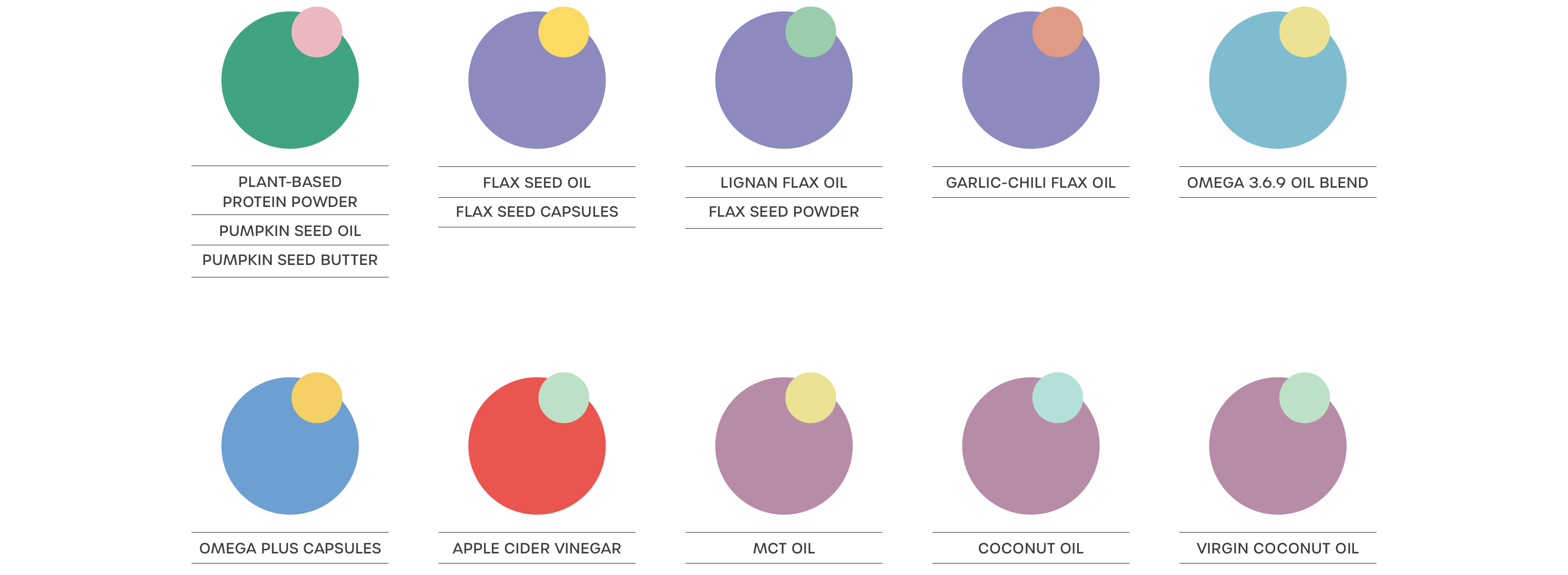
Visual Language System:
This system facilitates seamless integration across various sizes within each product line. The majority of SKUs are available in three distinct sizes of bottles or containers.
This system facilitates seamless integration across various sizes within each product line. The majority of SKUs are available in three distinct sizes of bottles or containers.
Packaging Colour Palette:
I collaborated closely with GLB printers to assess the legibility of color combinations for the labels. Through multiple print tests, I ensured optimal contrast across labels, all while maintaining a cohesive and harmonious use of colors across various product lines and ingredients.
I collaborated closely with GLB printers to assess the legibility of color combinations for the labels. Through multiple print tests, I ensured optimal contrast across labels, all while maintaining a cohesive and harmonious use of colors across various product lines and ingredients.
Label Dimensions:
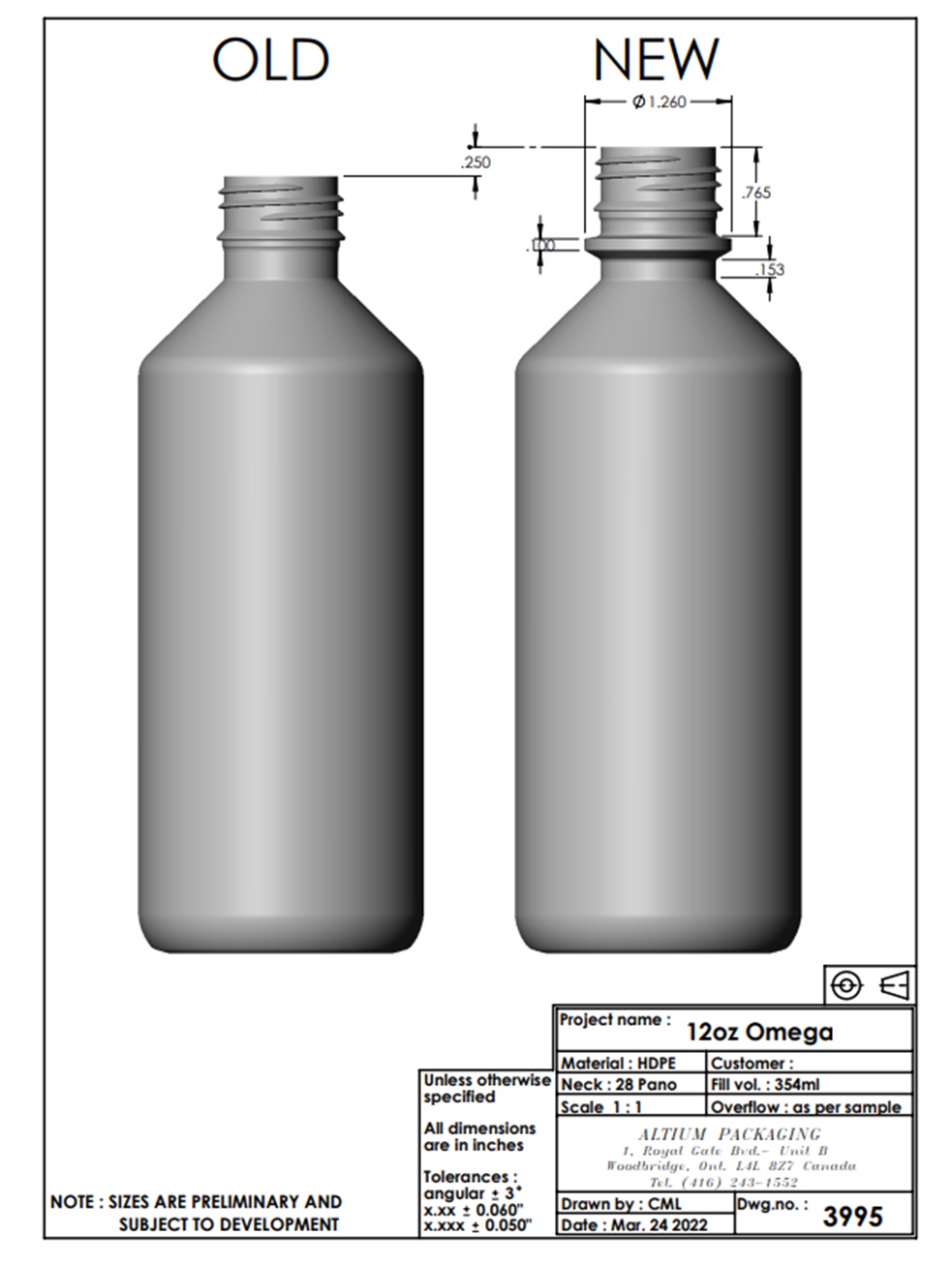
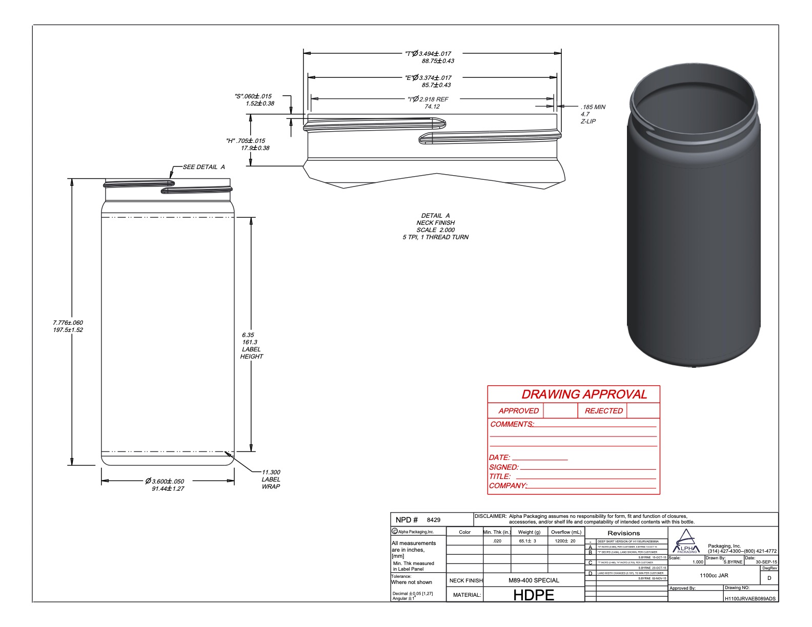
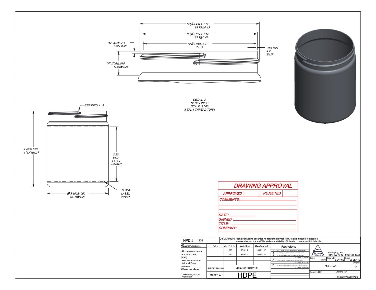
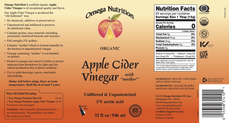
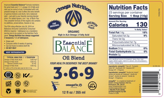
In response to a vendor change and considerations of packaging costs, we made the strategic decision to transition to new containers for all our products. The aim was to achieve a simpler and cleaner aesthetic while retaining the essential black color. The incorporation of black packaging was a deliberate choice to mitigate product oxidation, and thus, it remained a crucial element in our updated design.
After numerous revisions and meticulous measurements using a small office printer and ruler, I arrived at the final dimensions:
Label Size (Inches) Corresponding Bottle/Jar:
W: 11.01 H: 5.75 21oz Jar
W: 7.375 H: 4.375 12oz Bottle
W: 6.03 H: 4.75 8oz Bottle
W: 10.5 H: 5.75 32oz Bottle
W: 11.01 H: 3 20oz Jar
W: 11.5 H: 5 53oz Bottle
W: 8.61 H: 3 10oz Jar/12oz PSB
W: 6.5 H: 2.75 120's Omega Plus Caps


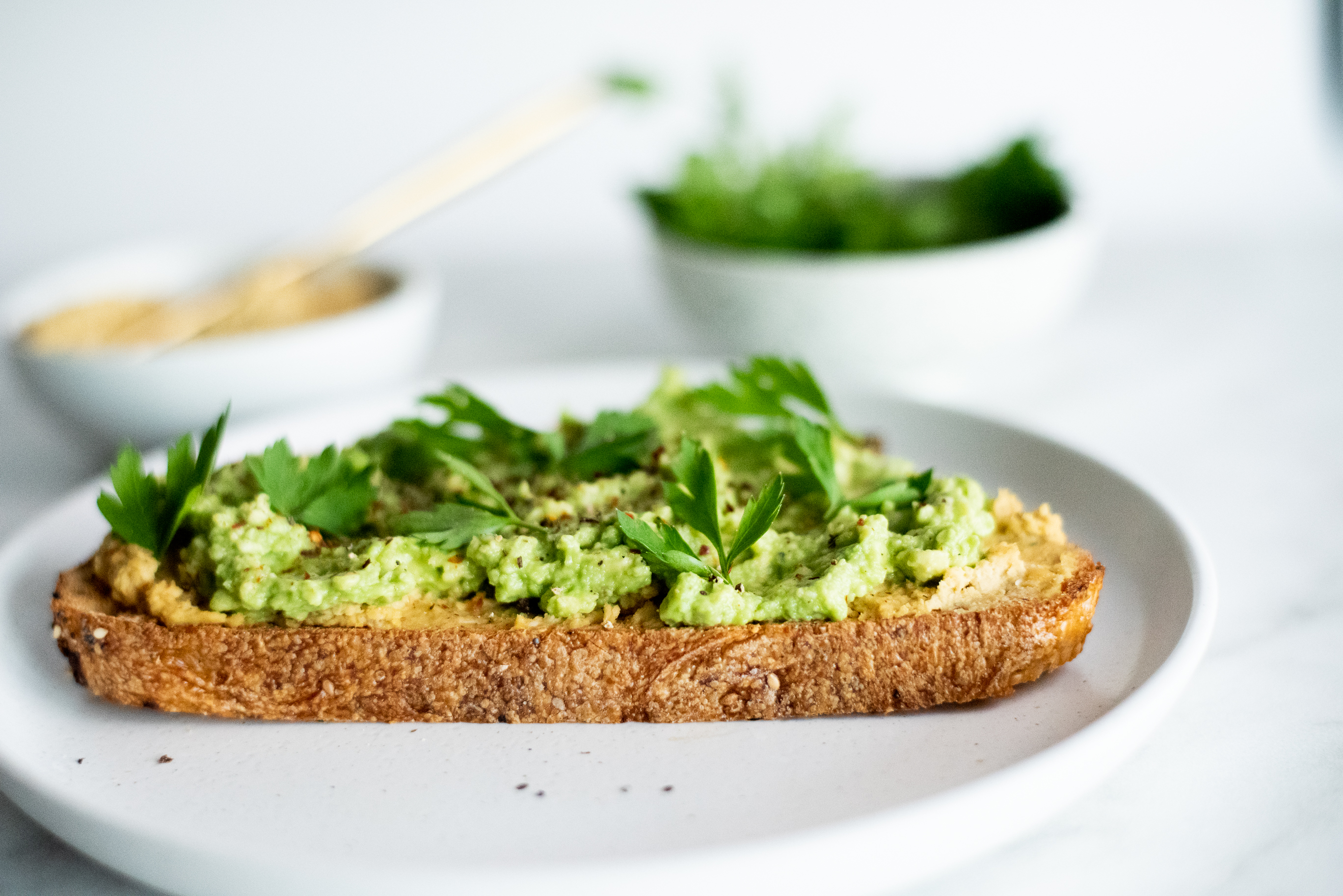
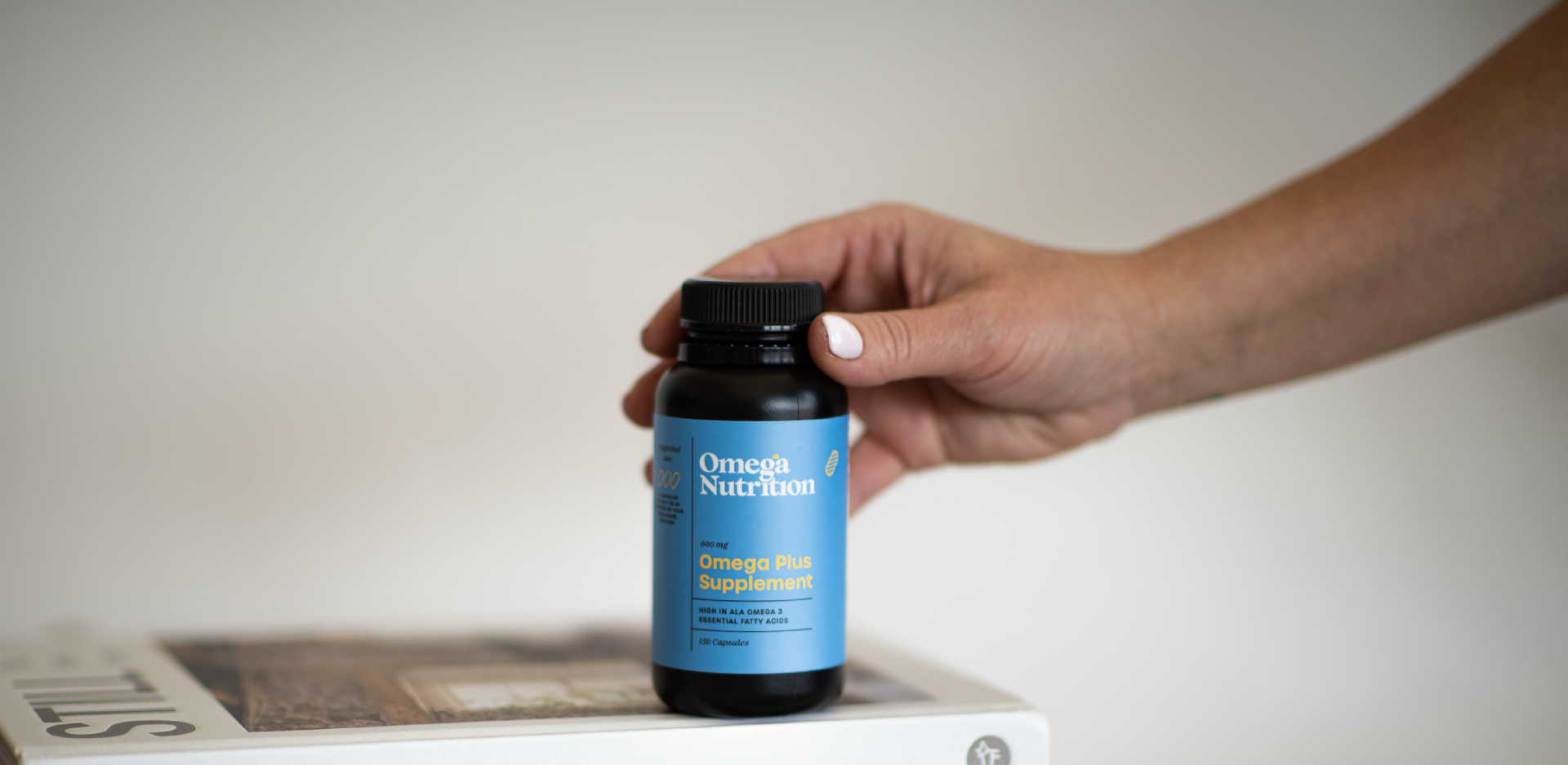
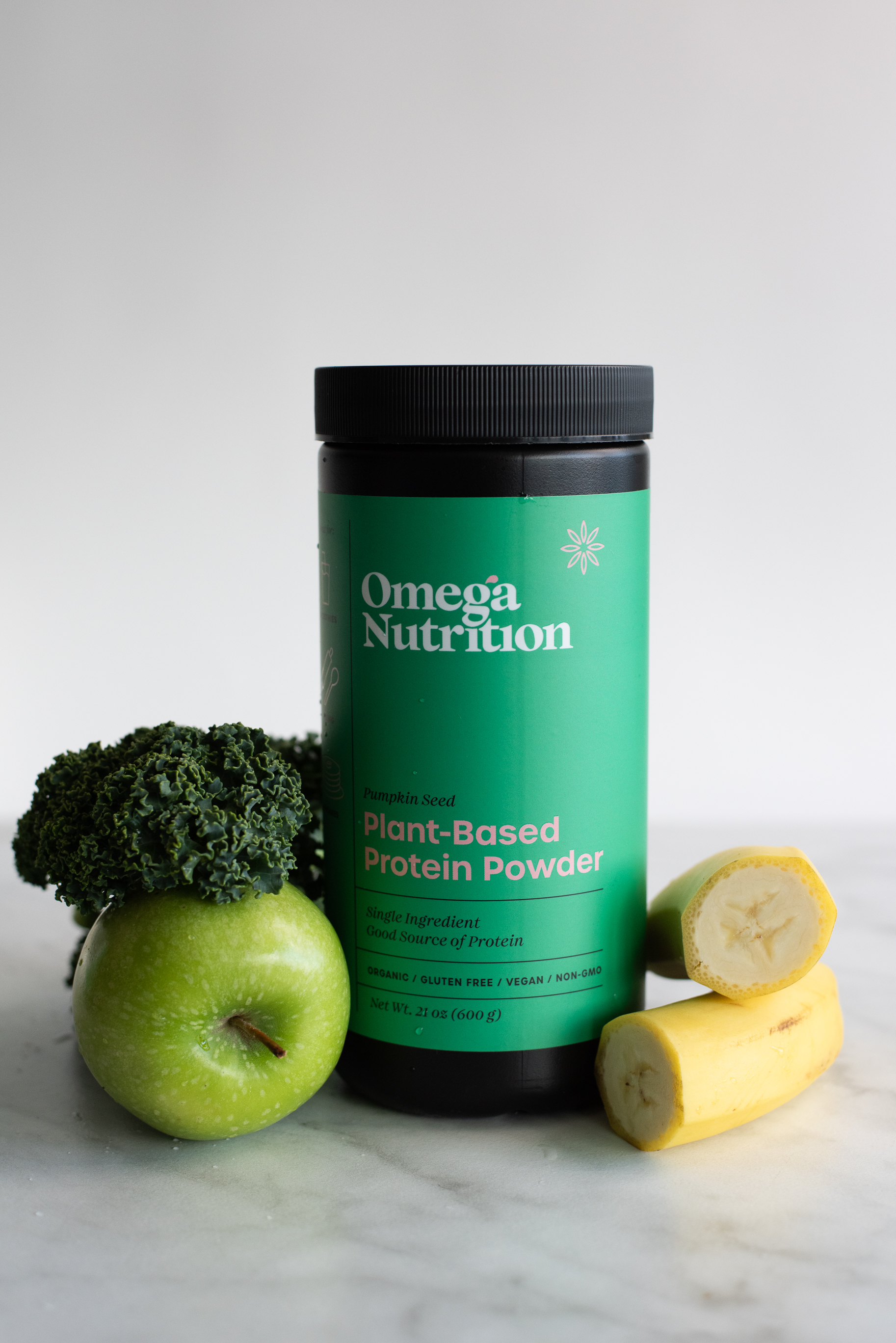
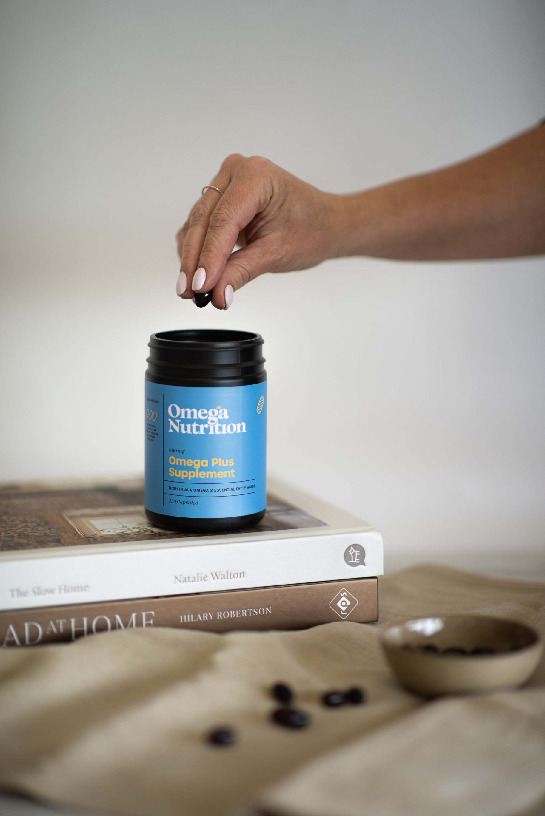
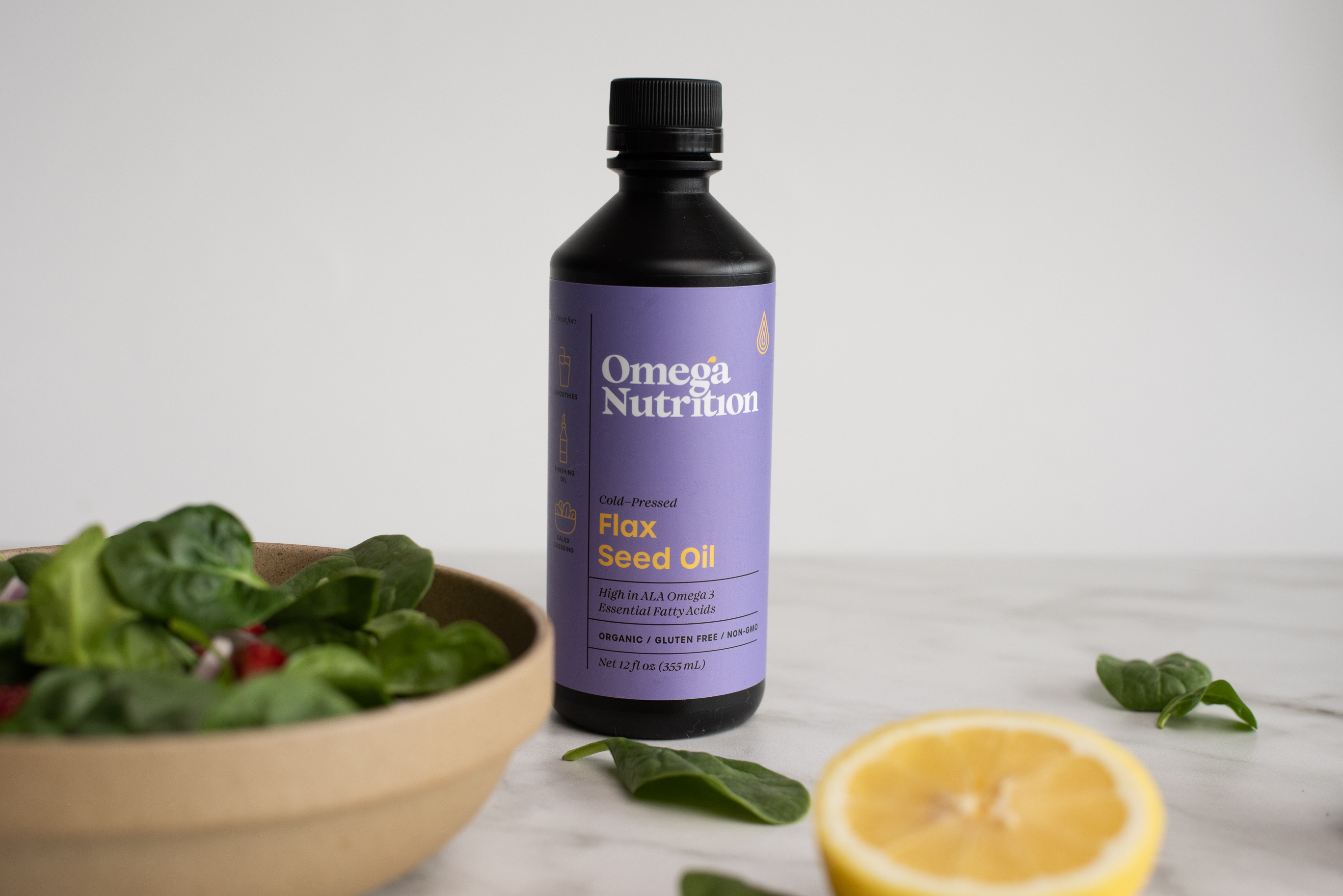
E-commerce Product Photography:
[13 SKU - total 20 including specific product sizes] - Captured using studio lighting and 85mm Nikon Lens
[13 SKU - total 20 including specific product sizes] - Captured using studio lighting and 85mm Nikon Lens
Labels: [English + French]: Design and production of pre-press files
What it used to be:


03
Documents – External
Sell-sheets and Specification sheets have played a pivotal role in the company's strategy for engaging wholesale customers and educating the public about product content. These documents, characterized by a blend of high-impact visuals and critical information, were exclusively distributed to confirmed and potential buyers.
My objective was to create sheets that are not only aesthetically pleasing but also effortlessly navigable, ensuring a seamless reading experience for customers without overwhelming them with unnecessary details.
Sell-Sheets:
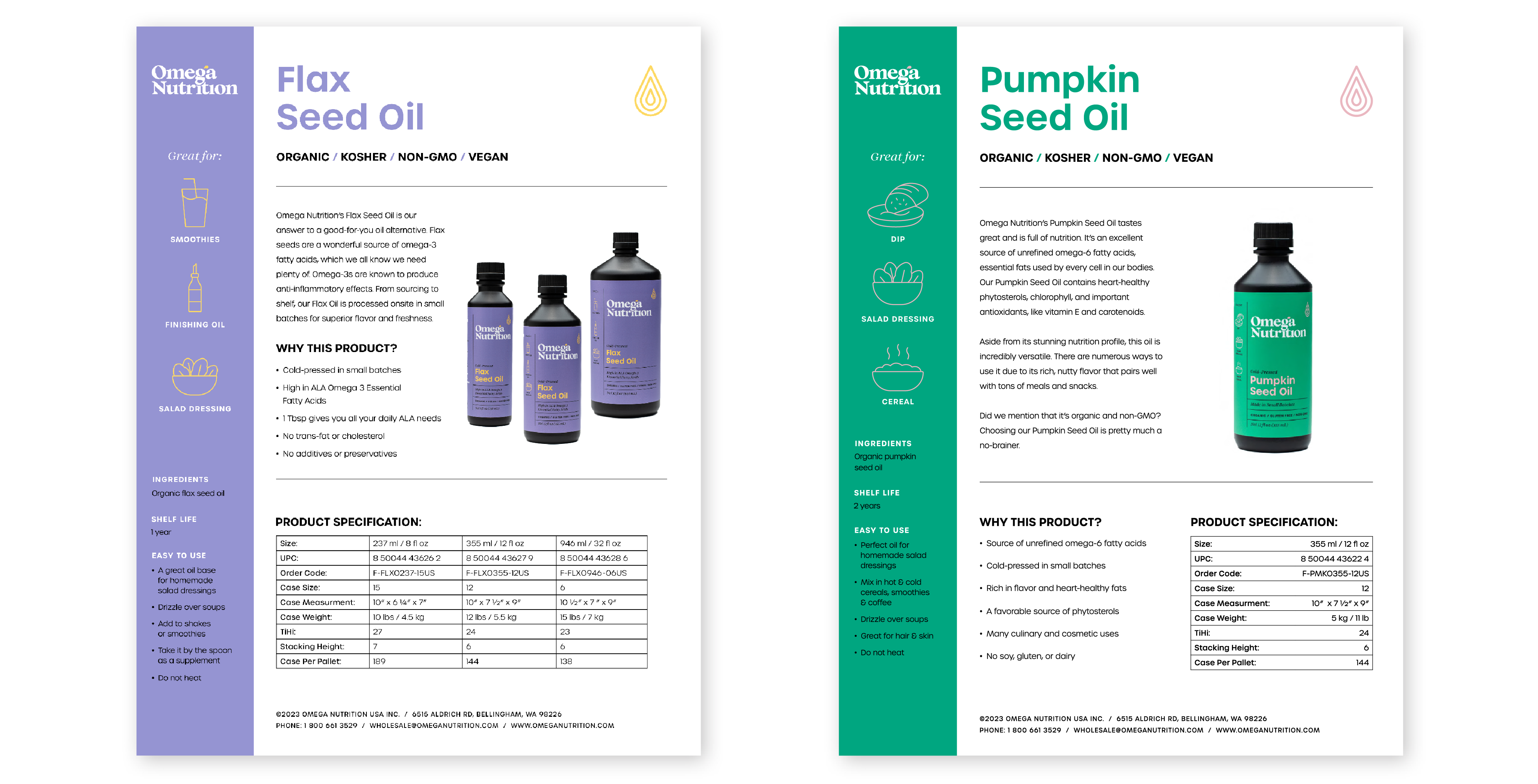
Specification Sheets:
What it used to be:


04
Documents – Finance & Leterhead Design
Previously, all financial documents were disseminated to customers in Excel sheets—an inefficient, challenging-to-read method that made tracking updates cumbersome. With numerous versions scattered across the company's hard drive, my responsibility involved consolidating these files into coherent PDF documents. I became the designated person to manage updates, ensuring a streamlined and accessible system for necessary changes.
I conceptualized and crafted fillable PDFs, strategically engineered to enhance usability and facilitate seamless access for all company documents.
05
Content: Website + Social Media
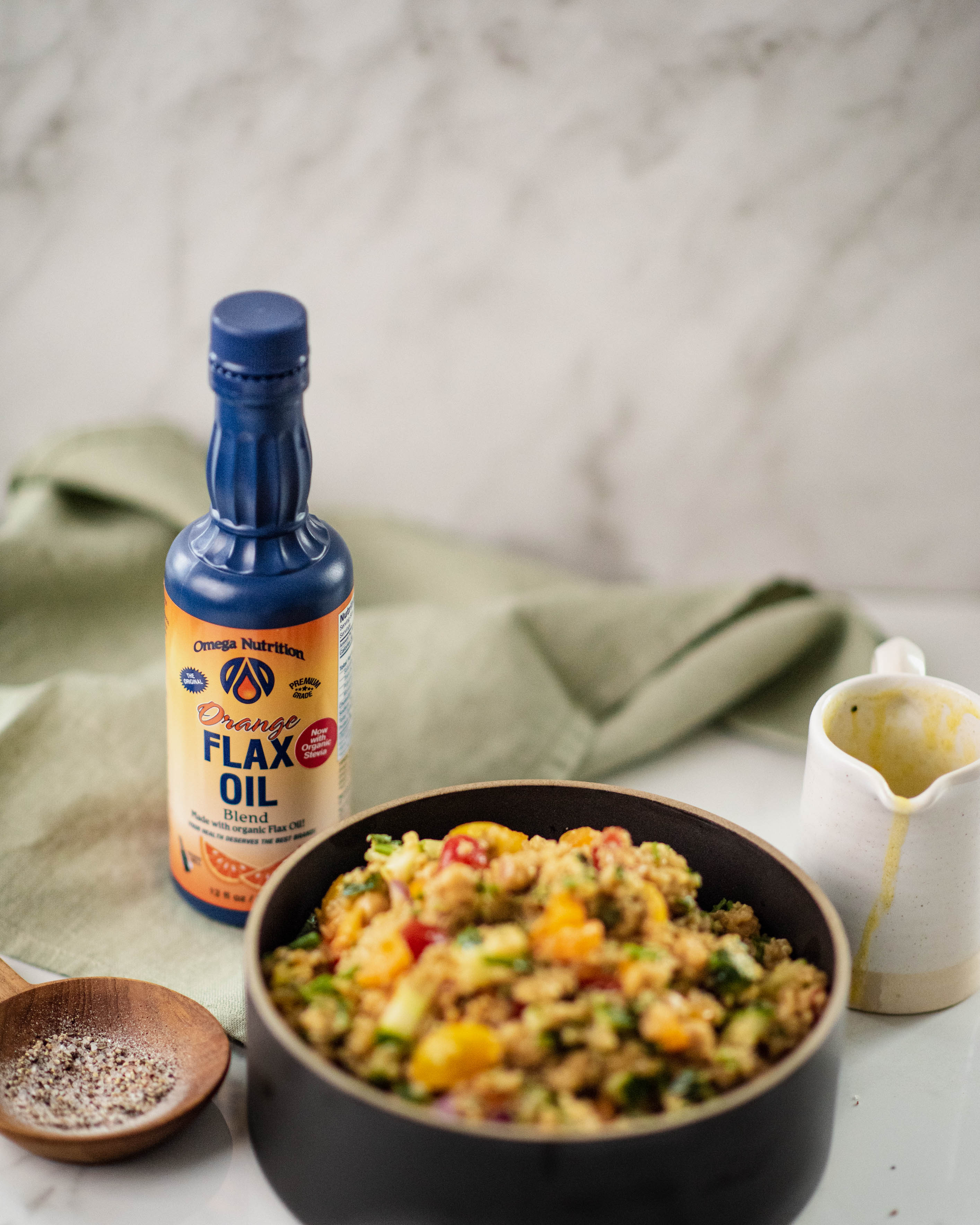
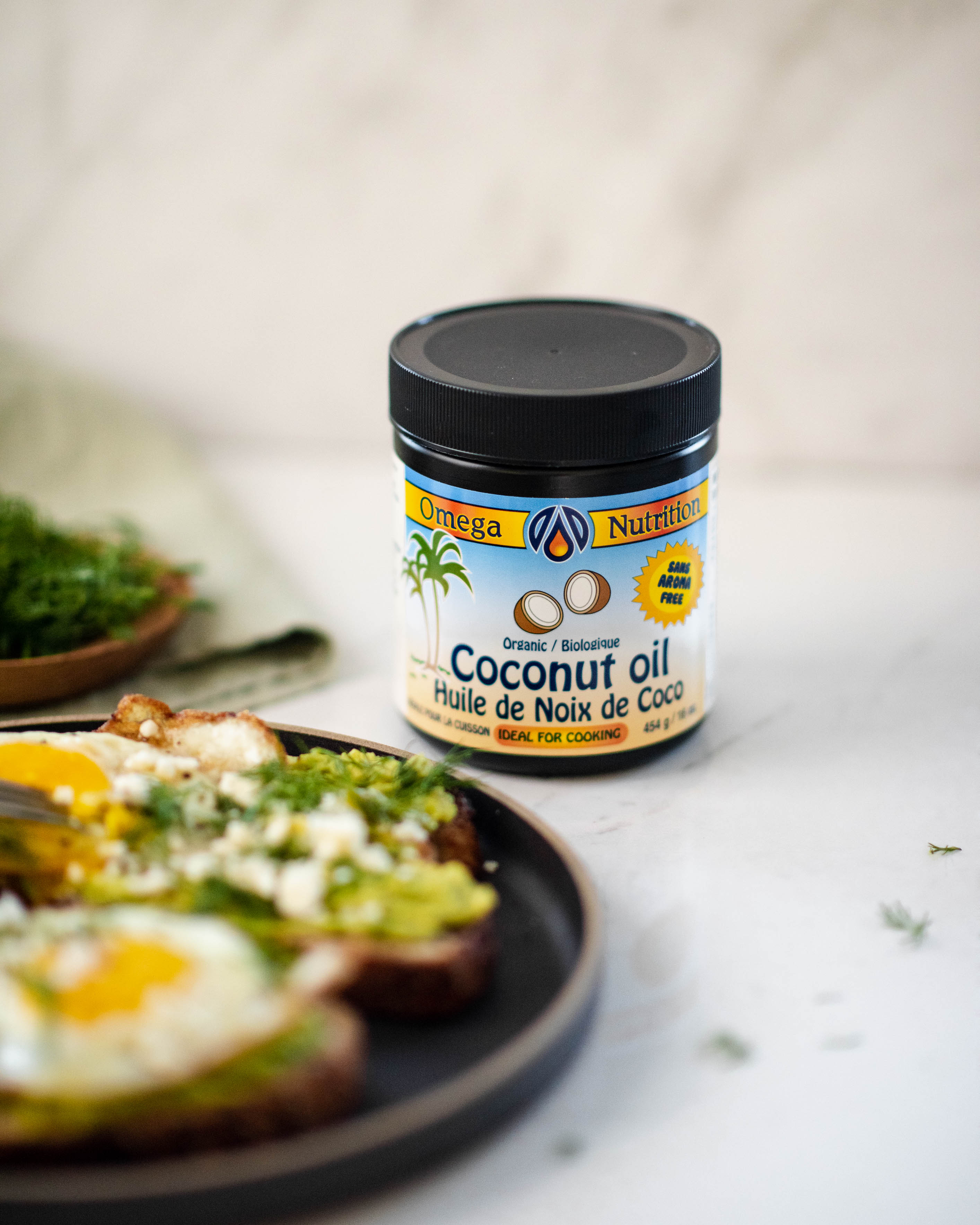
Upon completing phase 1 of the company's re-branding, which included revamping labels and documents, I transitioned to the exciting phase: promoting products, health, and nutrition. Initiating this phase involved crafting a strategic marketing plan. I began by curating simple recipes that not only showcased the essence of the products but also empowered customers to embrace healthy eating without compromising on taste and time.
︎︎︎ Target audience research and market analysis insights on presentation section of this page.
IG Reels: Click to watch:


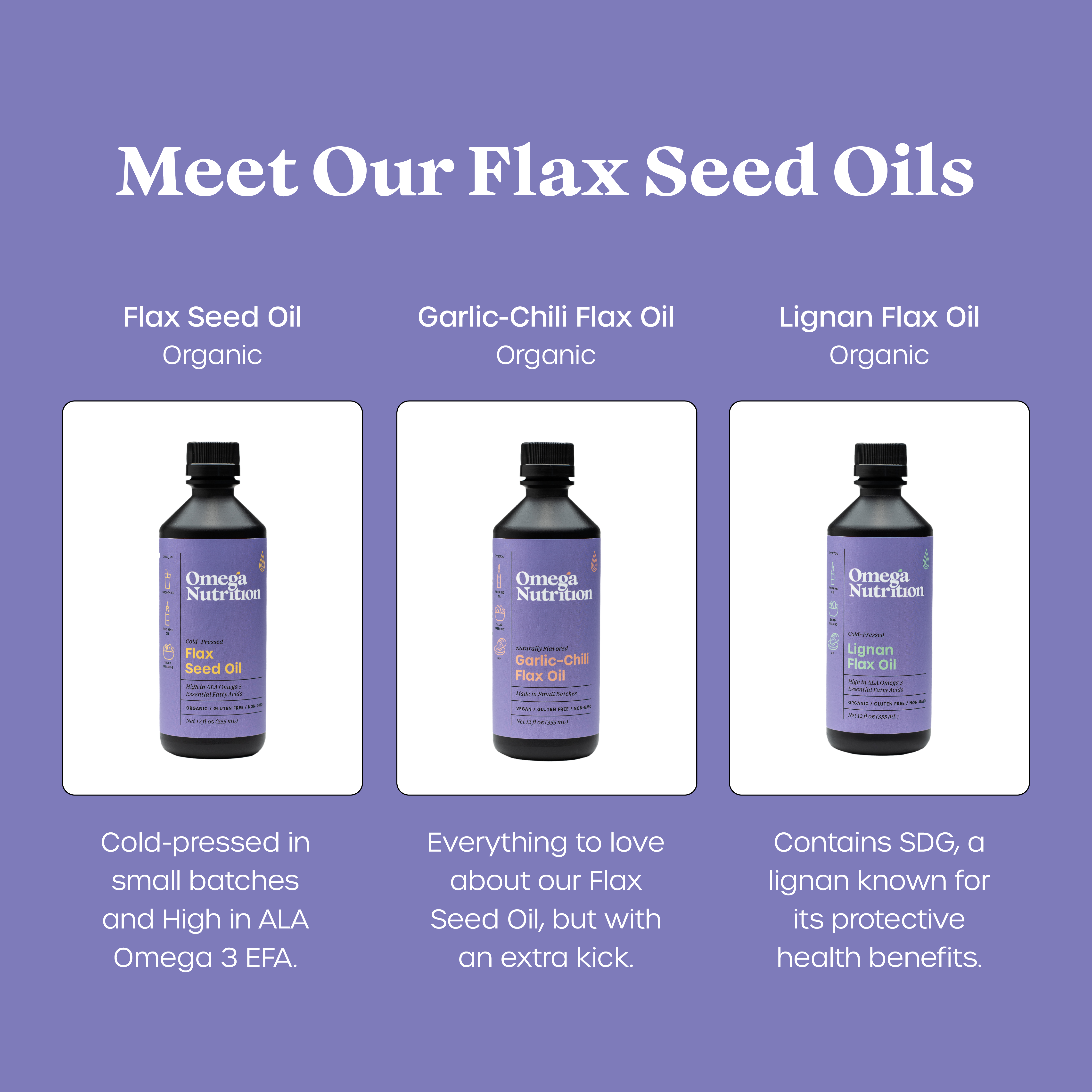
Social Media Direction & Infographics:
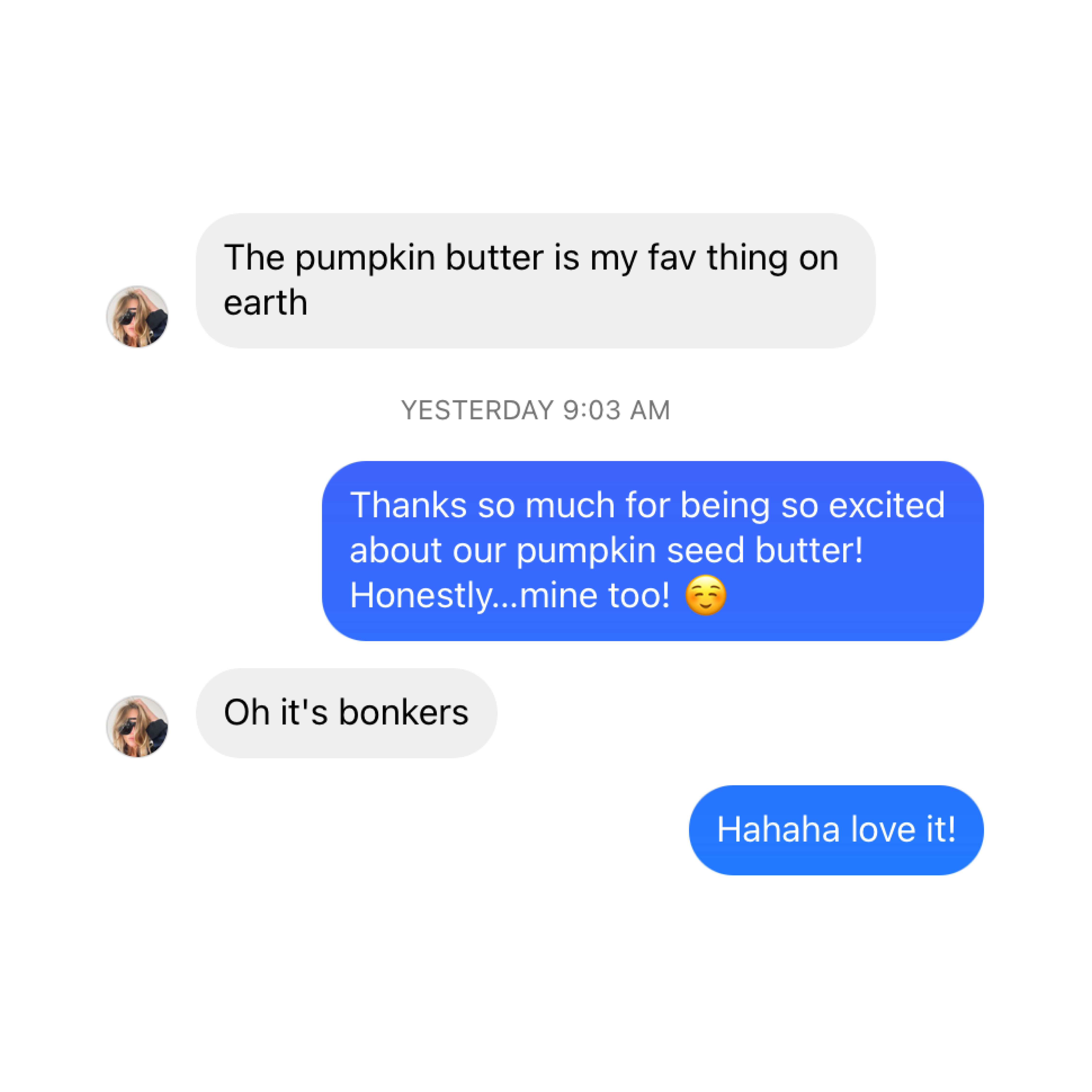
The photography direction I curated aimed to exude vibrancy, joy, and creativity, all while embracing simplicity to mirror the core essence of the brand: pure, clean, and straightforward. Employing engaging infographics and customer review posts, as exemplified below, became instrumental in fostering relatability and providing educational content. These strategic visual elements played a pivotal role in enlightening our audience about the myriad benefits of our products.
The photography direction I curated aimed to exude vibrancy, joy, and creativity, all while embracing simplicity to mirror the core essence of the brand: pure, clean, and straightforward. Employing engaging infographics and customer review posts, as exemplified below, became instrumental in fostering relatability and providing educational content. These strategic visual elements played a pivotal role in enlightening our audience about the myriad benefits of our products.


Instagram & Ads:
The photography direction I curated aimed to exude vibrancy, joy, and creativity, all while embracing simplicity to mirror the core essence of the brand: pure, clean, and straightforward. Employing engaging infographics and customer review posts, as exemplified below, became instrumental in fostering relatability and providing educational content. These strategic visual elements played a pivotal role in enlightening our audience about the myriad benefits of our products.
The photography direction I curated aimed to exude vibrancy, joy, and creativity, all while embracing simplicity to mirror the core essence of the brand: pure, clean, and straightforward. Employing engaging infographics and customer review posts, as exemplified below, became instrumental in fostering relatability and providing educational content. These strategic visual elements played a pivotal role in enlightening our audience about the myriad benefits of our products.
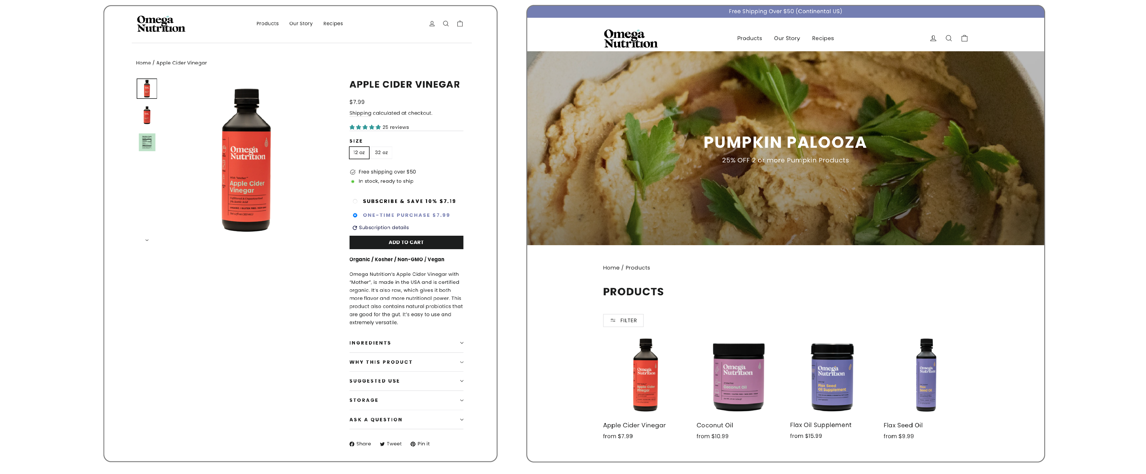
Web Design: Shopify
[UI, UX, Content Photography, Videos, Recipe Development + Cooking and E-commerce phottography]
One of my initial undertakings involved a comprehensive redesign of Omega Nutrition's website, leveraging Shopify to craft a seamless online shopping experience. While maintaining the familiarity of the original layout, I introduced an innovative "recipe page" to share healthy culinary inspirations that spotlighted product utilization. The following showcases a glimpse of the assets I meticulously designed to enhance the overall web experience.
View website: Here
Utilizing intuitive product pages coupled with dynamic drop-down menus to enlighten customers about our offerings.
06
Business Cards

07