Role:
+ Editorial Design
+ Art Direction
+ Art Direction
Project:
Editorial
Editorial
Collaborators:
1. Ali Etrati: Coneptual Photography
2. Matej Balaz: Studio Photography
3. Sam: Editorial Photography
https://extensostudio.com
1. Ali Etrati: Coneptual Photography
2. Matej Balaz: Studio Photography
3. Sam: Editorial Photography
https://extensostudio.com
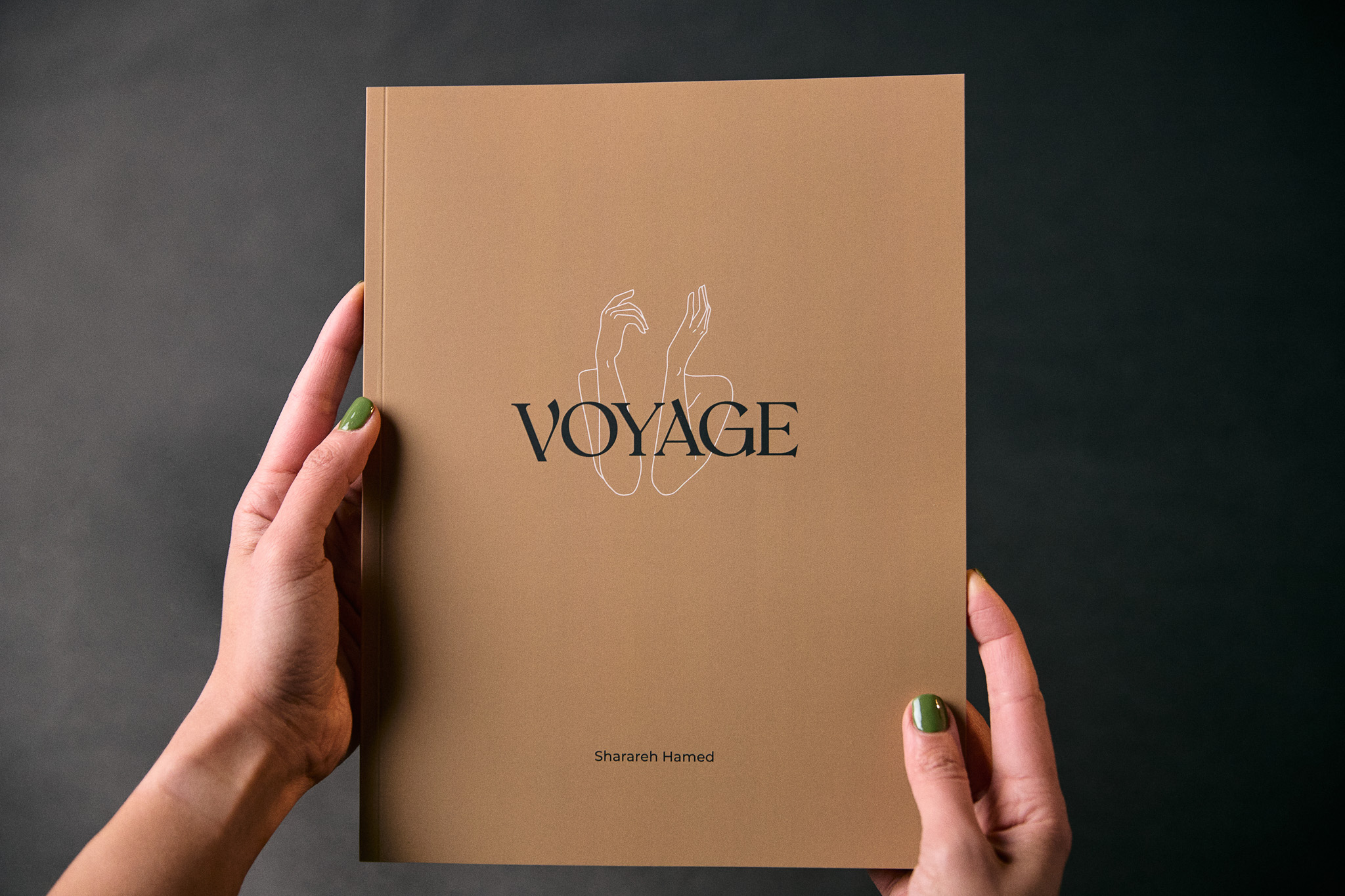
Design Challenge: How might facing our trauma, past hurt and vulnerability help us build stronger relationships with ourselves and others?
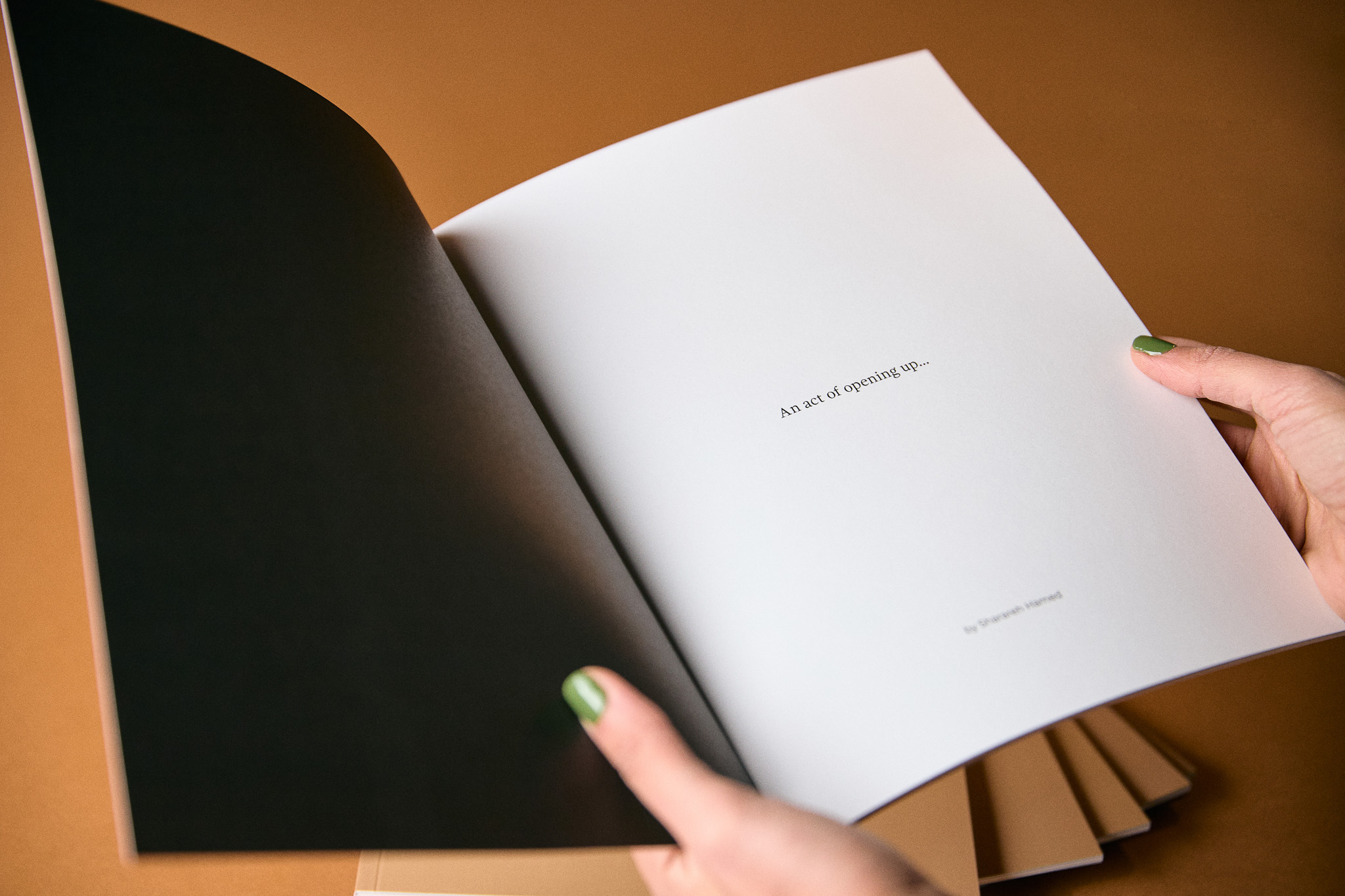
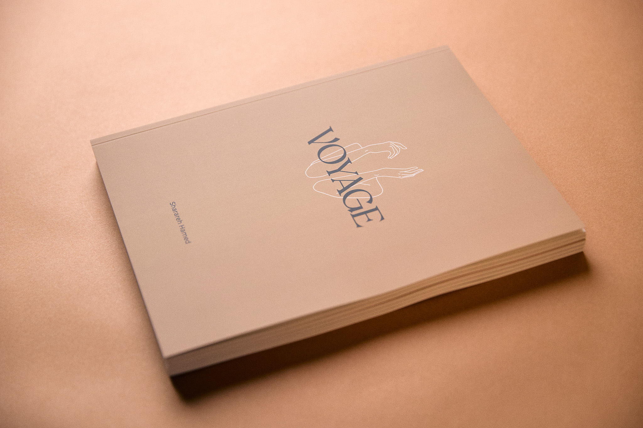
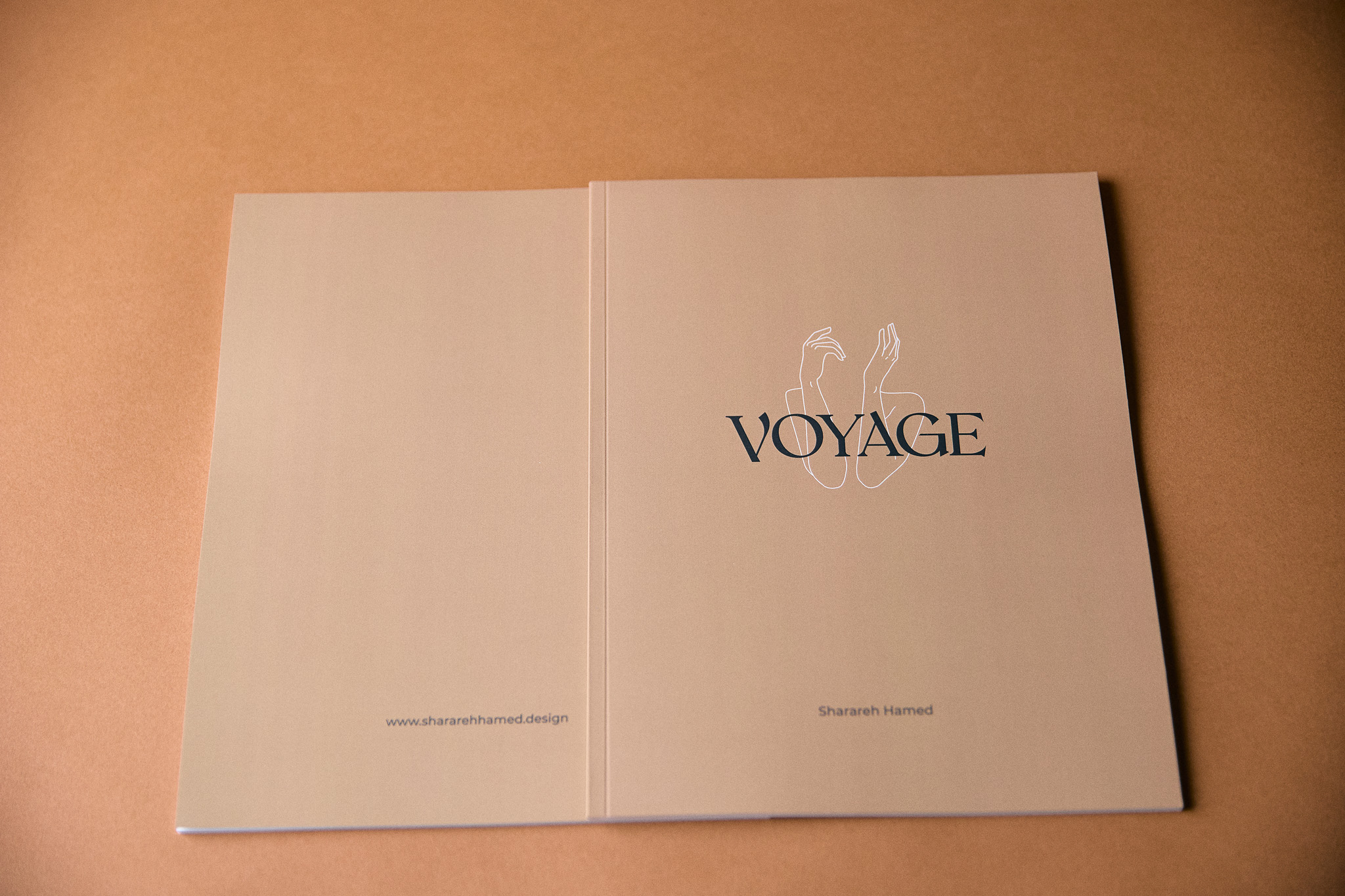
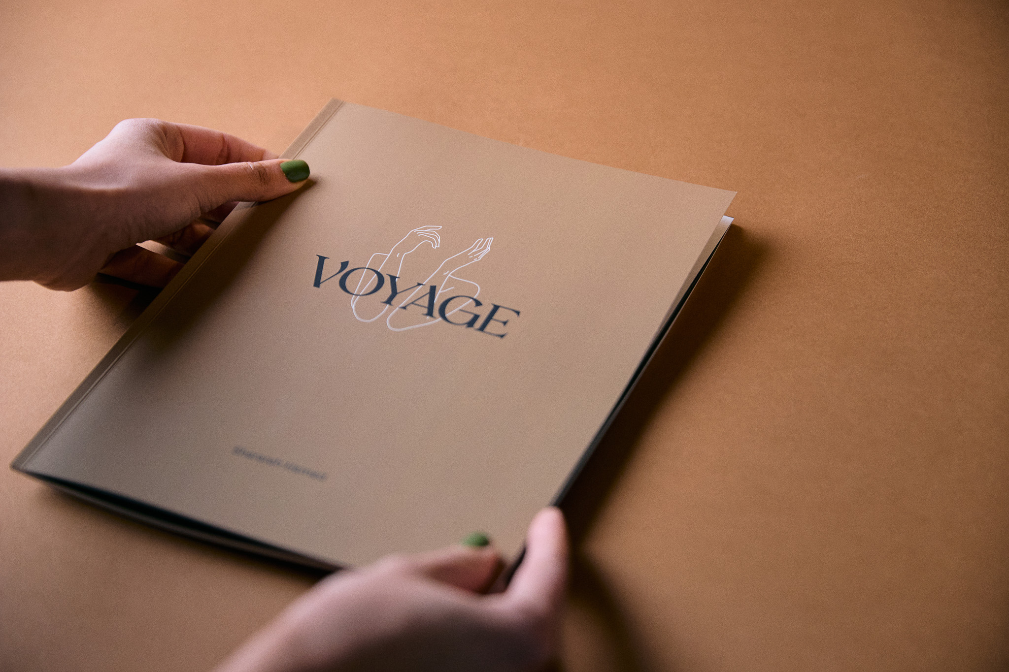
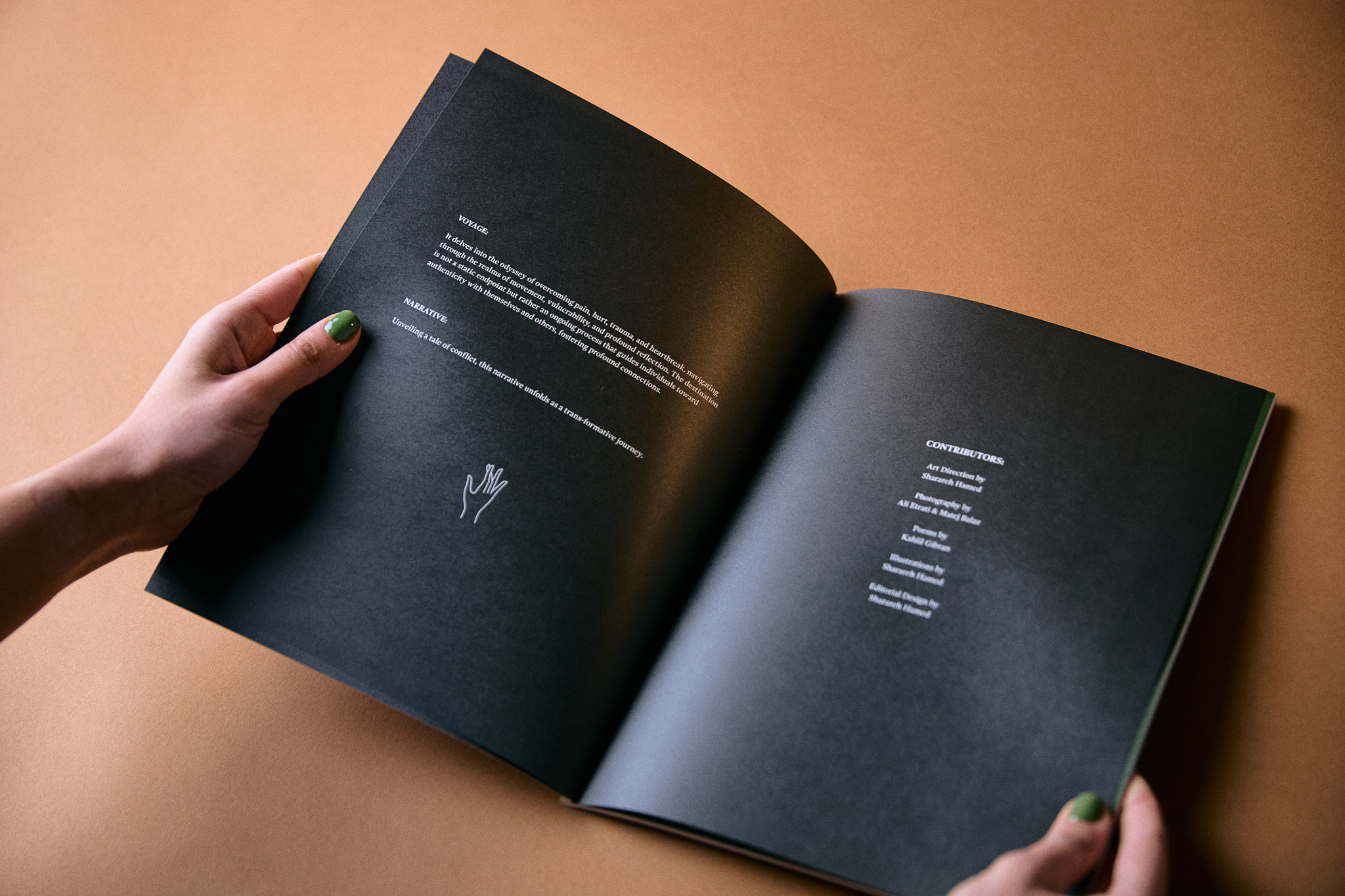
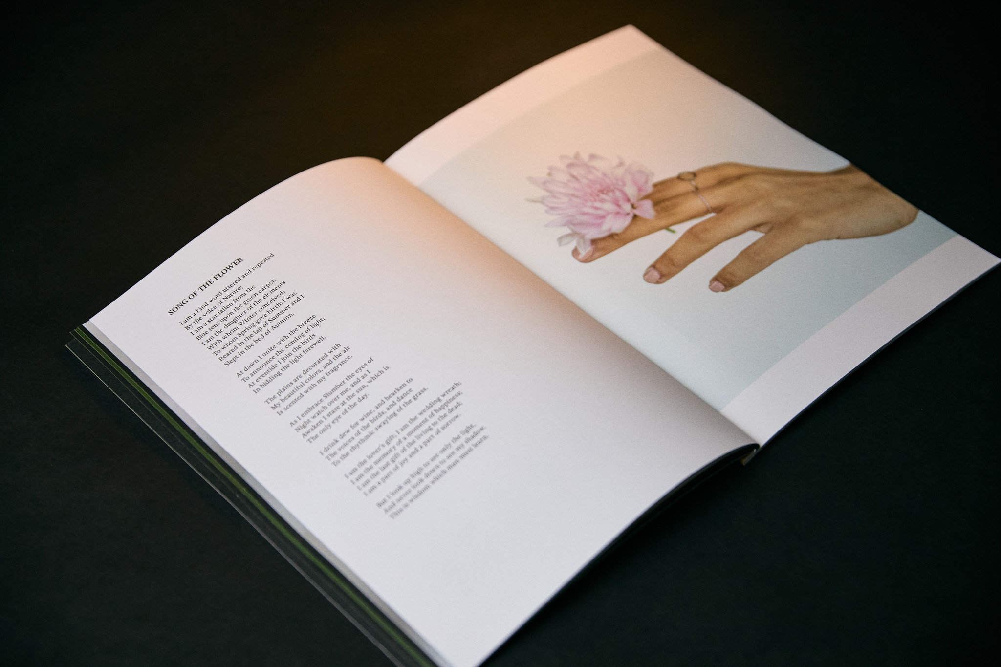
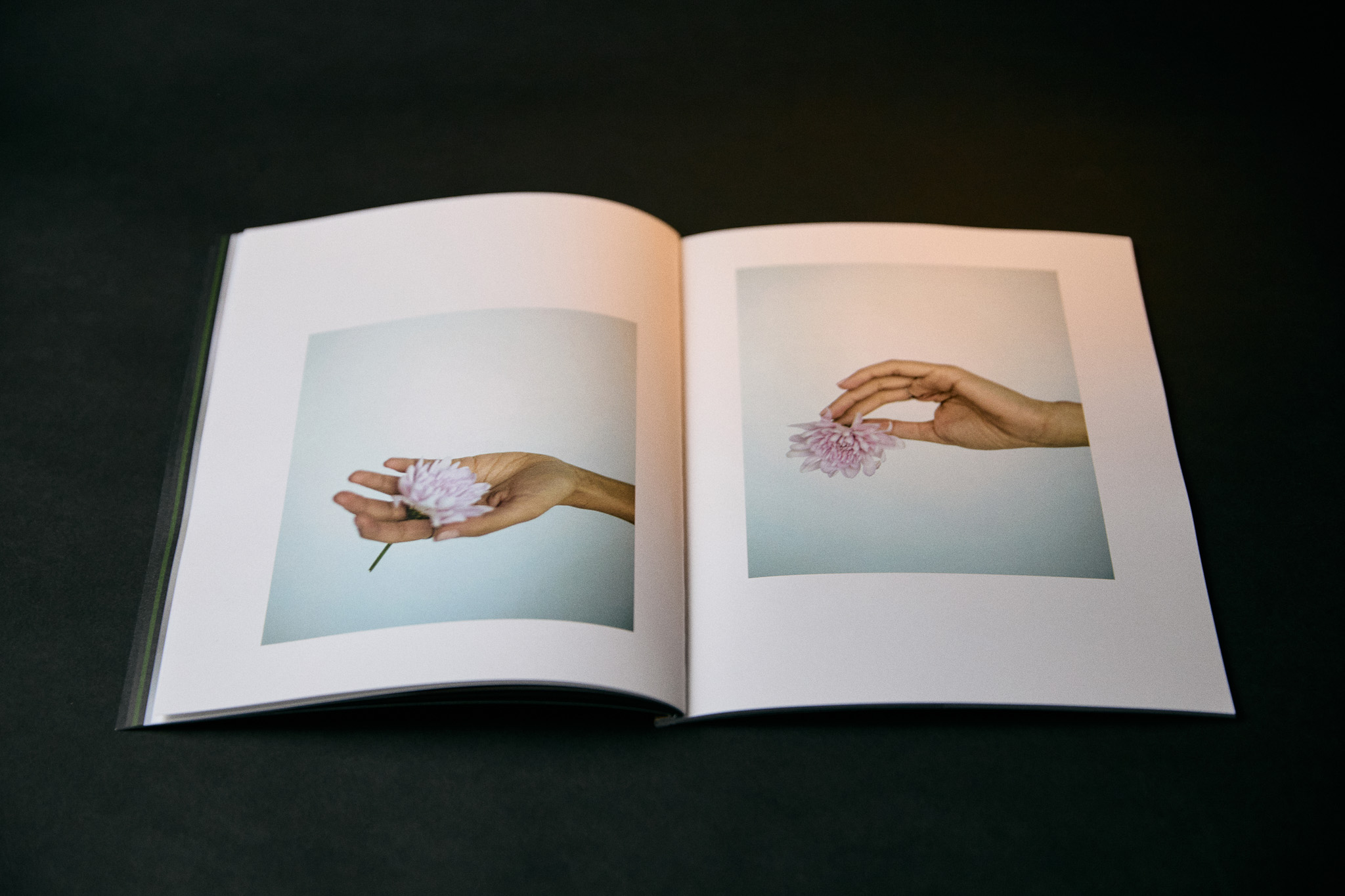
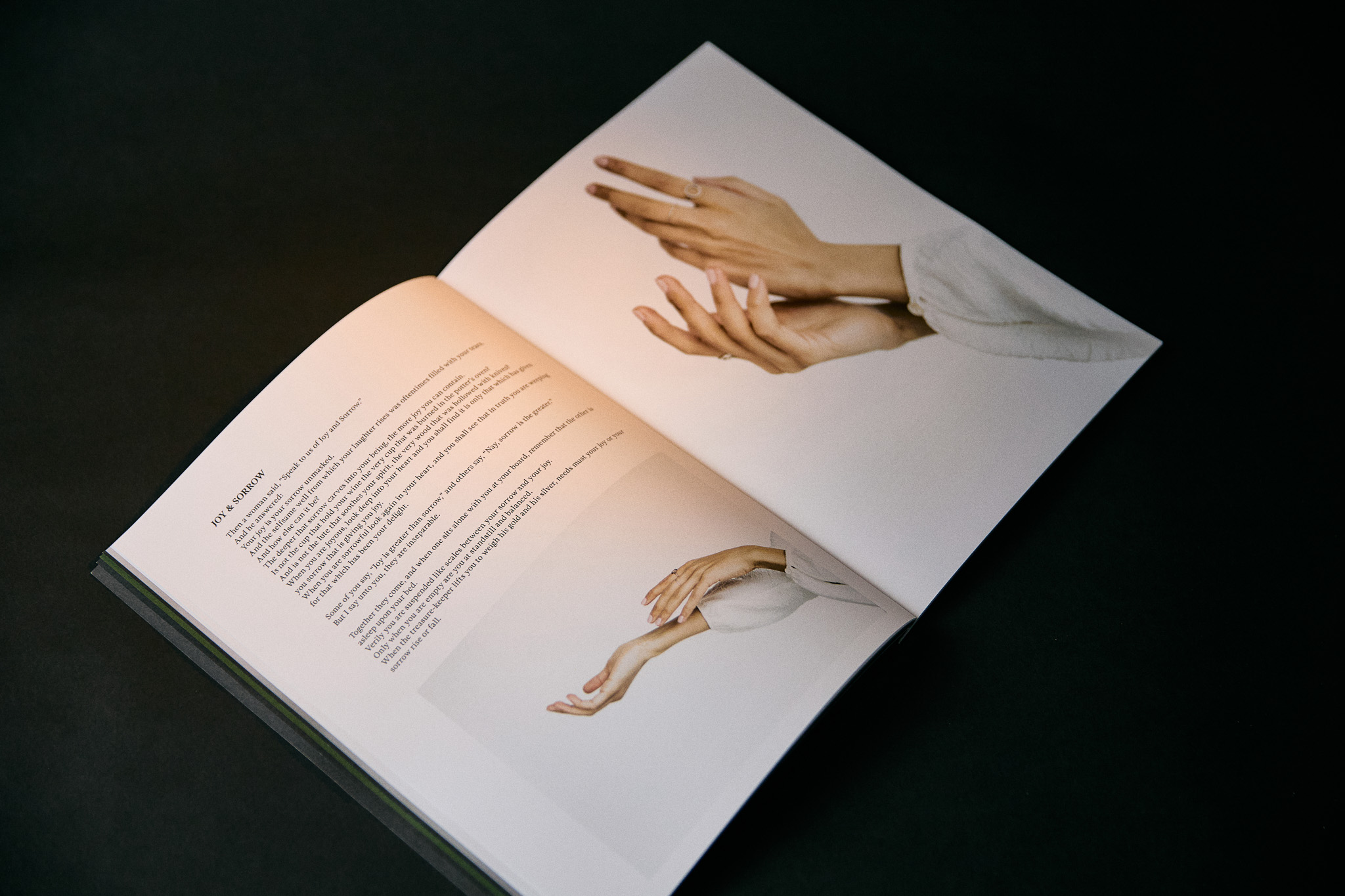
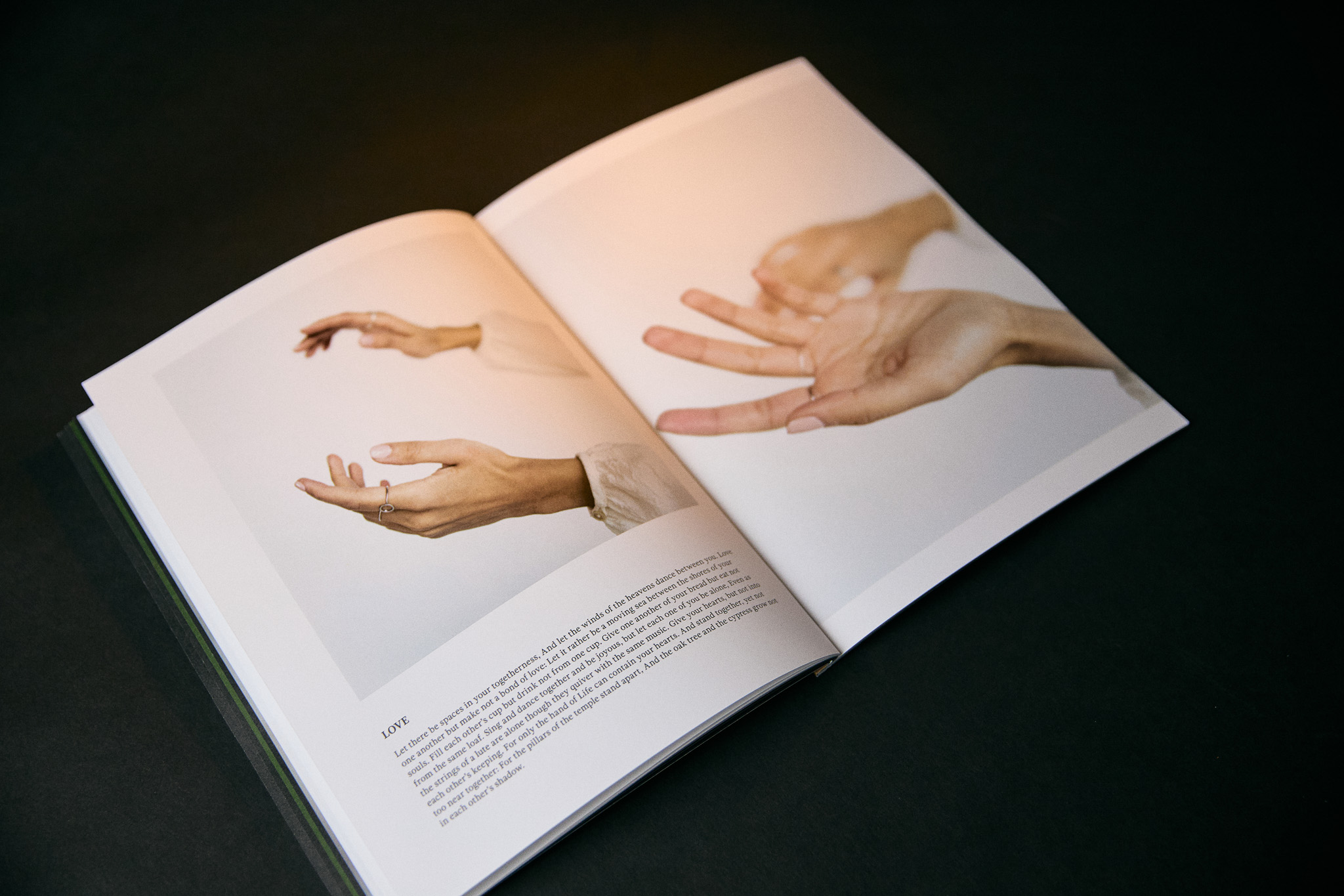
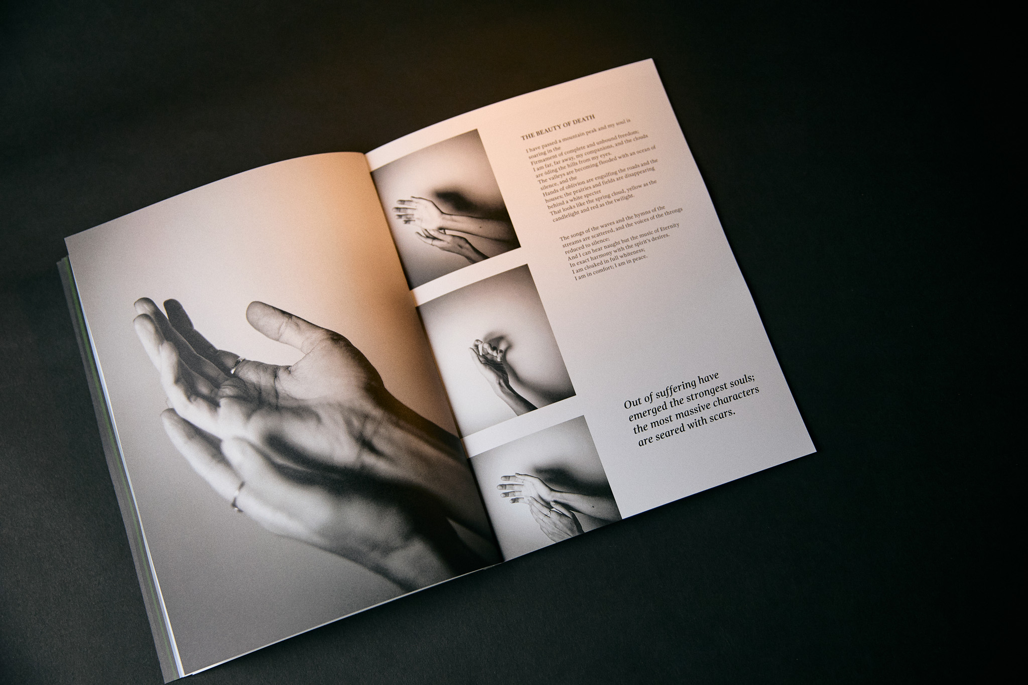
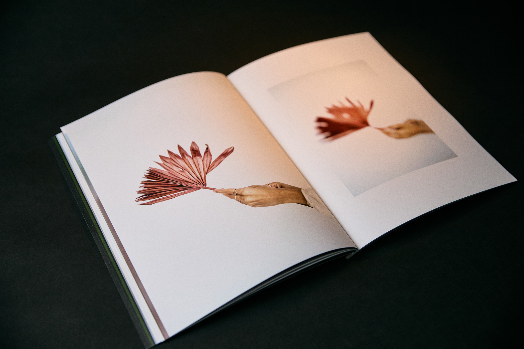
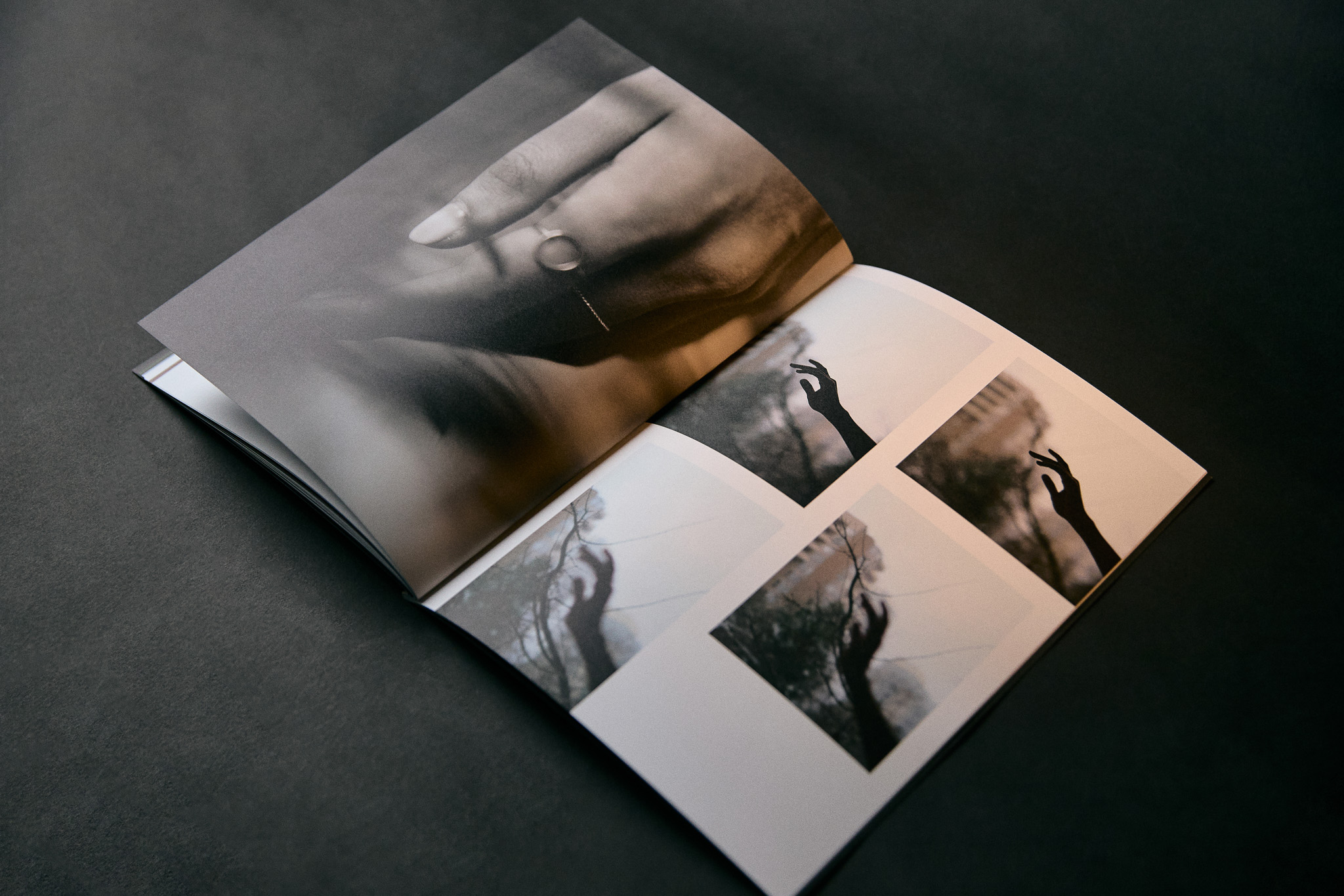
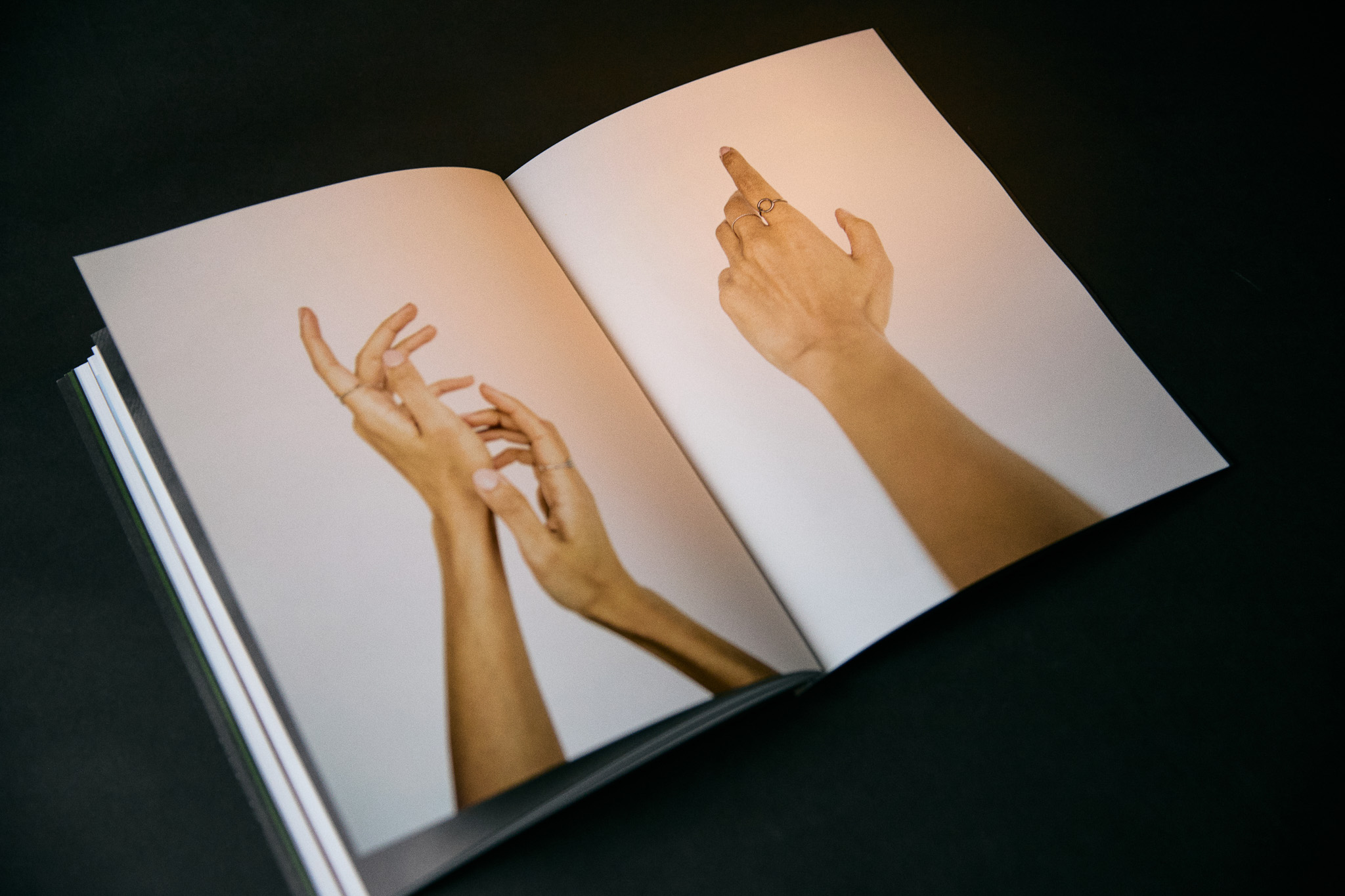
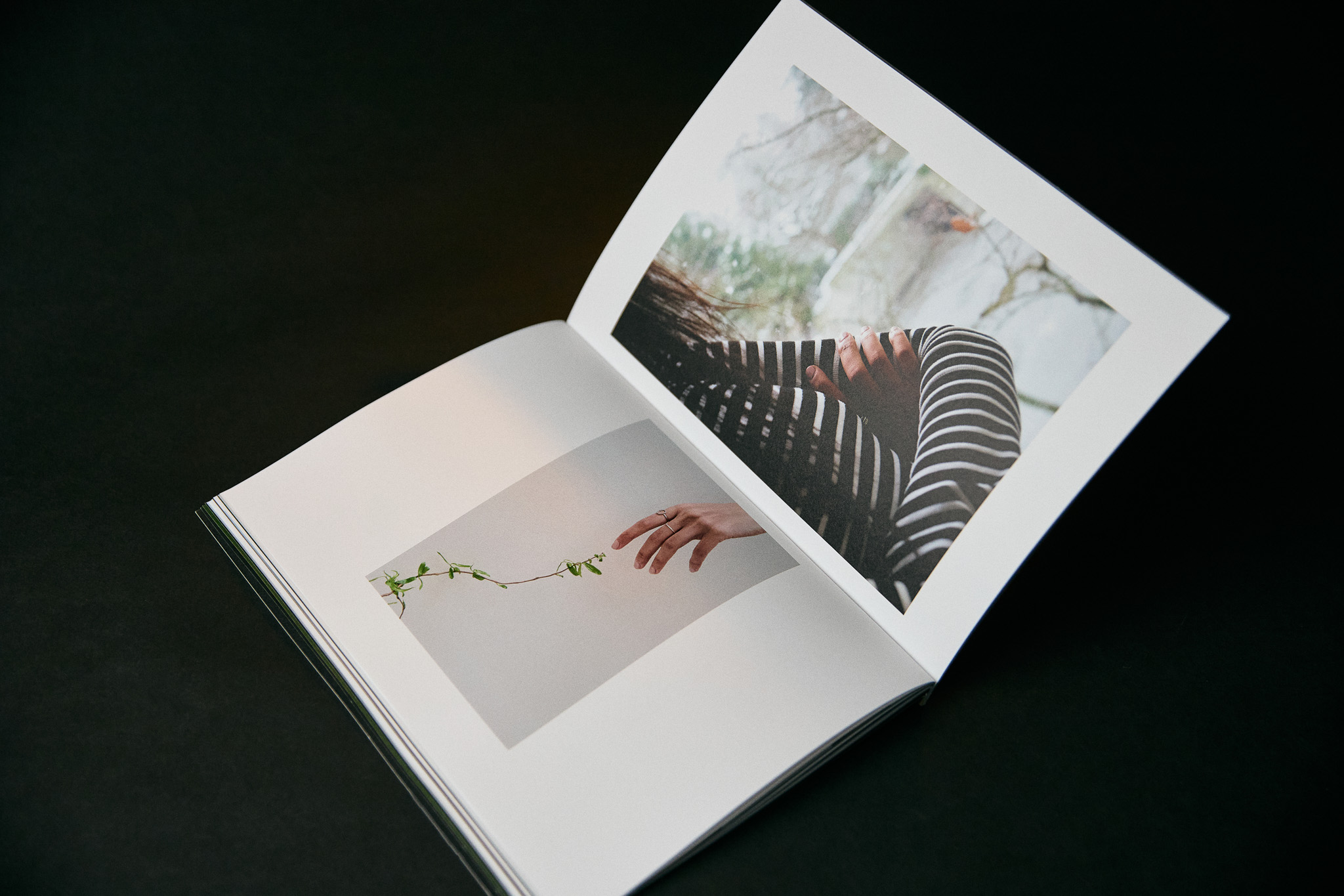
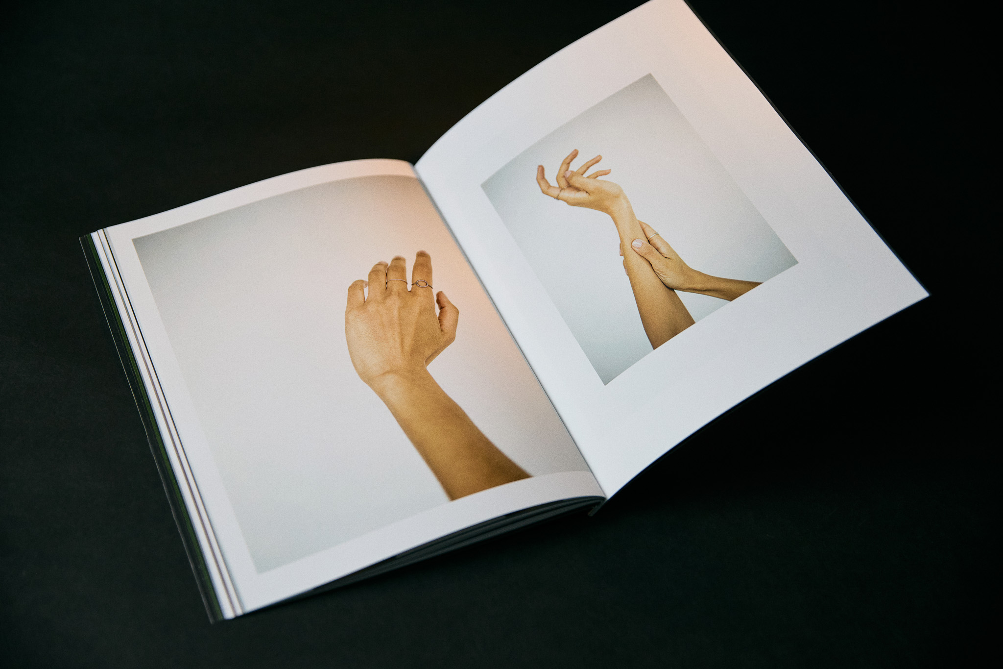
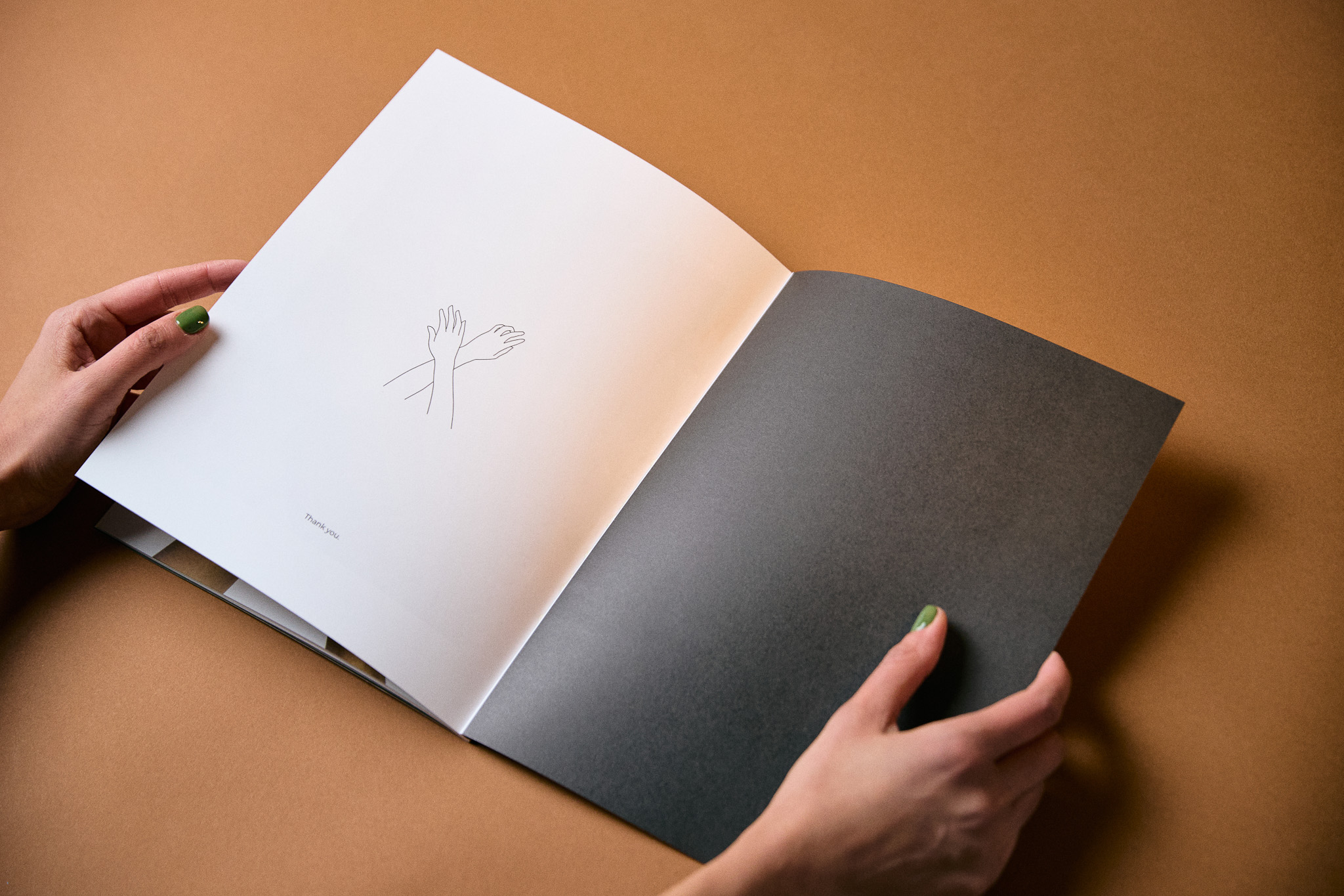
As I sit here holding my book, a labor of love that has resided in my heart for over four years, the overwhelming emotion of gratitude consumes me. The weight of the pages, the texture of the paper, and the tangible presence of Khalil Gibran’s poems and my photos represent a journey of writing, editing, and publishing that has transformed me. While I design digitally and create work that exist on a screen, physically holding this newly printed book is an unparalleled experience—an amalgamation of wonder, satisfaction, fulfillment, and accomplishment. The act of designing, delving into the depths of my soul to assemble moments of pain and healing, has been a transformative journey lasting four years. This book, now in my hands, is not just a publication; it is a testament to the profound impact poetry and visuals can have on the soul, providing unexpected healing and a newfound sense of accomplishment.

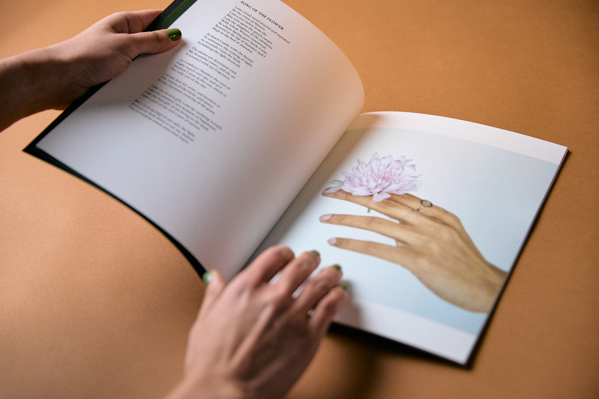
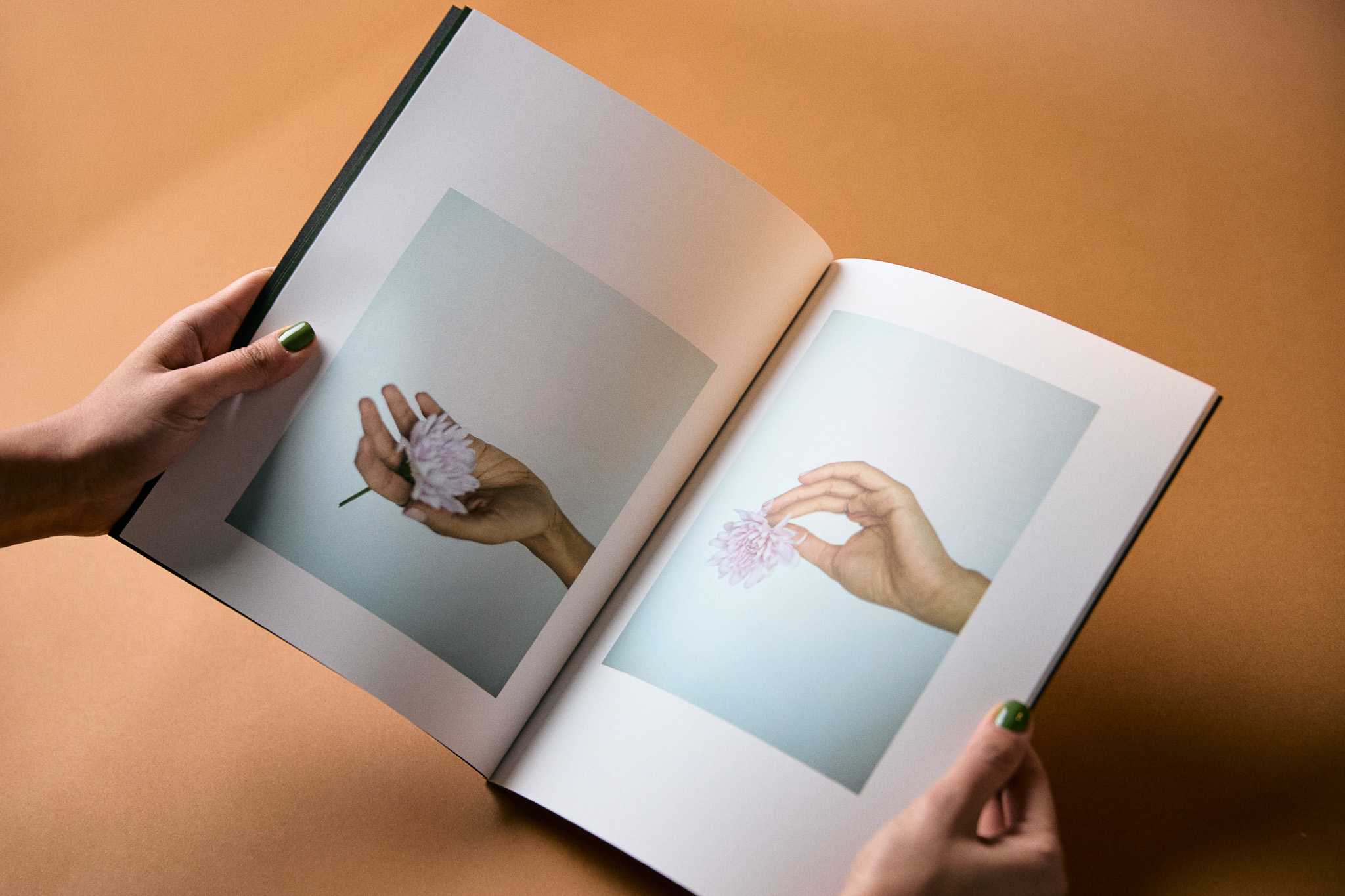
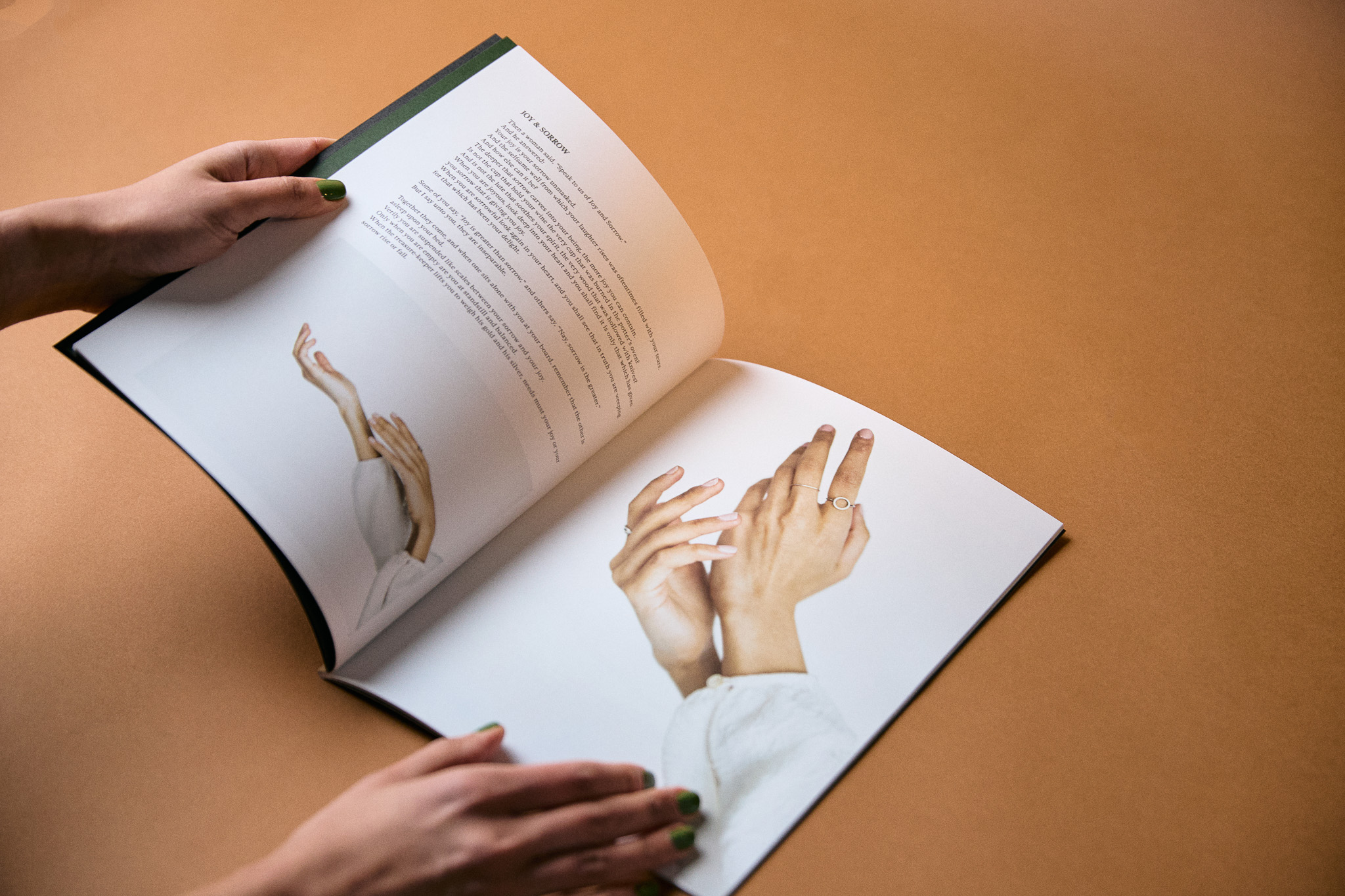
My greatest hope is that this book becomes an instrument to bringing transformation and freedom to many lives. That’s the sole reason I share my story on VOYAGE, and it holds immense significance. Looking forward, my next project involves publishing a book of my own writings within the next year. I aspire to continue creating narratives that resonate with the human experience, fostering connection and understanding. The journey of self-expression through words and design has become an integral part of my identity, and I am excited to embark on the next chapter of sharing stories that inspire and bring solace to those who may find resonance in them.

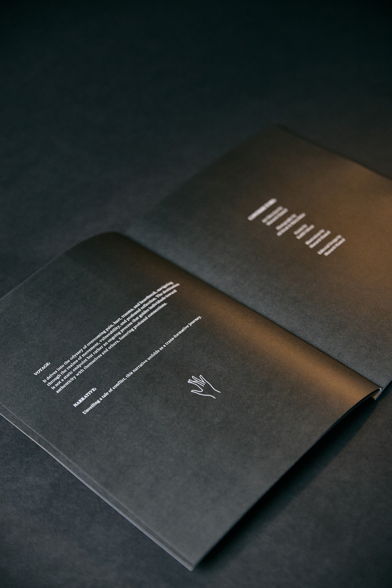
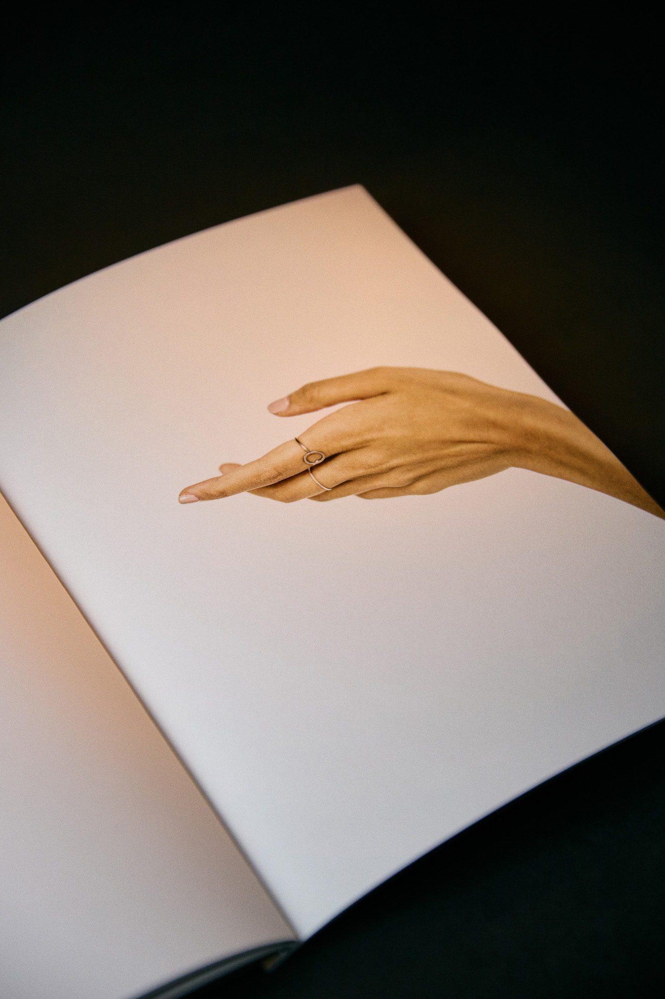
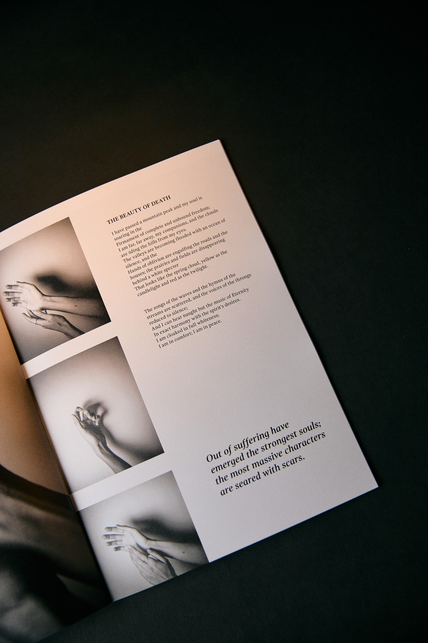
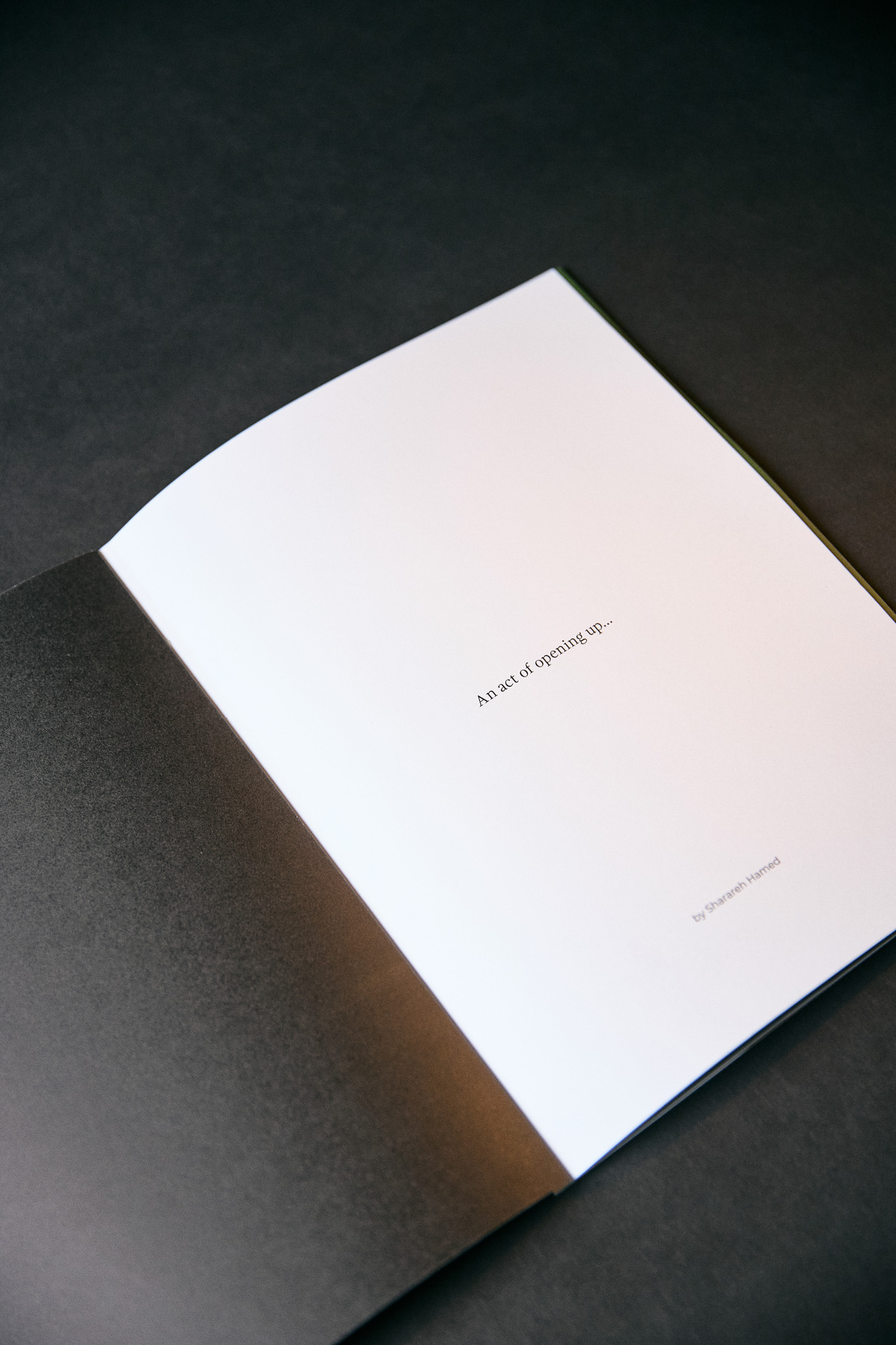
Swipe below to view all pages:




Role:
In-House Designer
Promotion: Art Director
+ Art Direction
+ Packaging
+ Print Production
+ Labels: Eng & Fr
+ NFT Design, Genesis
+ Copywriting
+ Photography
+ Videography (content & facility)
+ E-commerce product photography
+ Web Design (UI & UX | Shopify)
+ Social Media
+ Content Design
+ Presentations
+ E-mail Marketing (Klaviyo)
Company:
Omega Nutrition
USA & CA
Year:
2021 – 2023
Omega Nutrition
USA & CA
Year:
2021 – 2023
Collaborators:
1. Mykal Machon: Web development
2. QuickFire: Marketing Agency
3. Jacknife: Branding Agency
4. Globe Printers: Collateral Prints
5. Great Little Box: Label Prints
5. Nik Ferrario: Designer Intern
1. Mykal Machon: Web development
2. QuickFire: Marketing Agency
3. Jacknife: Branding Agency
4. Globe Printers: Collateral Prints
5. Great Little Box: Label Prints
5. Nik Ferrario: Designer Intern
Essence: Keeping it real since the 80’s!
We’re in it for the long haul. We’ve been there from the beginning of the plant based movement and we know what it takes to create high-quality products that actually work. From our production practices, to the ingredients we use, to the quality of our products, we’ve never wavered. That’s what we’ve done for over 30 years and that’s what we’ll continue to do.
Keywords: Legacy, holistic, heritage, trust, integrity, honesty.
Tone: playful, bold, confident, unexpected, direct.
Welcome to Omega Nutrition’s case study presentation. Throughout my two-year tenure at Omega Nutrition, I undertook the formidable task of spearheading the company's brand transformation, often operating with limited resources and, more often than not, working independently. The contents below provide a glimpse into the substantial scope of my contributions. This experience filled with ups and downs provided me with many learnings which I am forever grateful for.
I eagerly anticipate witnessing the brand's continued evolution, as we endeavour to embody and mirror the principles of equity, a dedication to continuous learning, and inclusivity within our organizational culture.
01
Custom Wordmark
A modern serif with natural flourish that reflects the plant-based qualities of the product.
A modern serif with natural flourish that reflects the plant-based qualities of the product.

Brand Colours:

02
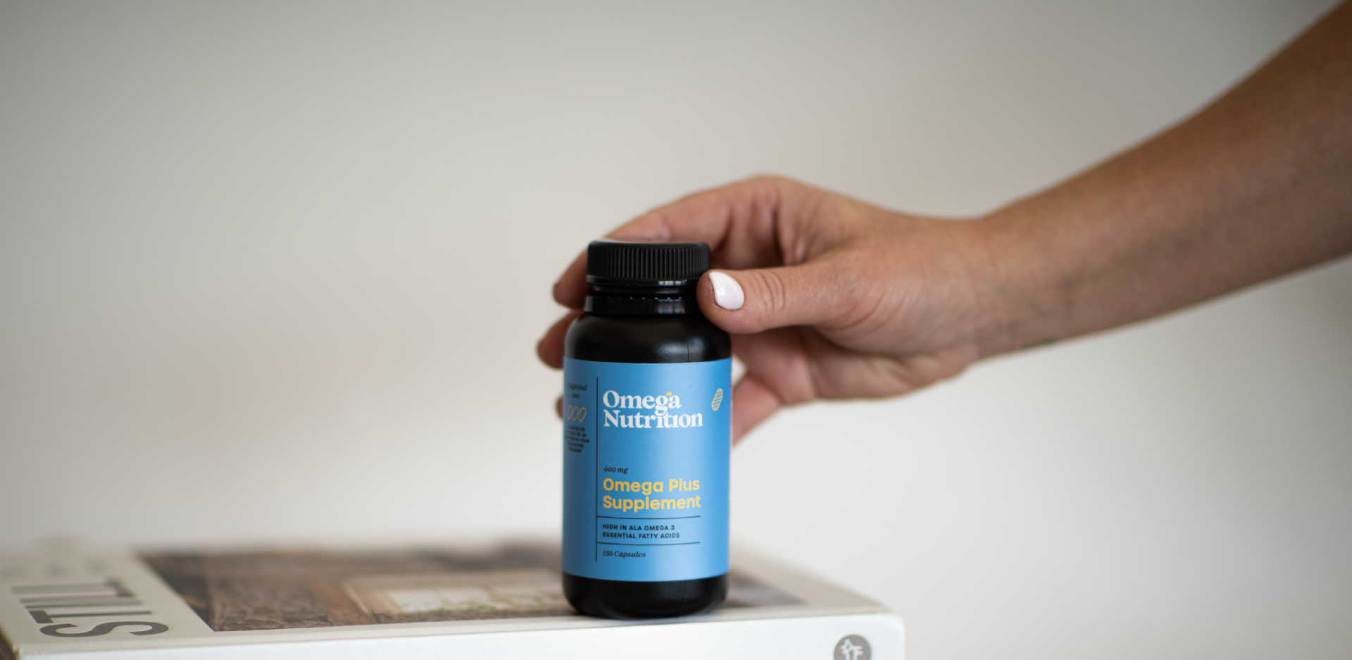
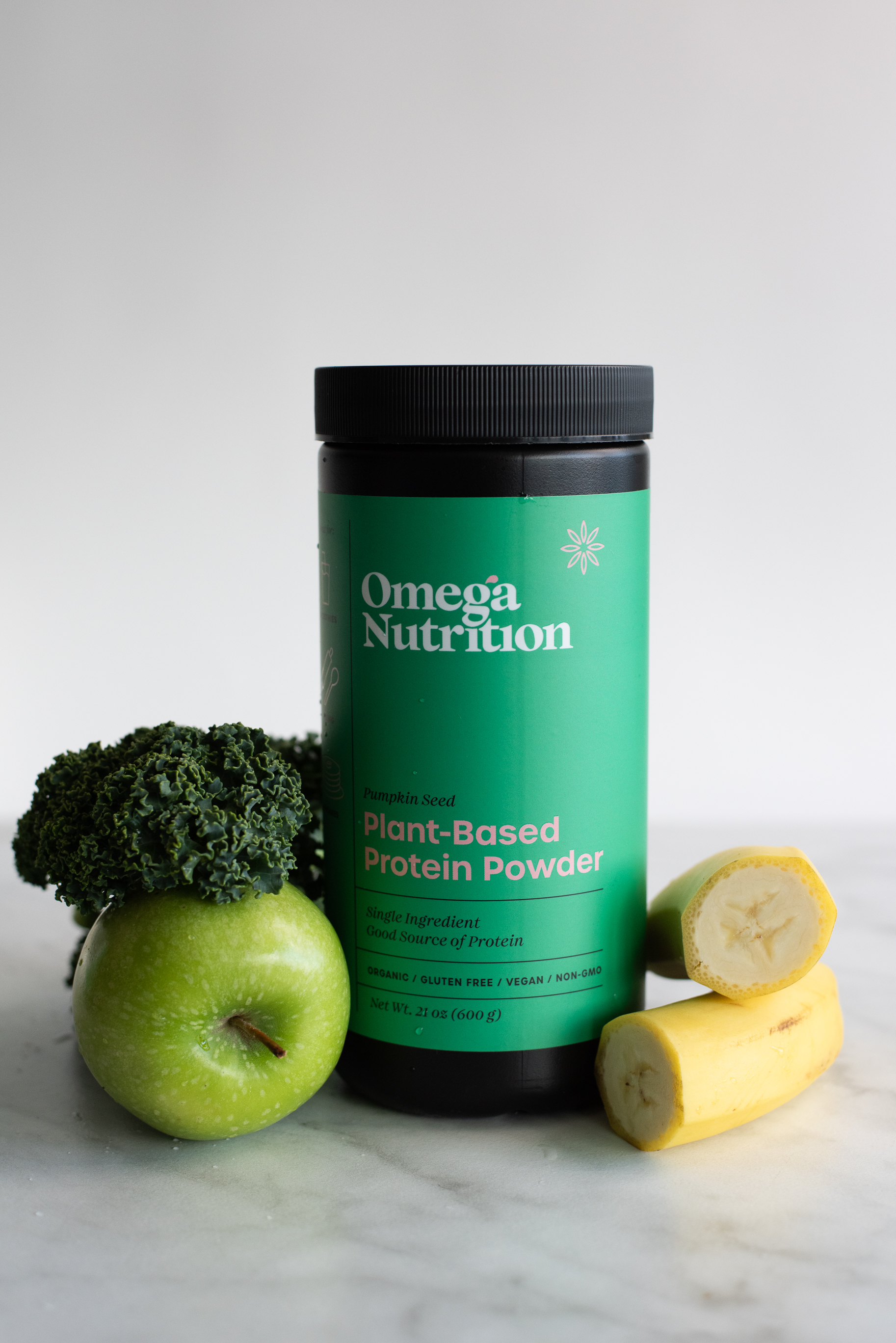
Packaging Design
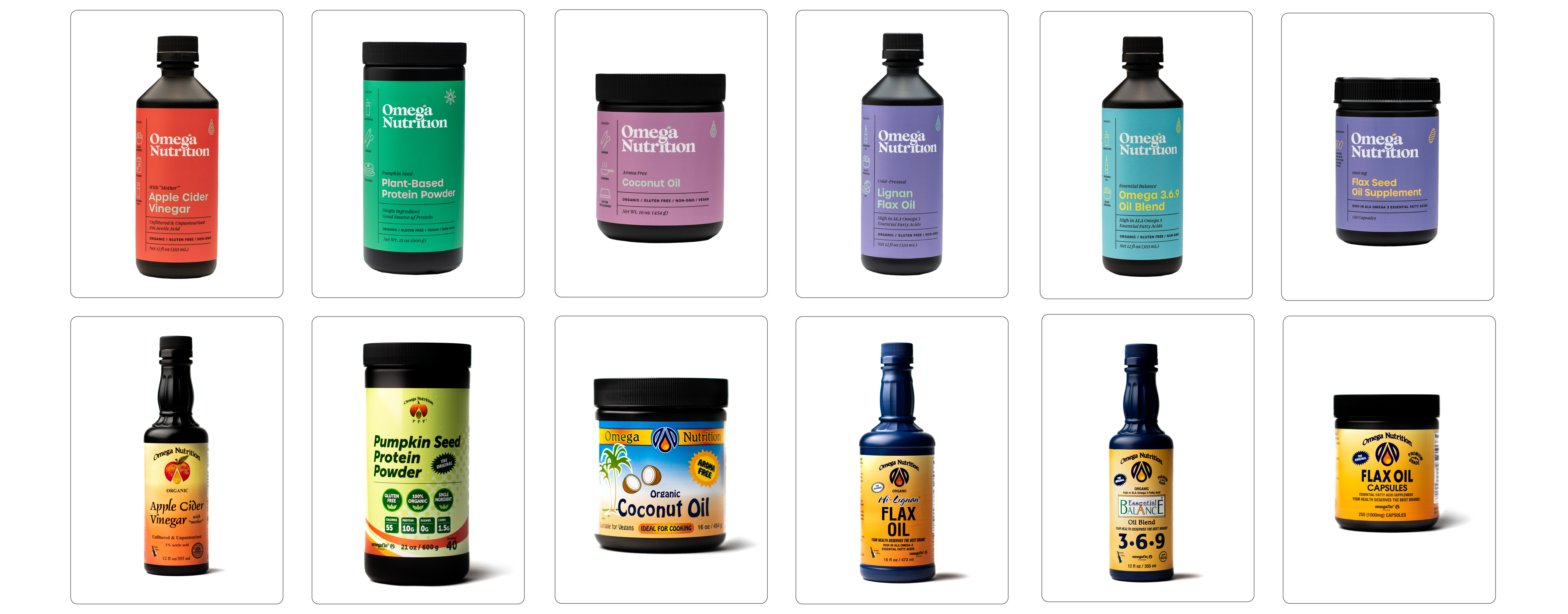
A design system that unifies the brand but expresses the key flavours and ingredients of each product.
My design strategy aimed at creating packaging that seamlessly harmonizes with both the US and Canadian markets, recognizing the unique preferences and expectations of each. This involved a meticulous approach to meet the specific requirements of French regulations, Health Canada, and the FDA, showcasing my adaptability to diverse regulatory environments. A key aspect of my task was establishing a robust branding identity system capable of accommodating the continuous expansion of Omega Nutrition's product line, currently boasting 14 SKUs and counting. Striking the delicate balance between cohesion and avoiding repetition, my design approach seeks to convey a sense of unity across the diverse product range, ensuring a visually compelling presence on the shelves.


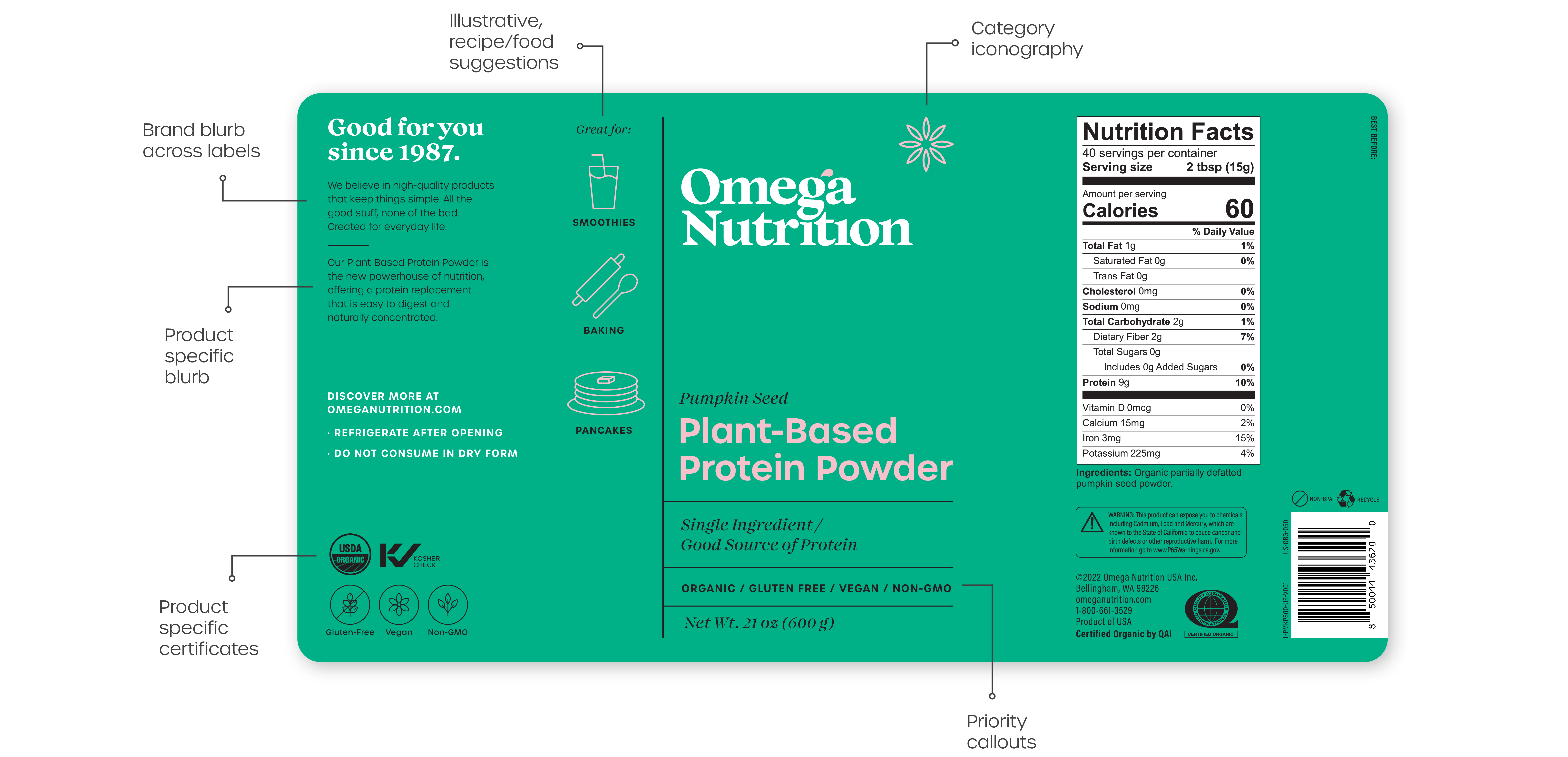
Packaging Design Elements:
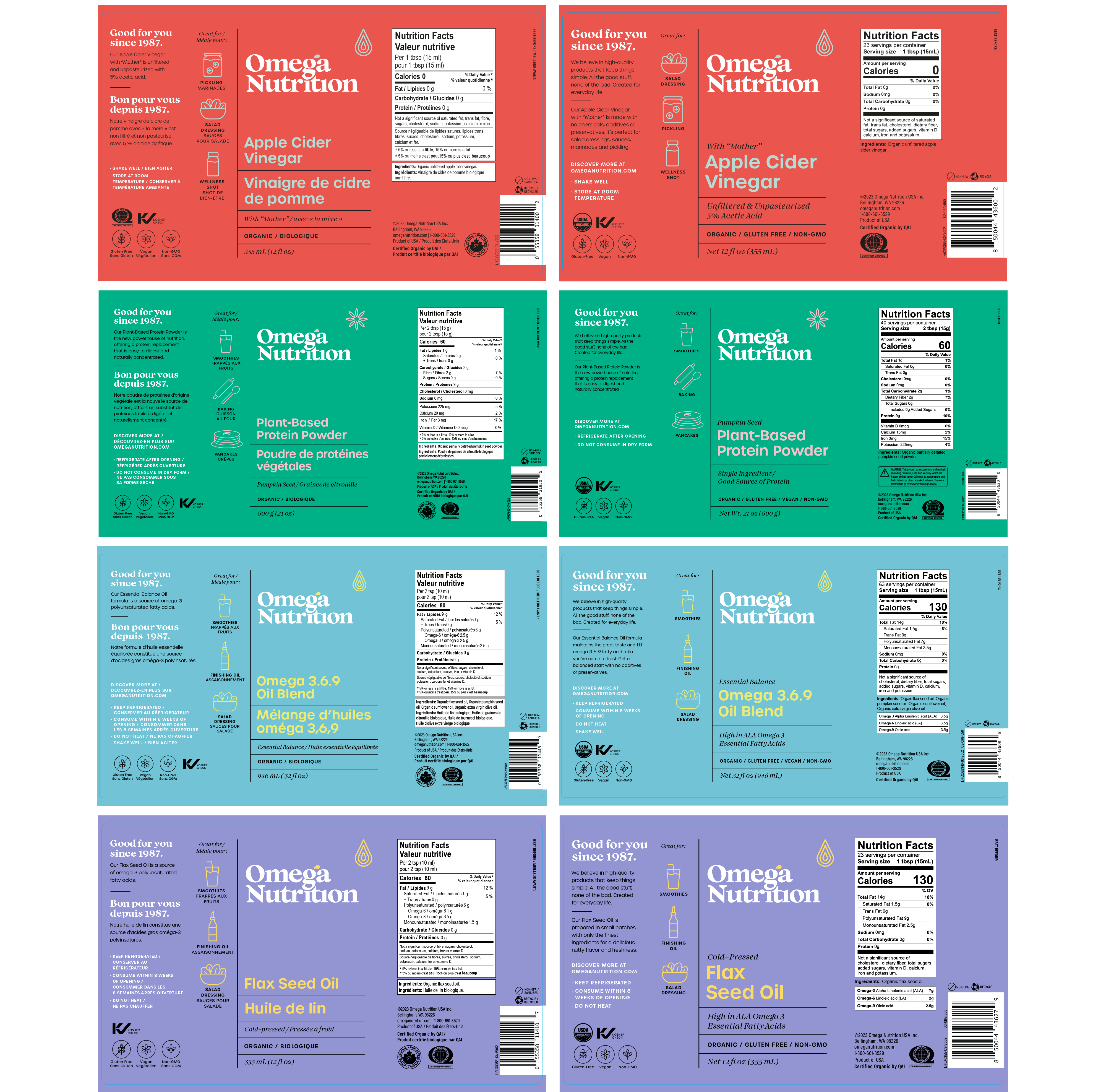
Both the English and bilingual (French+English) labels adhere to a consistent design with identical elements. The inclusion of illustrations serves a dual purpose: not only do they effectively compartmentalize information, but they also establish a dynamic interplay of shapes and words. This intentional design not only aids consumers in comprehending product details but also inspires them to explore creative applications and recipes.
Both the English and bilingual (French+English) labels adhere to a consistent design with identical elements. The inclusion of illustrations serves a dual purpose: not only do they effectively compartmentalize information, but they also establish a dynamic interplay of shapes and words. This intentional design not only aids consumers in comprehending product details but also inspires them to explore creative applications and recipes.
Visual Language System:
This system facilitates seamless integration across various sizes within each product line. The majority of SKUs are available in three distinct sizes of bottles or containers.
This system facilitates seamless integration across various sizes within each product line. The majority of SKUs are available in three distinct sizes of bottles or containers.
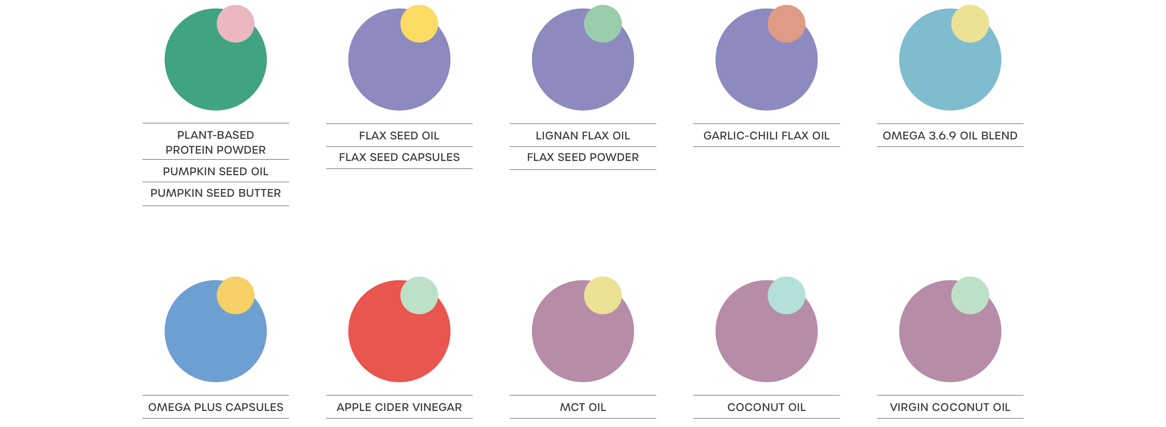
Packaging Colour Palette:
I collaborated closely with GLB printers to assess the legibility of color combinations for the labels. Through multiple print tests, I ensured optimal contrast across labels, all while maintaining a cohesive and harmonious use of colors across various product lines and ingredients.
I collaborated closely with GLB printers to assess the legibility of color combinations for the labels. Through multiple print tests, I ensured optimal contrast across labels, all while maintaining a cohesive and harmonious use of colors across various product lines and ingredients.
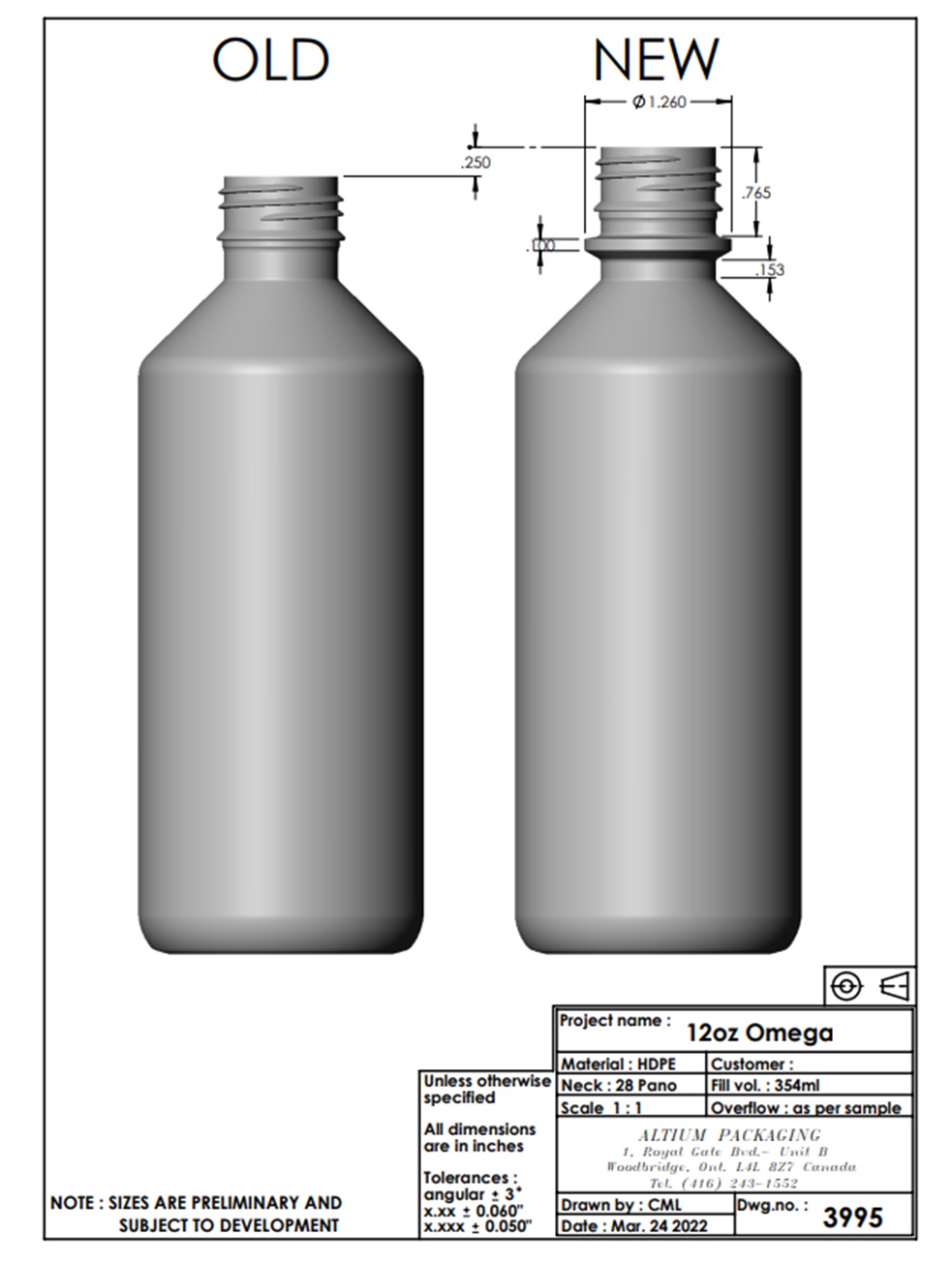
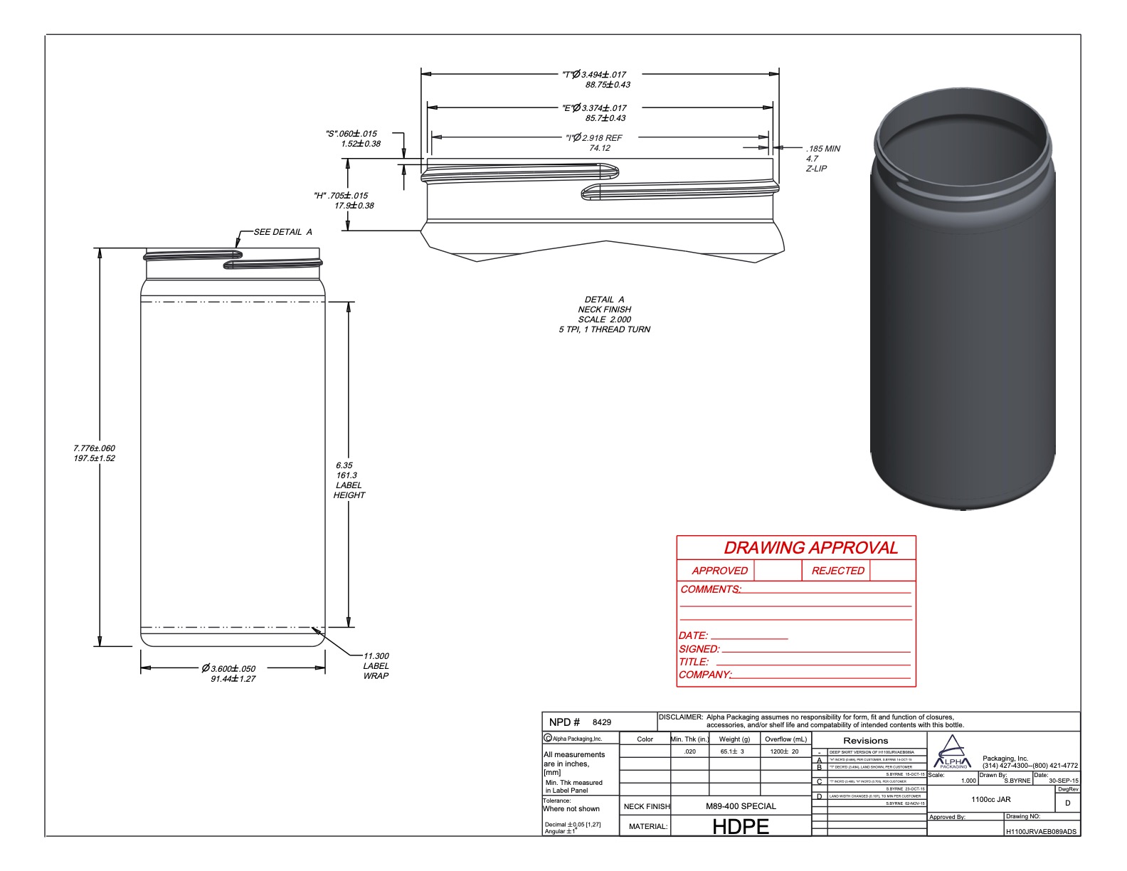
Label Dimensions:
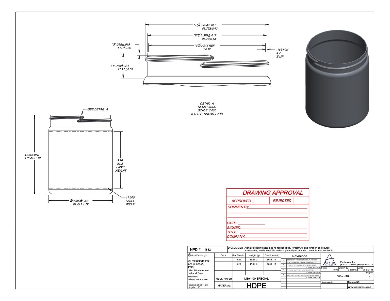
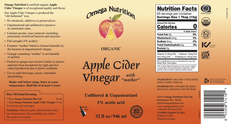
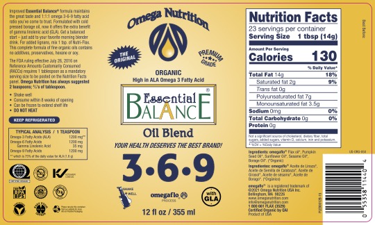
In response to a vendor change and considerations of packaging costs, we made the strategic decision to transition to new containers for all our products. The aim was to achieve a simpler and cleaner aesthetic while retaining the essential black color. The incorporation of black packaging was a deliberate choice to mitigate product oxidation, and thus, it remained a crucial element in our updated design.
After numerous revisions and meticulous measurements using a small office printer and ruler, I arrived at the final dimensions:
Label Size (Inches) Corresponding Bottle/Jar:
W: 11.01 H: 5.75 21oz Jar
W: 7.375 H: 4.375 12oz Bottle
W: 6.03 H: 4.75 8oz Bottle
W: 10.5 H: 5.75 32oz Bottle
W: 11.01 H: 3 20oz Jar
W: 11.5 H: 5 53oz Bottle
W: 8.61 H: 3 10oz Jar/12oz PSB
W: 6.5 H: 2.75 120's Omega Plus Caps




E-commerce Product Photography:
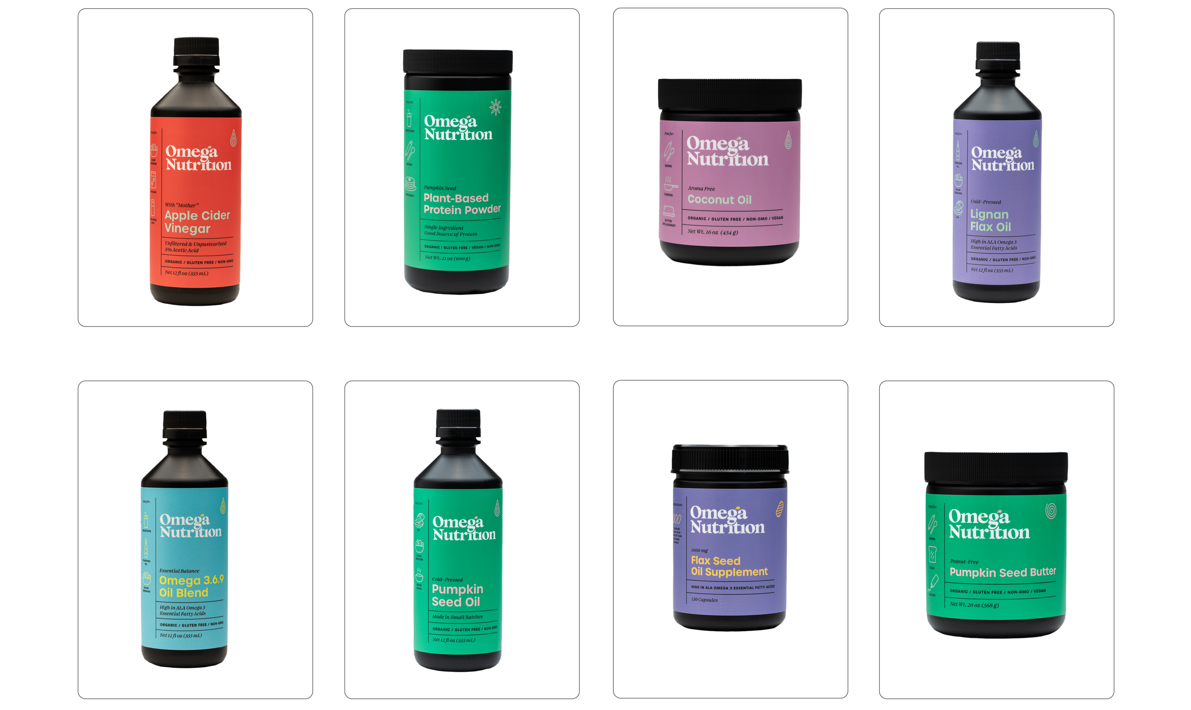
[13 SKU - total 20 including specific product sizes] - Captured using studio lighting and 85mm Nikon Lens
[13 SKU - total 20 including specific product sizes] - Captured using studio lighting and 85mm Nikon Lens
Labels: [English + French]: Design and production of pre-press files
What it used to be:





03
Documents – External
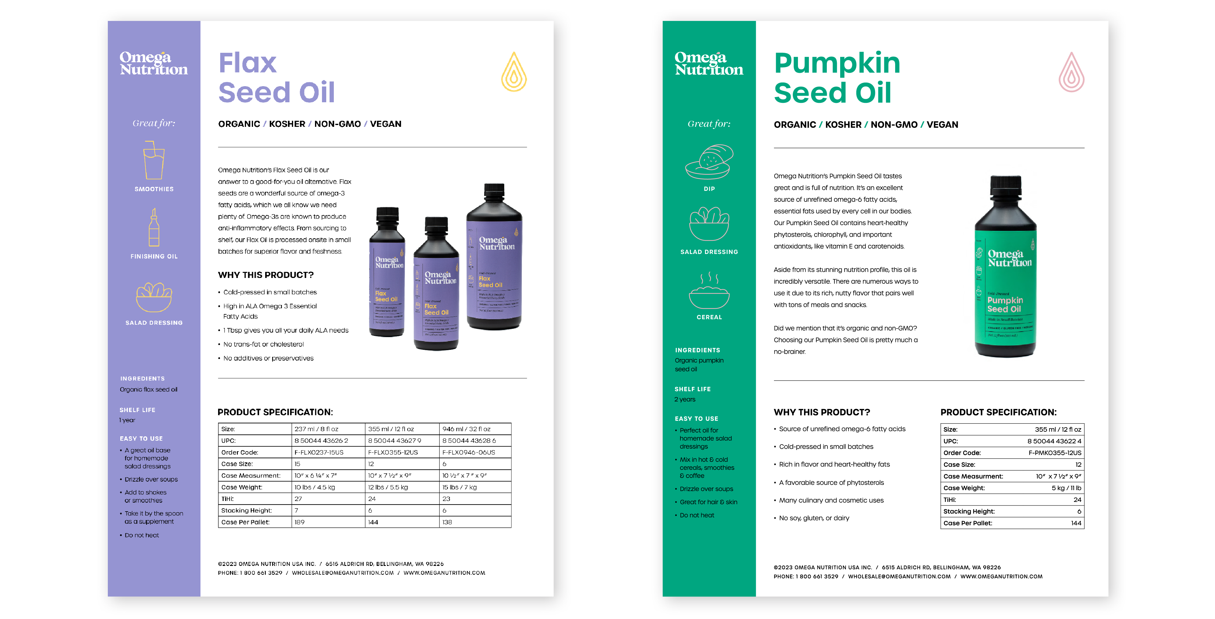
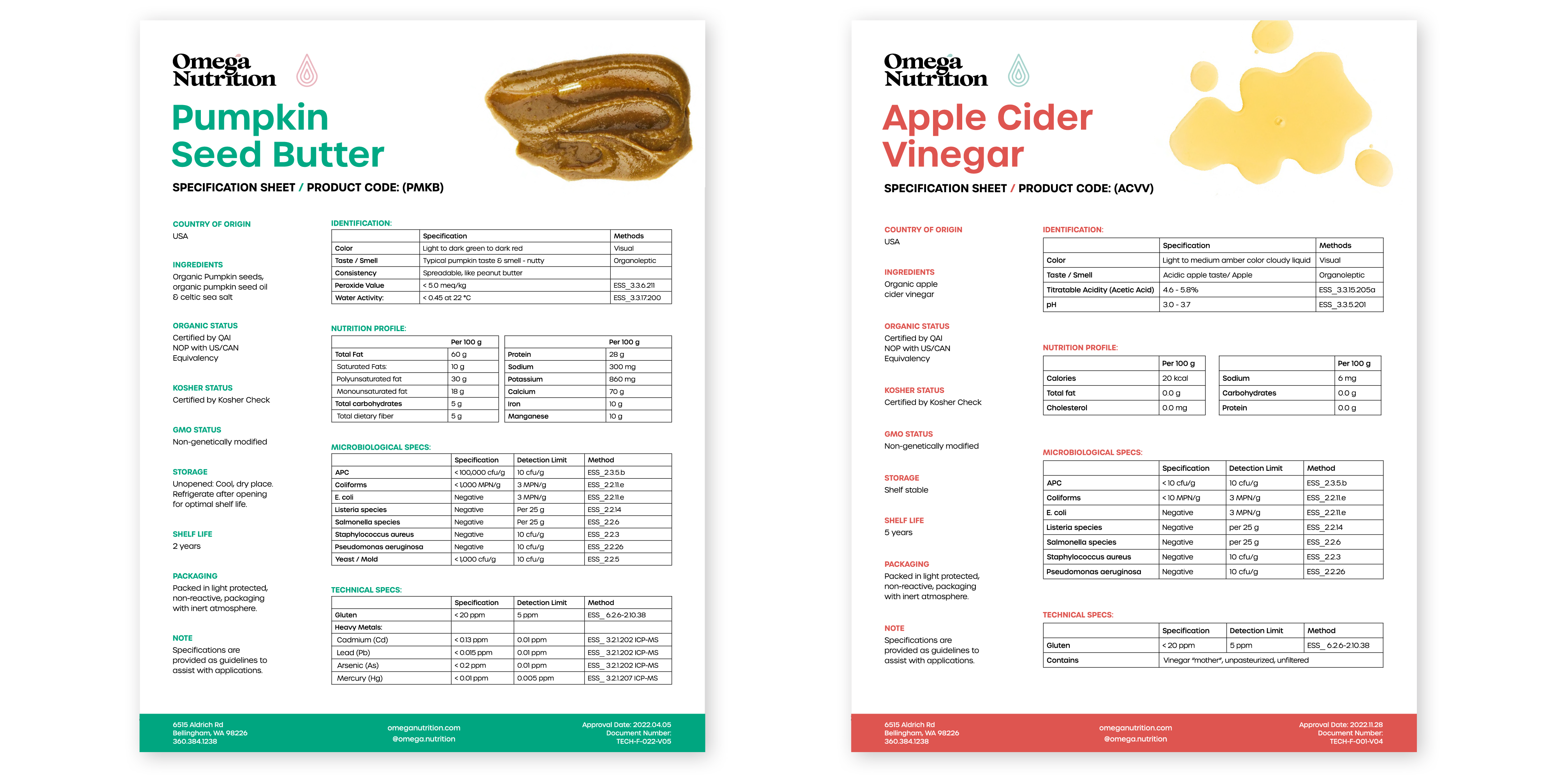
Sell-sheets and Specification sheets have played a pivotal role in the company's strategy for engaging wholesale customers and educating the public about product content. These documents, characterized by a blend of high-impact visuals and critical information, were exclusively distributed to confirmed and potential buyers.
My objective was to create sheets that are not only aesthetically pleasing but also effortlessly navigable, ensuring a seamless reading experience for customers without overwhelming them with unnecessary details.
Sell-Sheets:
Specification Sheets:
What it used to be:


04
Documents – Finance & Leterhead Design
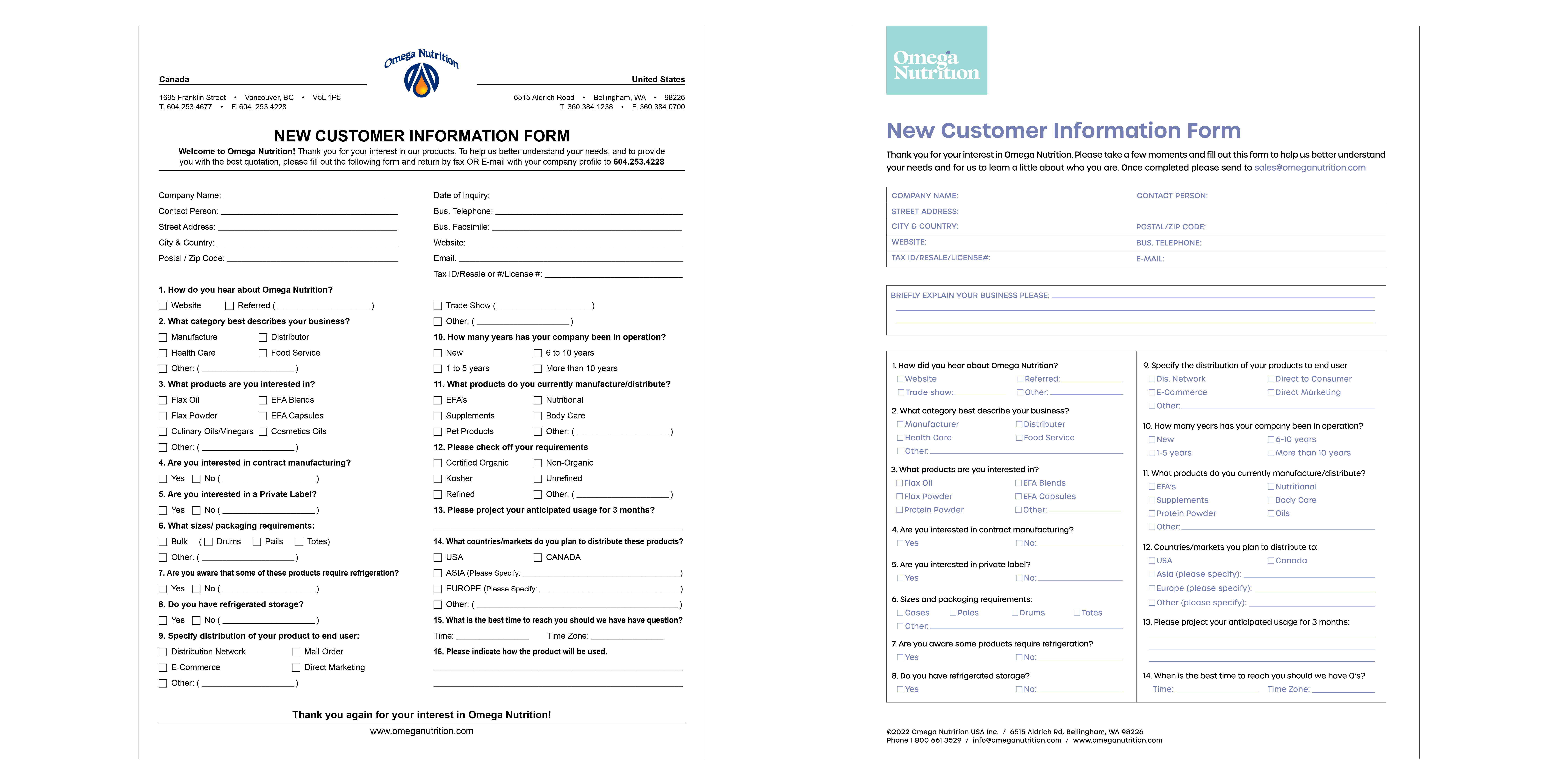
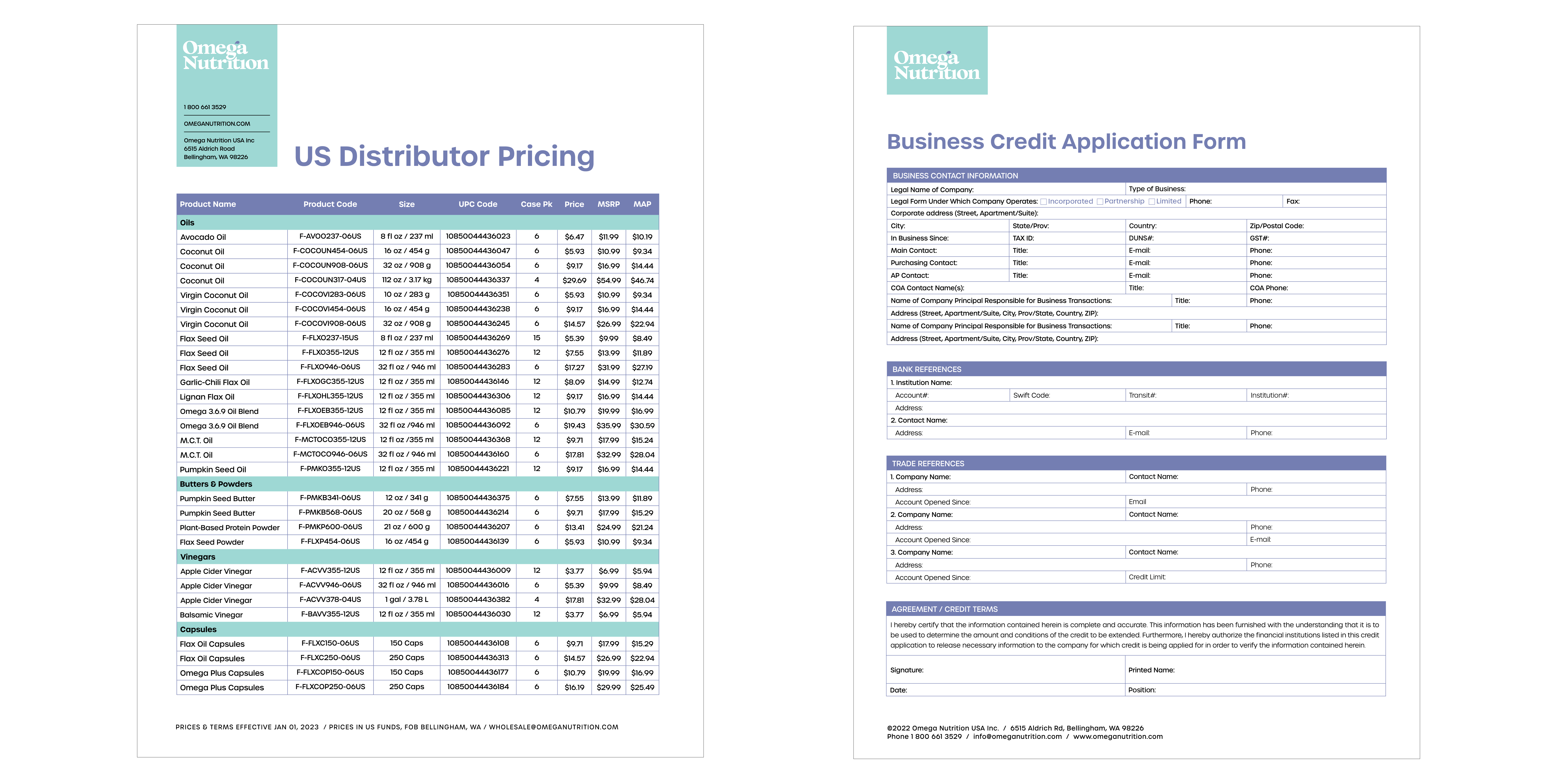
Previously, all financial documents were disseminated to customers in Excel sheets—an inefficient, challenging-to-read method that made tracking updates cumbersome. With numerous versions scattered across the company's hard drive, my responsibility involved consolidating these files into coherent PDF documents. I became the designated person to manage updates, ensuring a streamlined and accessible system for necessary changes.
I conceptualized and crafted fillable PDFs, strategically engineered to enhance usability and facilitate seamless access for all company documents.
05
Content: Website + Social Media
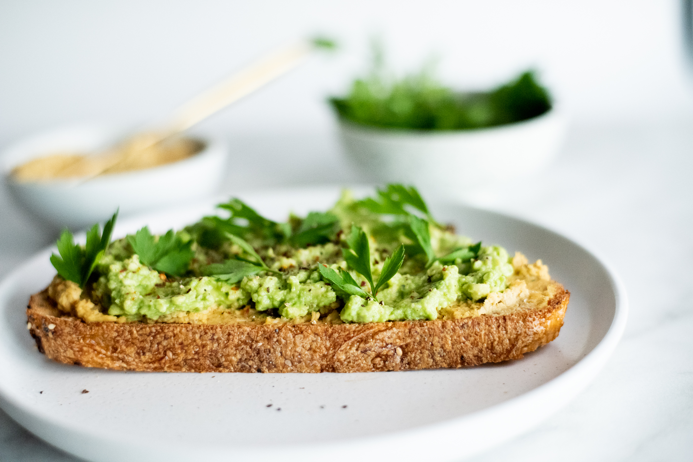
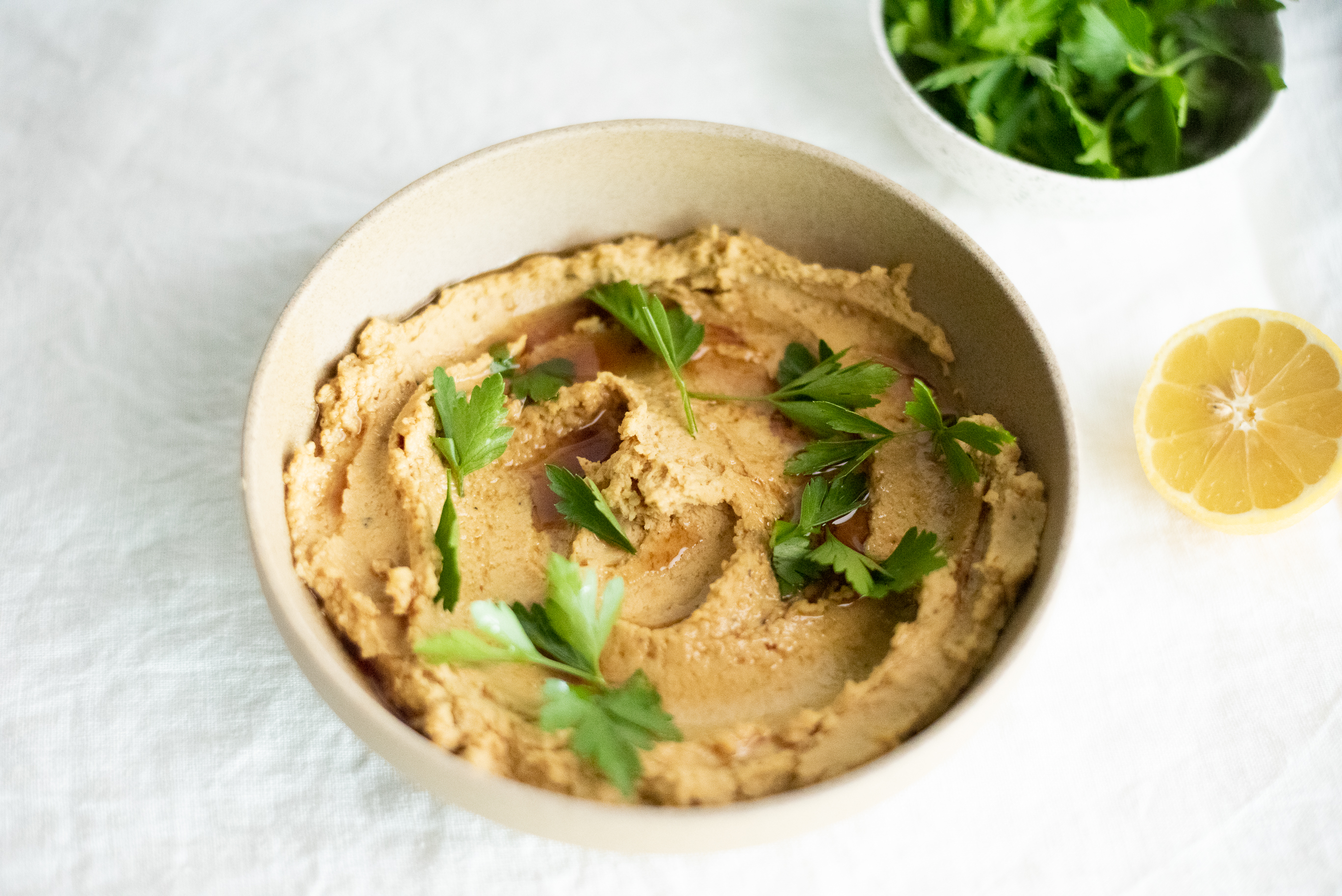
Upon completing phase 1 of the company's re-branding, which included revamping labels and documents, I transitioned to the exciting phase: promoting products, health, and nutrition. Initiating this phase involved crafting a strategic marketing plan. I began by curating simple recipes that not only showcased the essence of the products but also empowered customers to embrace healthy eating without compromising on taste and time.
︎︎︎ Target audience research and market analysis insights on presentation section of this page.
IG Reels: Click to watch:
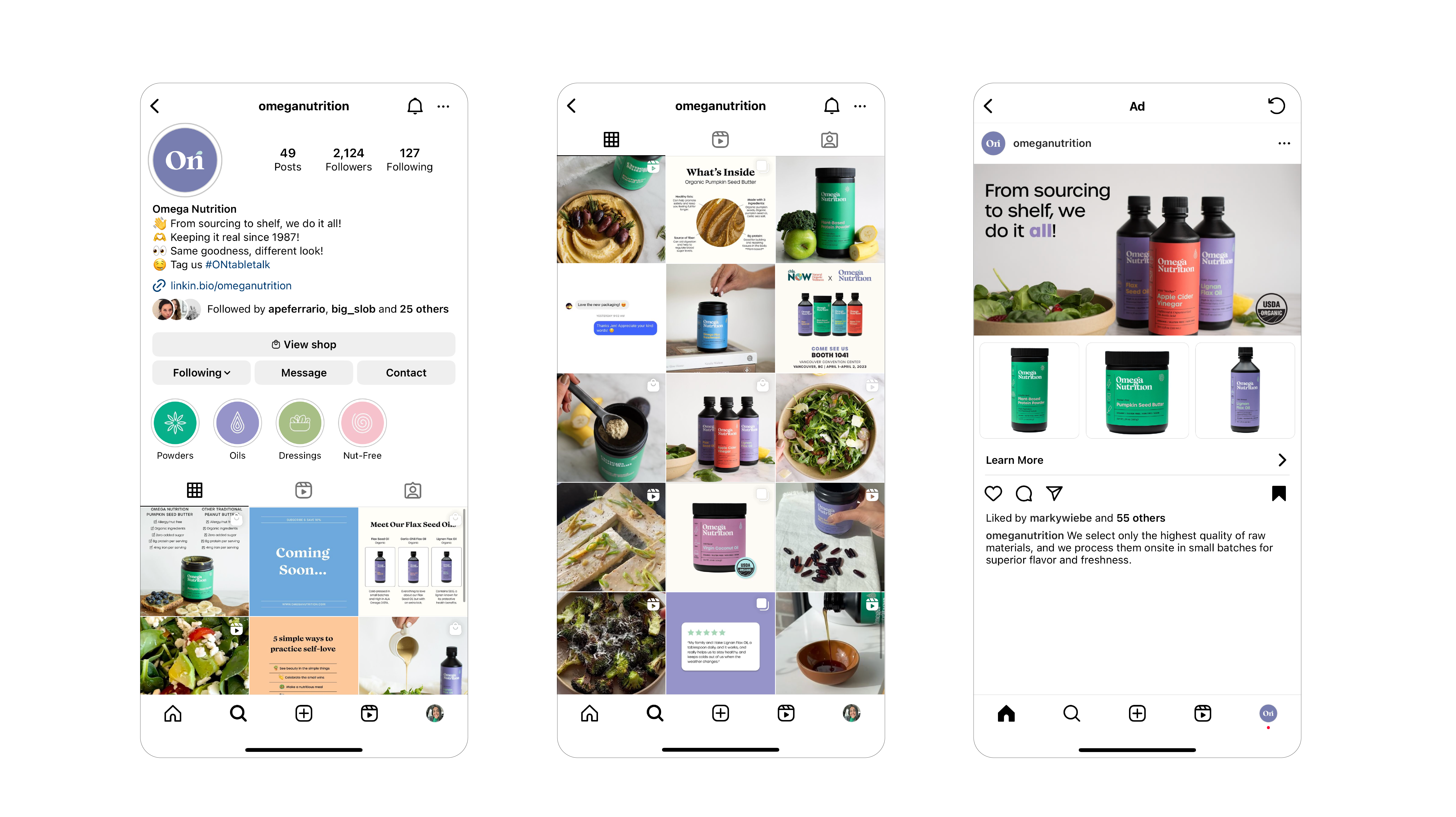
Social Media Direction & Infographics:
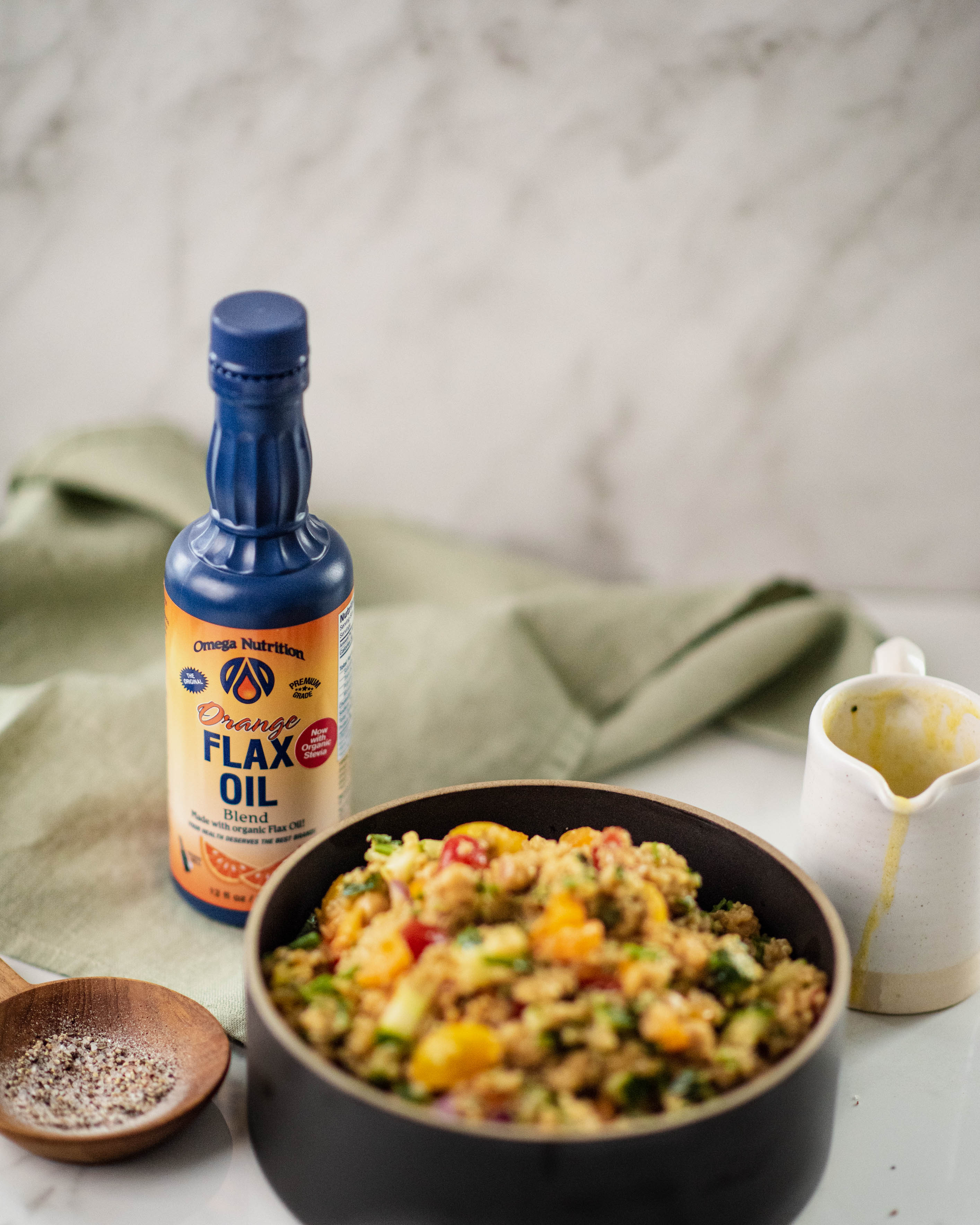
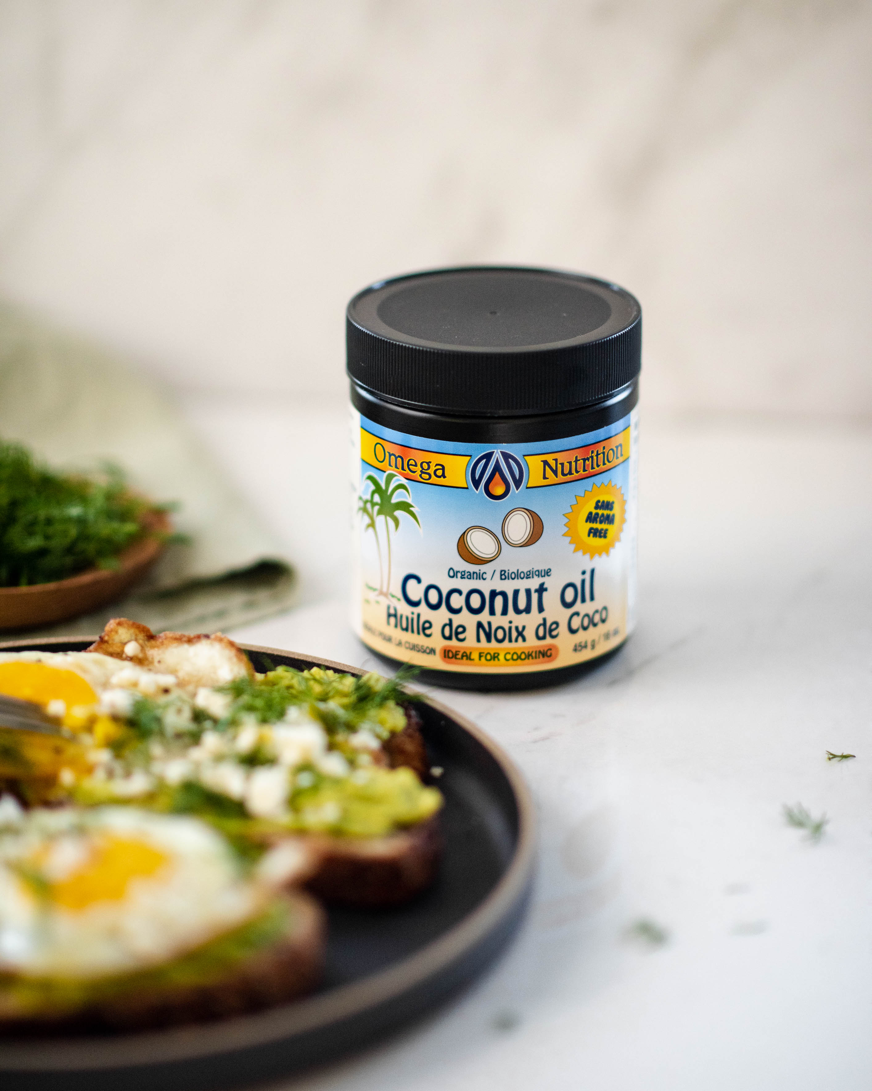
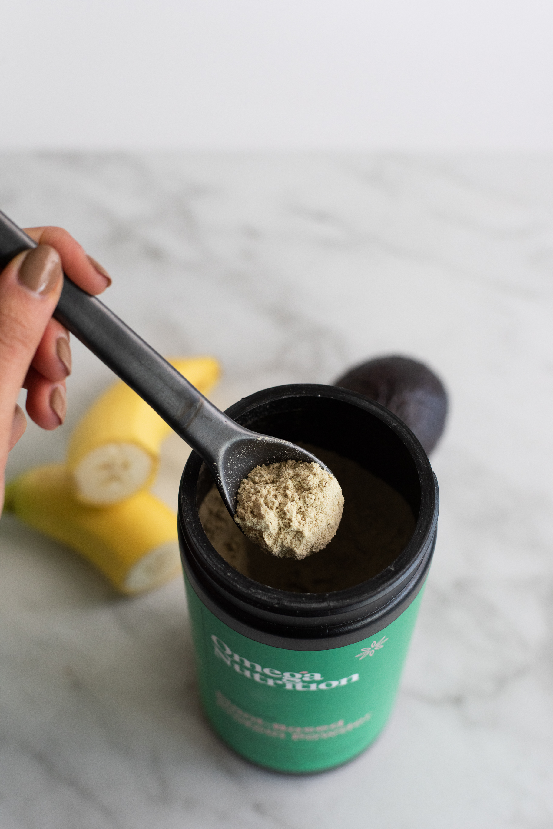
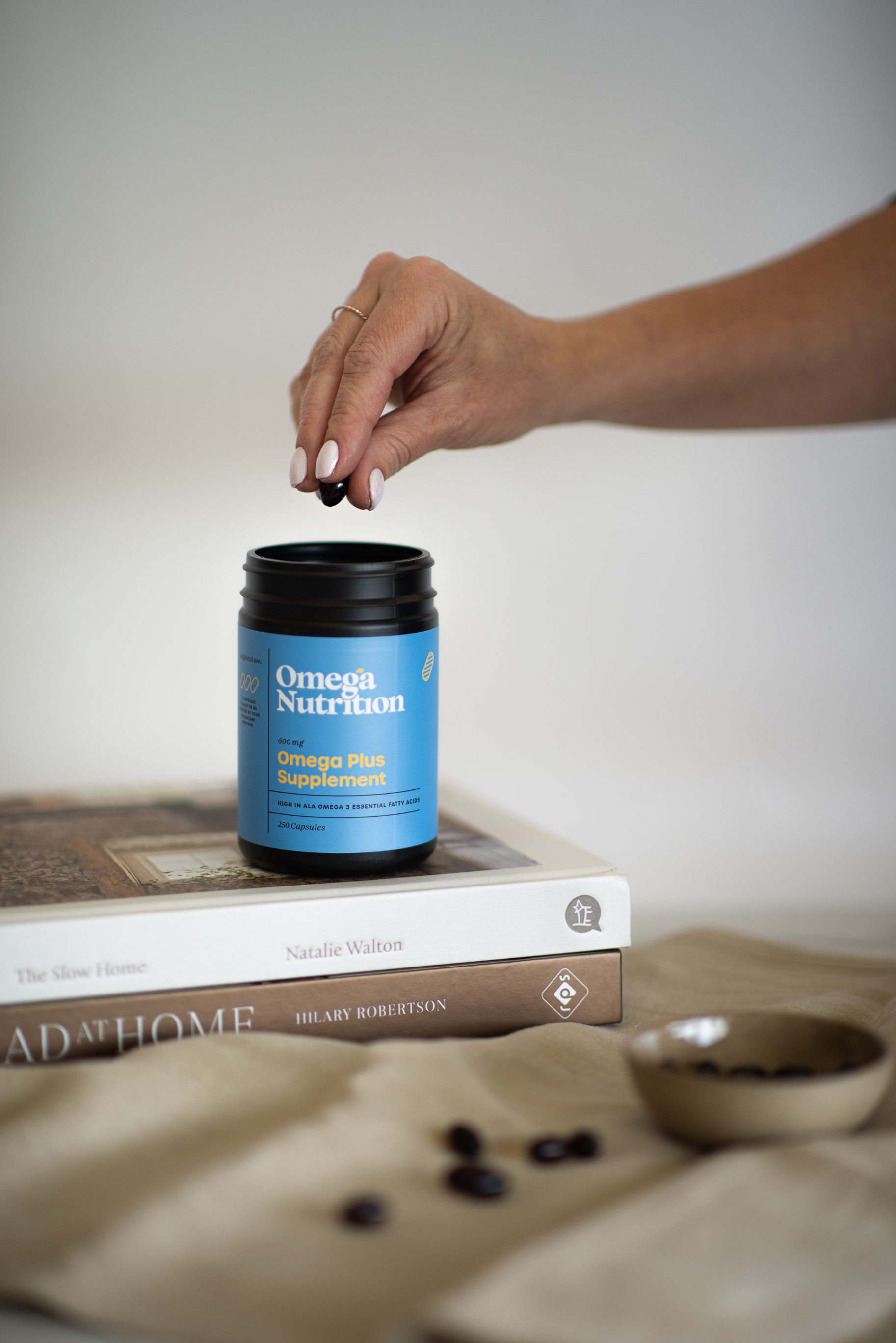
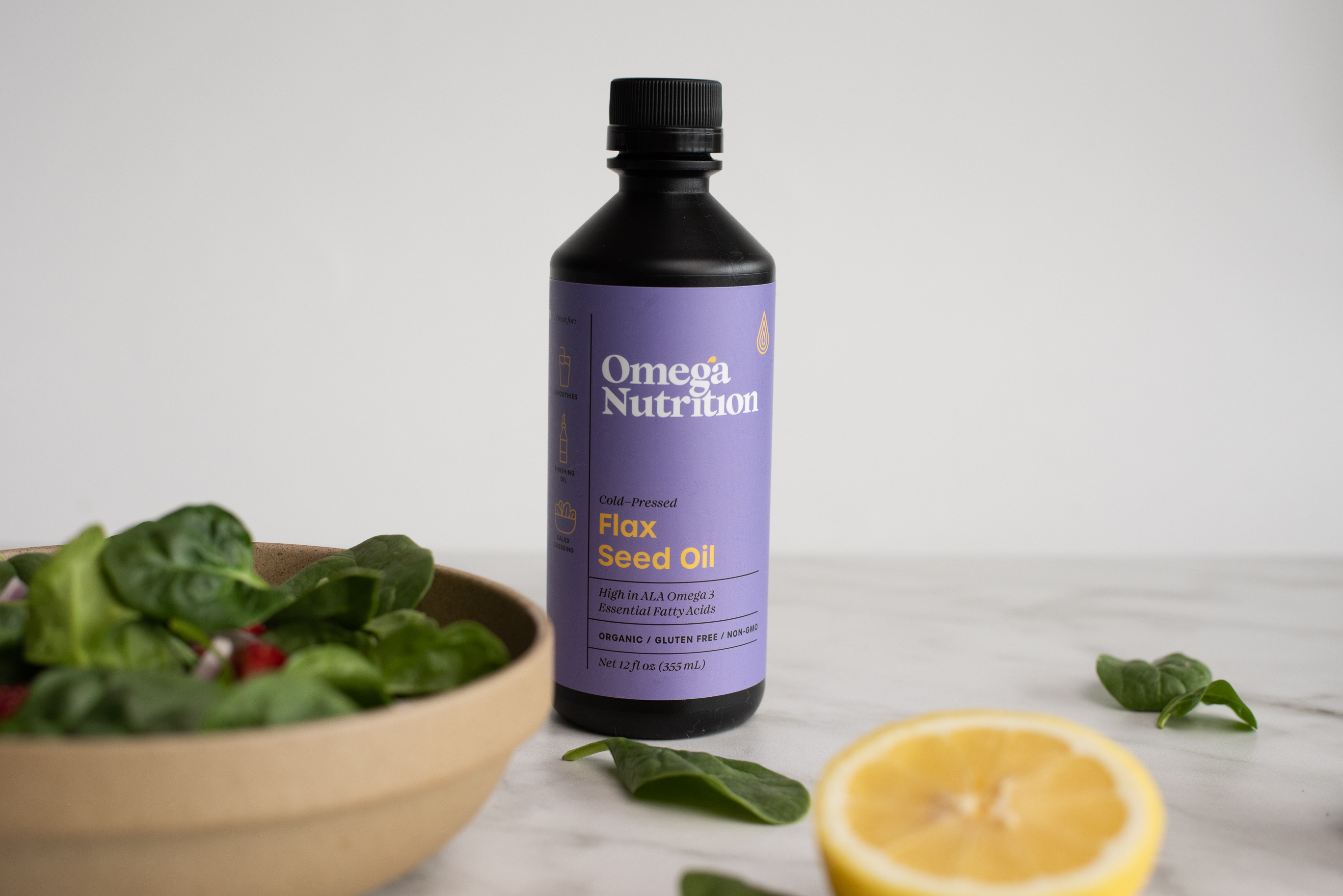
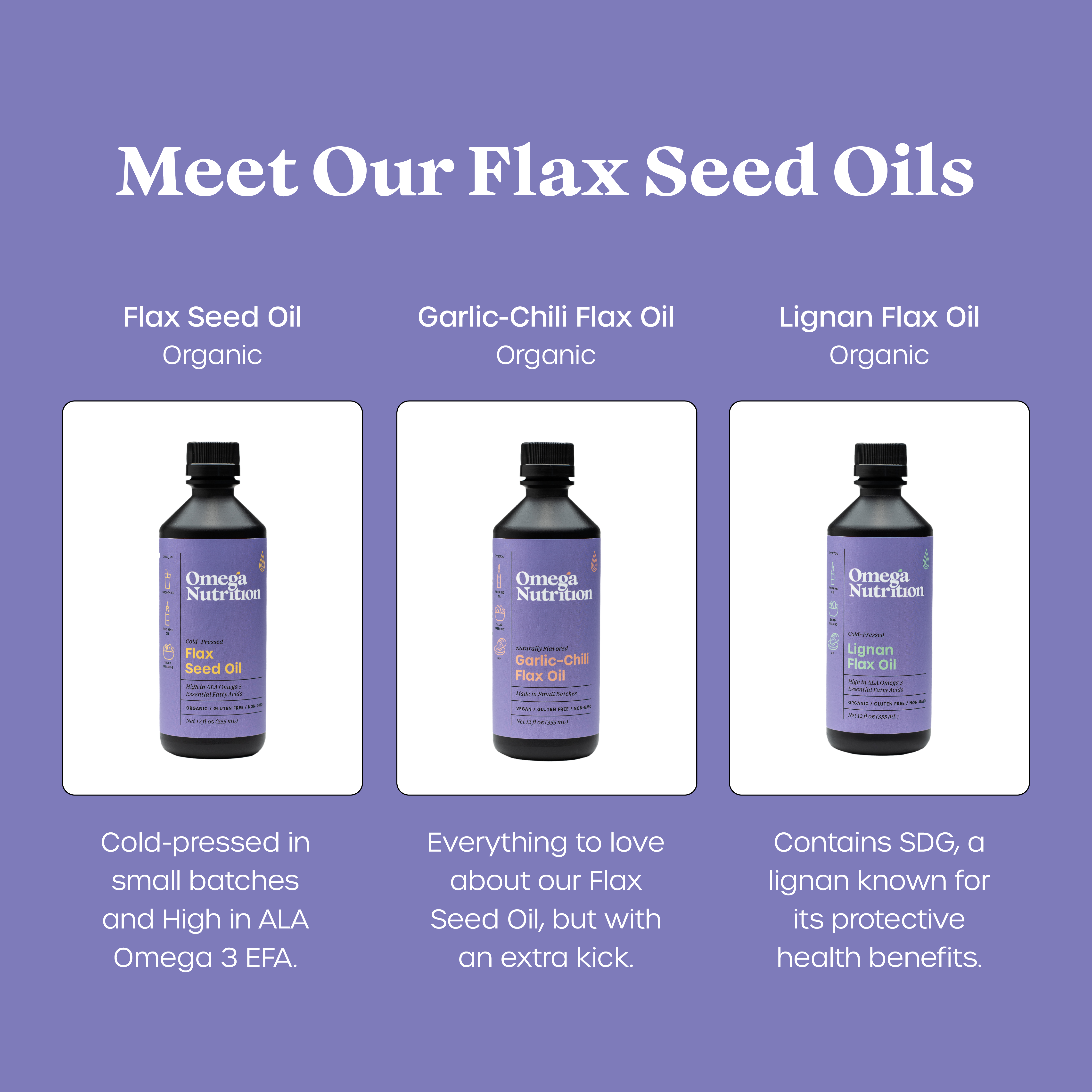
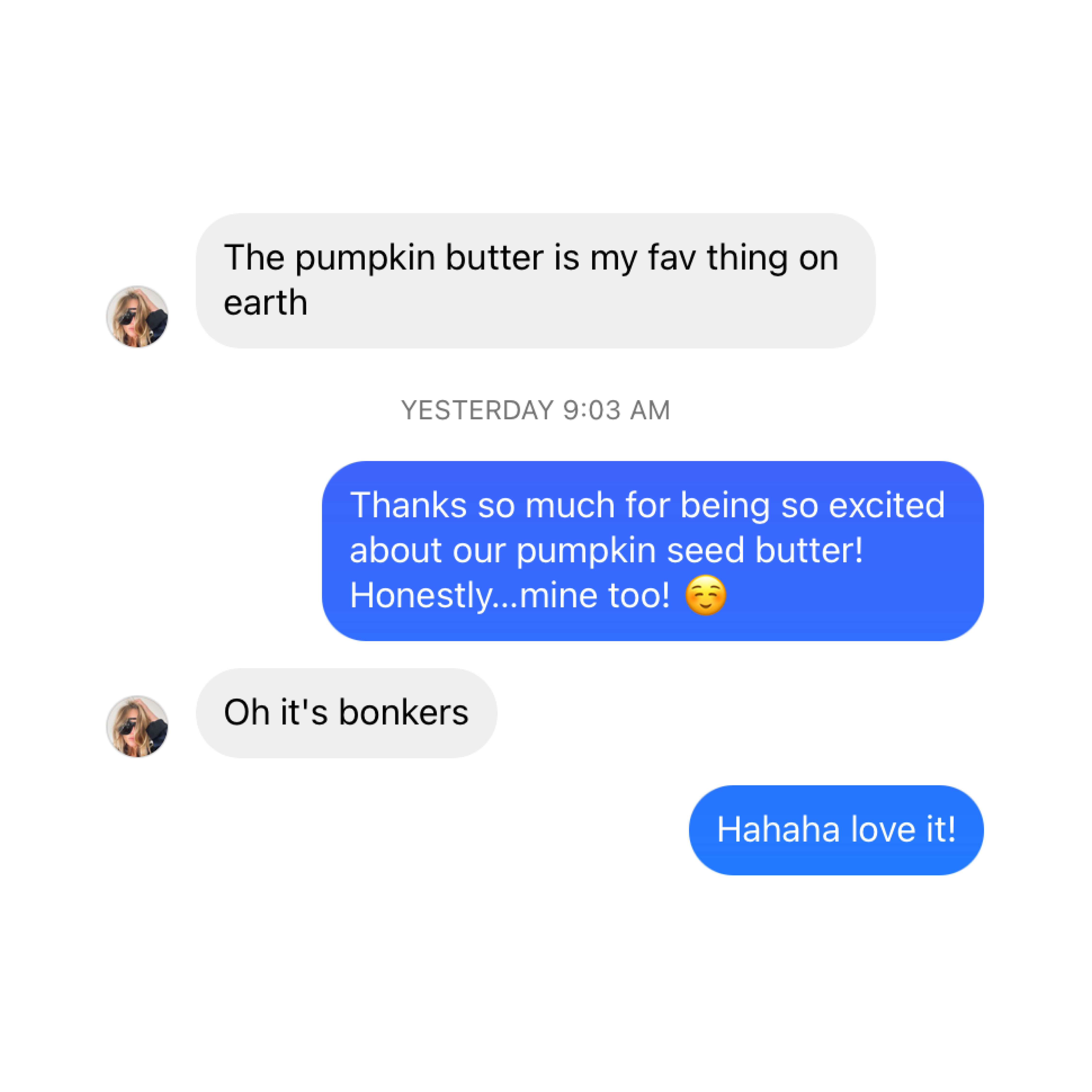
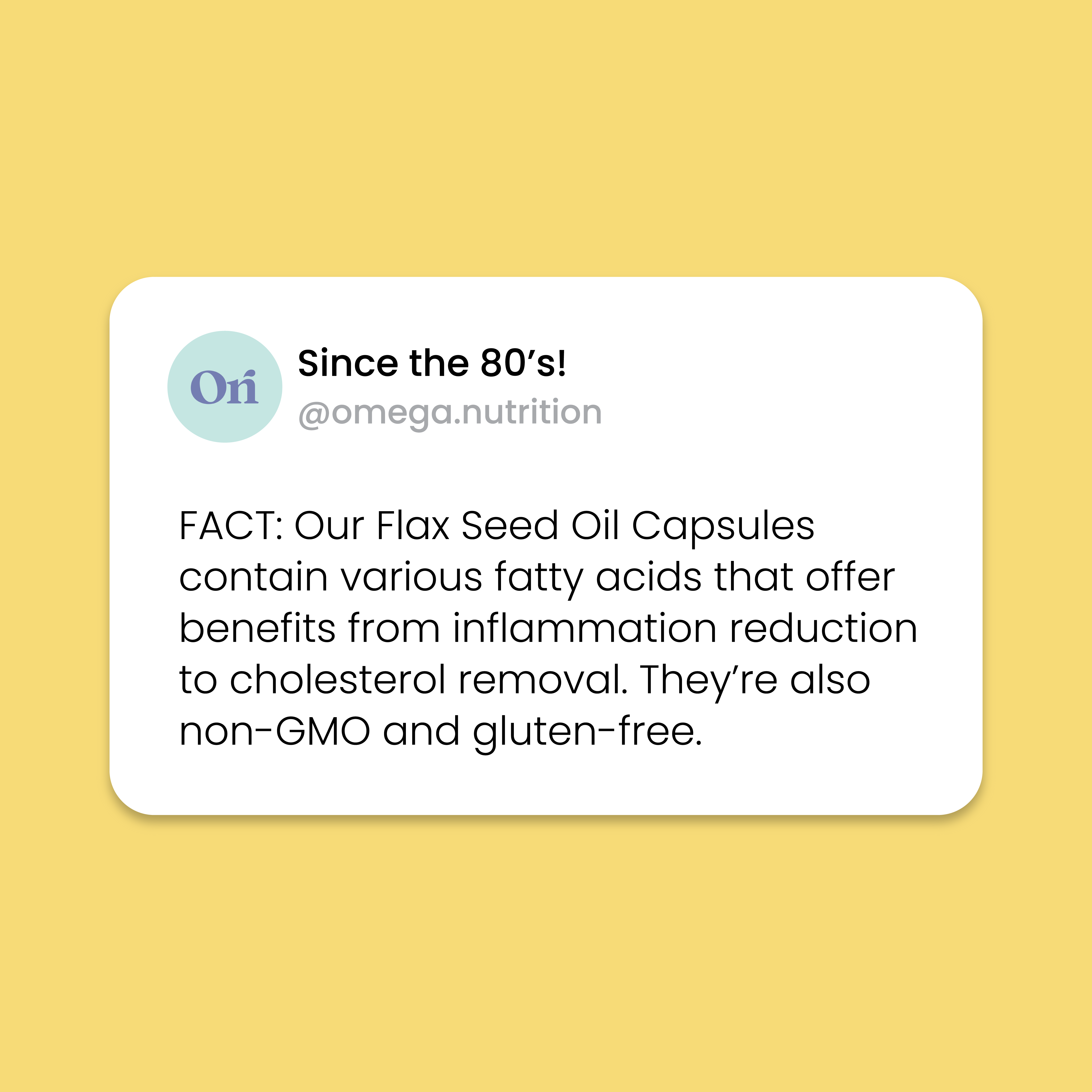
The photography direction I curated aimed to exude vibrancy, joy, and creativity, all while embracing simplicity to mirror the core essence of the brand: pure, clean, and straightforward. Employing engaging infographics and customer review posts, as exemplified below, became instrumental in fostering relatability and providing educational content. These strategic visual elements played a pivotal role in enlightening our audience about the myriad benefits of our products.
The photography direction I curated aimed to exude vibrancy, joy, and creativity, all while embracing simplicity to mirror the core essence of the brand: pure, clean, and straightforward. Employing engaging infographics and customer review posts, as exemplified below, became instrumental in fostering relatability and providing educational content. These strategic visual elements played a pivotal role in enlightening our audience about the myriad benefits of our products.







Instagram & Ads:
The photography direction I curated aimed to exude vibrancy, joy, and creativity, all while embracing simplicity to mirror the core essence of the brand: pure, clean, and straightforward. Employing engaging infographics and customer review posts, as exemplified below, became instrumental in fostering relatability and providing educational content. These strategic visual elements played a pivotal role in enlightening our audience about the myriad benefits of our products.
The photography direction I curated aimed to exude vibrancy, joy, and creativity, all while embracing simplicity to mirror the core essence of the brand: pure, clean, and straightforward. Employing engaging infographics and customer review posts, as exemplified below, became instrumental in fostering relatability and providing educational content. These strategic visual elements played a pivotal role in enlightening our audience about the myriad benefits of our products.
Web Design: Shopify
[UI, UX, Content Photography, Videos, Recipe Development + Cooking and E-commerce phottography]
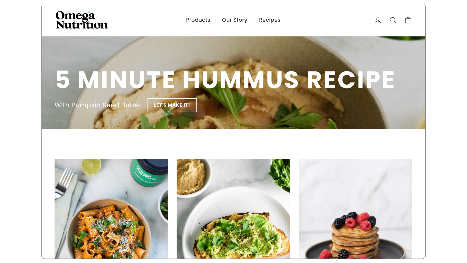
One of my initial undertakings involved a comprehensive redesign of Omega Nutrition's website, leveraging Shopify to craft a seamless online shopping experience. While maintaining the familiarity of the original layout, I introduced an innovative "recipe page" to share healthy culinary inspirations that spotlighted product utilization. The following showcases a glimpse of the assets I meticulously designed to enhance the overall web experience.
View website: Here
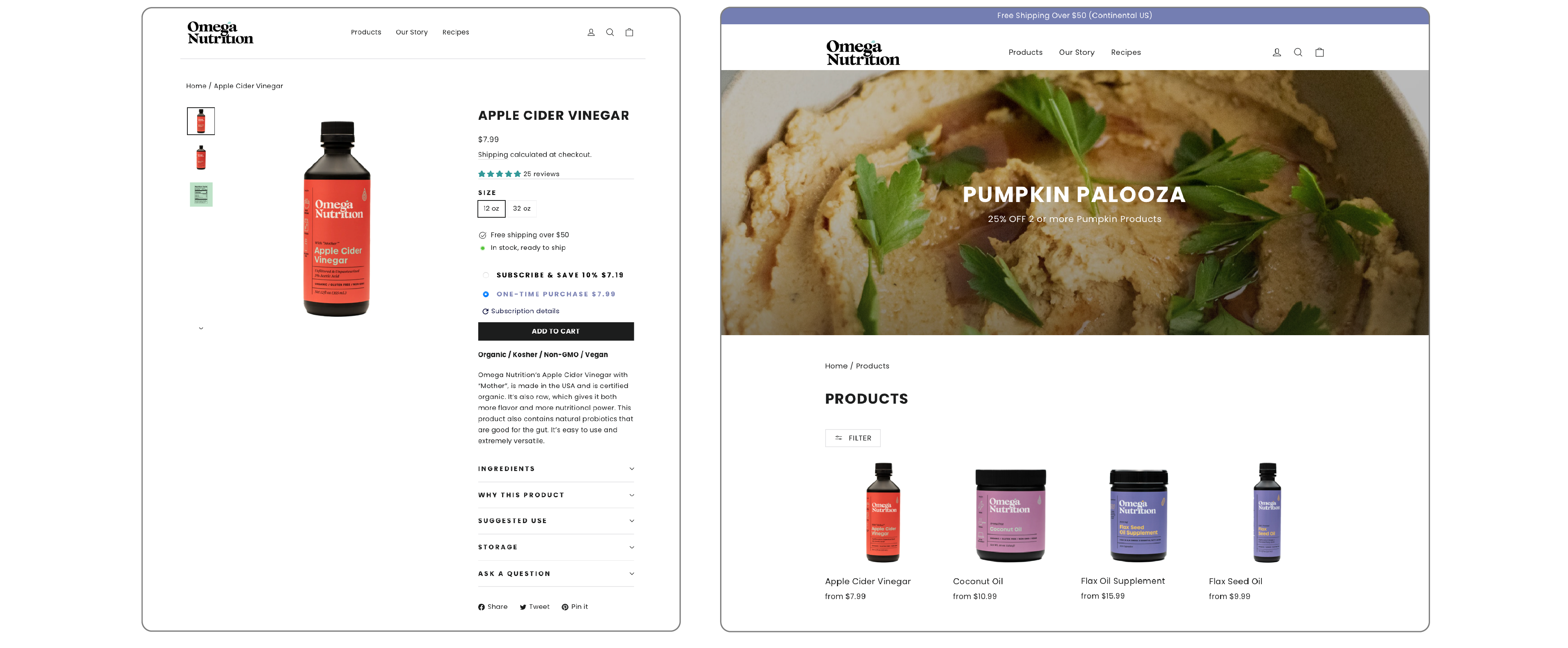
Utilizing intuitive product pages coupled with dynamic drop-down menus to enlighten customers about our offerings.
06
Business Cards

07




Role:
+ Brand Strategy
+ UX & UI
+ Illustration
+ Copy-writing
+ Photography
+ Video
+ Book Design
+ UX & UI
+ Illustration
+ Copy-writing
+ Photography
+ Video
+ Book Design
Project:
BFA
Thesis Project
Institution:
UFV
Grad year:
2020
BFA
Thesis Project
Institution:
UFV
Grad year:
2020
Collaborations:
1. Ali Etrati: Coneptual Photography & Videoggraphy
2. Matej Balaz: Studio Photography
1. Ali Etrati: Coneptual Photography & Videoggraphy
2. Matej Balaz: Studio Photography
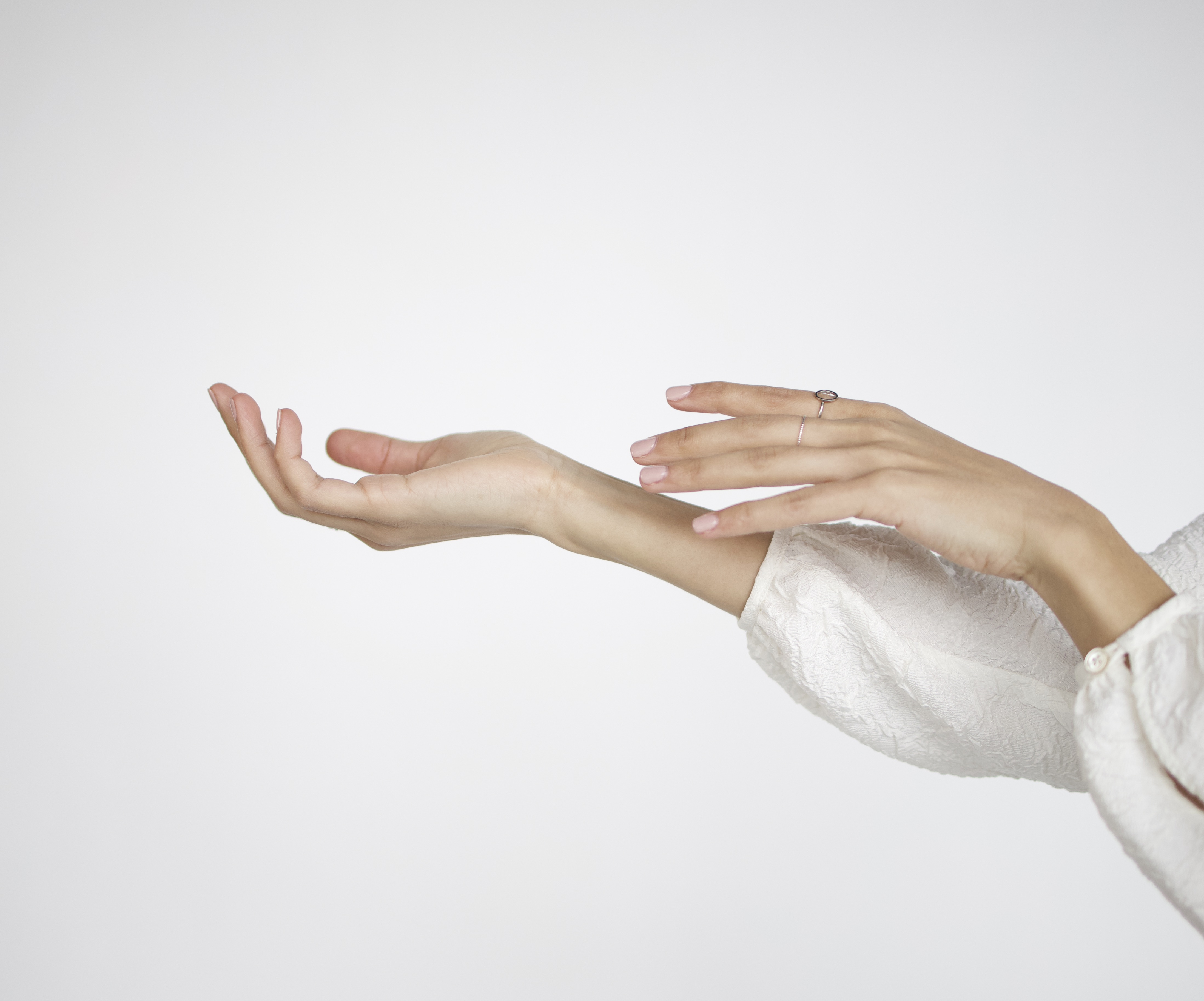
Design Challenge: How might facing our trauma, past hurt and vulnerability help us build stronger relationships with ourselves and others?
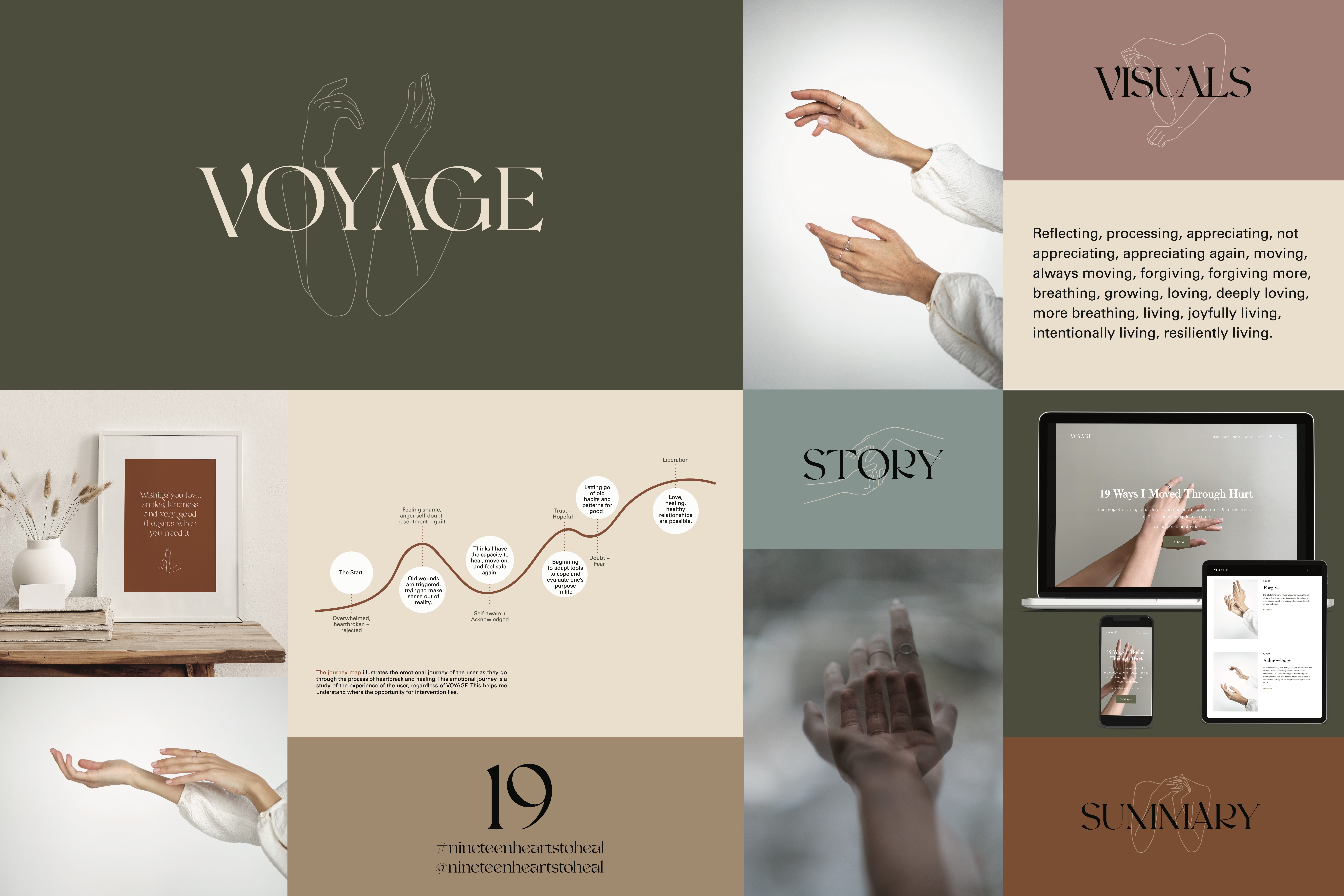
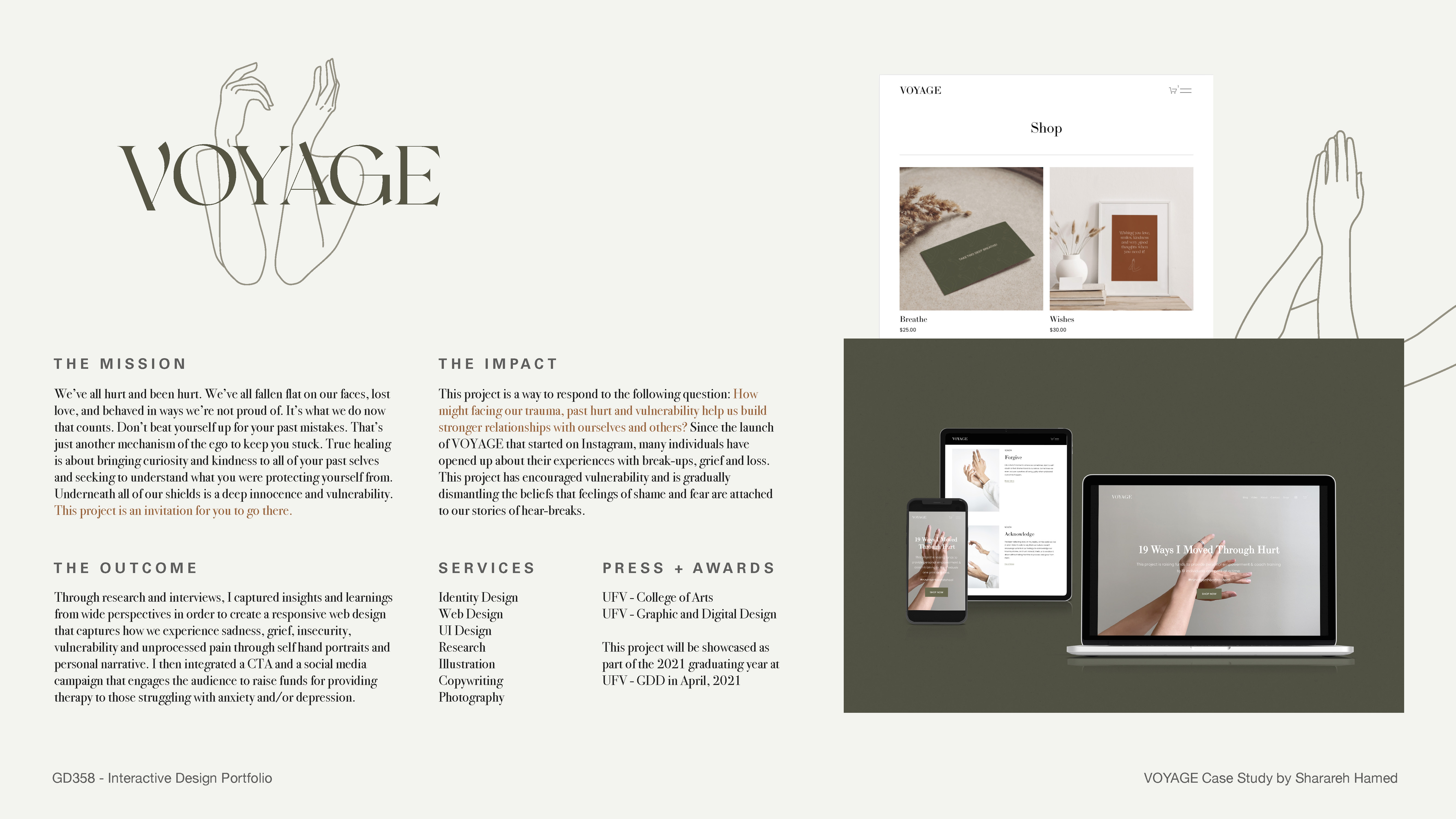
Mission: Through primary, secondary and ethnographic research, I captured insights and learnings from wide perspectives in order to create a visual identity that captures how we experience sadness, grief, insecurity, vulnerability and unprocessed pain. The deliverables of this project which introduced below, will respond to the “Design Challenge” question.
︎ Intro Video: https://vimeo.com/515427866
︎ VOYAGE Website Recording: https://vimeo.com/538561887
Special Acknowledgment: I extend heartfelt gratitude to Karen Jager, whose invaluable mentorship has been instrumental in guiding me through this transformative journey. Her profound teachings have not only enriched my current knowledge but have also significantly influenced and refined my approach to design, thanks to her unparalleled expertise and wisdom.
︎ Full PDF Presentation ︎︎︎ View
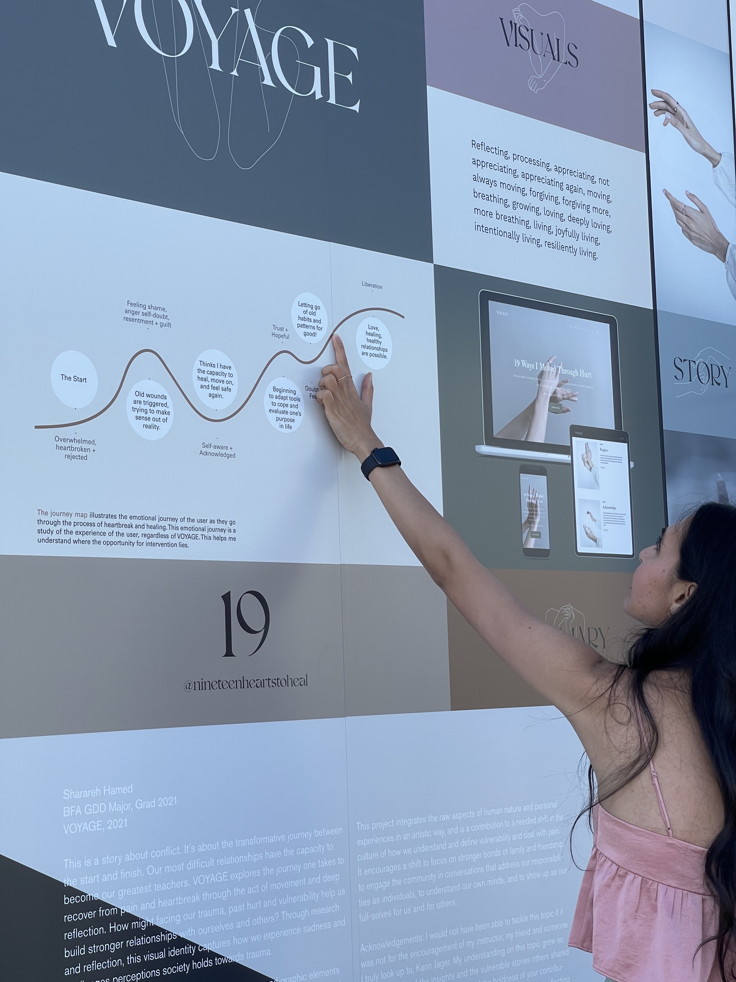
Graduation Show: UFV Graphic + Digital Design Showcase | Abbotsford

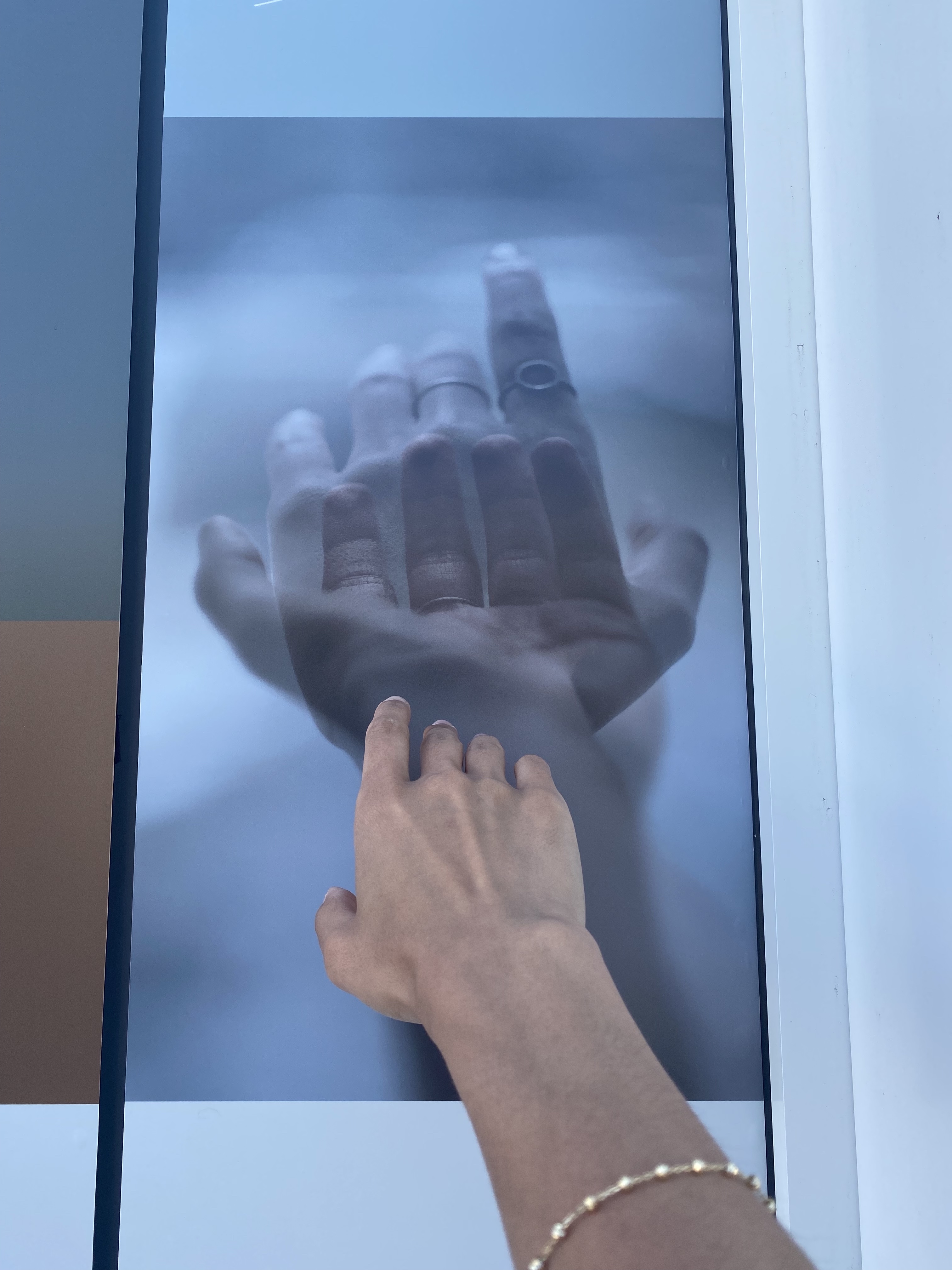
Brief:
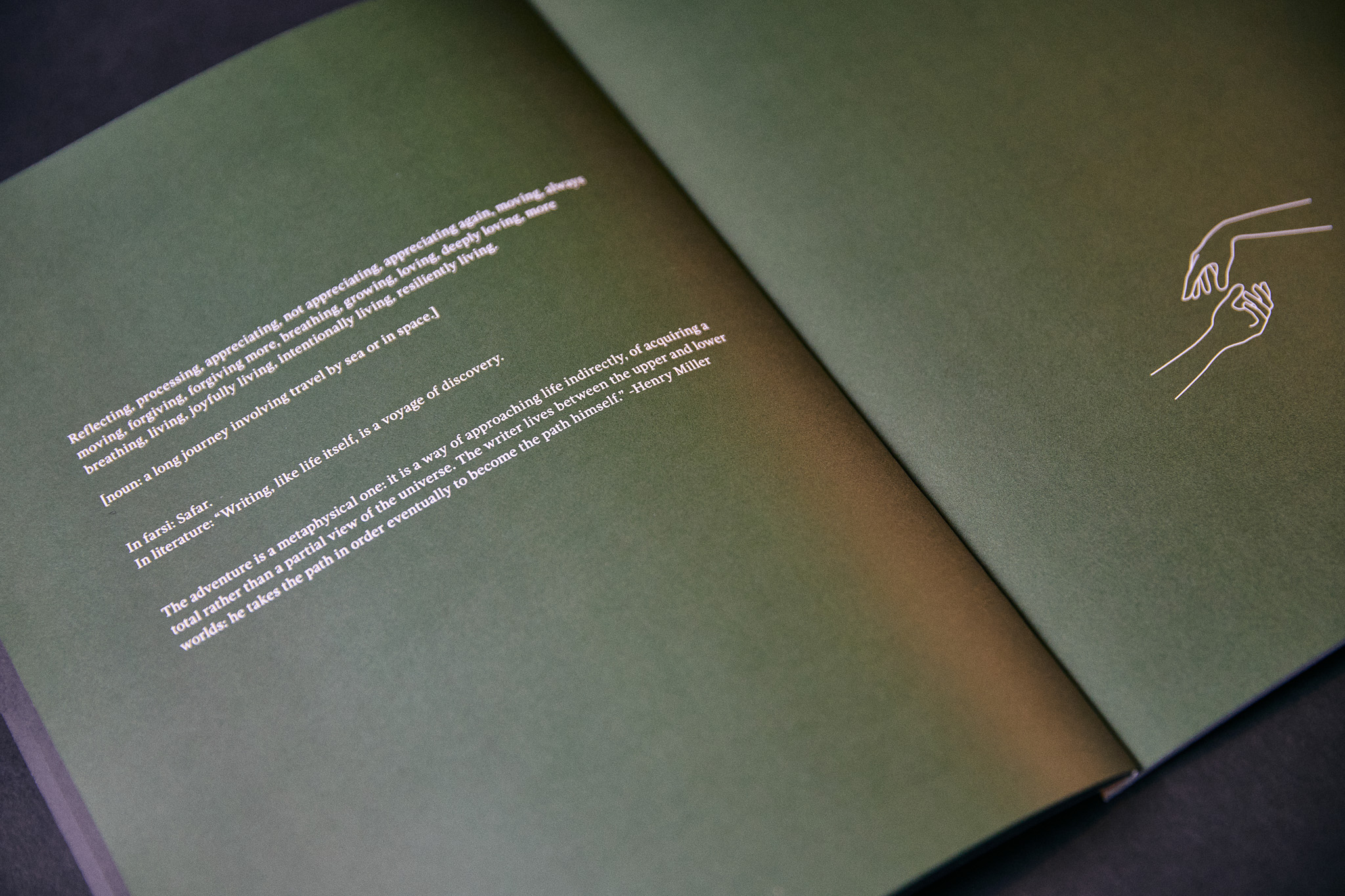
Reflecting, processing, appreciating, not appreciating, appreciating again, moving, always moving, forgiving, forgiving more, breathing, growing, loving, deeply loving, more breathing, living, joyfully living, intentionally living, resiliently living.
noun: a long journey involving travel by sea or in space.
in literature: “Writing, like life itself, is a voyage of discovery. The adventure is a metaphysical one: it is a way of approaching life indirectly, of acquiring a total rather than a partial view of the universe. The writer lives between the upper and lower worlds: he takes the path in order eventually to become the path himself.” -Henry Miller
In farsi: سفر (safar)

Mission:
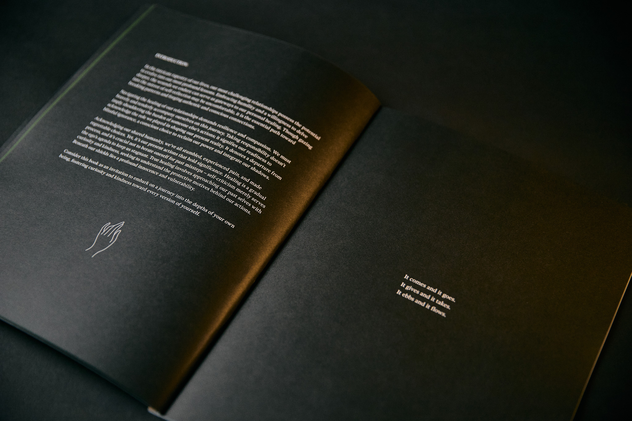
Our challenging relationships can become our best teachers. Embracing humility and introspection transforms our pain into healing opportunities. This mirrors a vital shift toward authentic, conscious connections. Healing relationships demands courage and compassion. Taking responsibility acknowledges our role without blaming ourselves for others' actions. It signifies shedding ignorance, owning our power, and integrating our shadow. Mistakes are part of life; it's our present actions that matter. Healing is a journey; self-compassion trumps dwelling on past errors. True healing involves curiosity and kindness toward our past selves, understanding the protective mechanisms. This project invites exploration of our deep innocence beneath protective layers.
Impact:
Our culture pushes us to suppress pain, even when it cuts deep, and to stay silent. The notion that "vulnerability is weakness" prevails. This project melds raw human aspects, drawing from my own experiences with pain and trauma. Through art, it aims to reshape our cultural outlook, redefining and understanding "vulnerability." The goal is a culture shift towards stronger bonds and community conversations. It urges personal growth, self-awareness, and being authentic for ourselves and others.

Narrative: This is a story about conflict. It’s about the transformative journey.


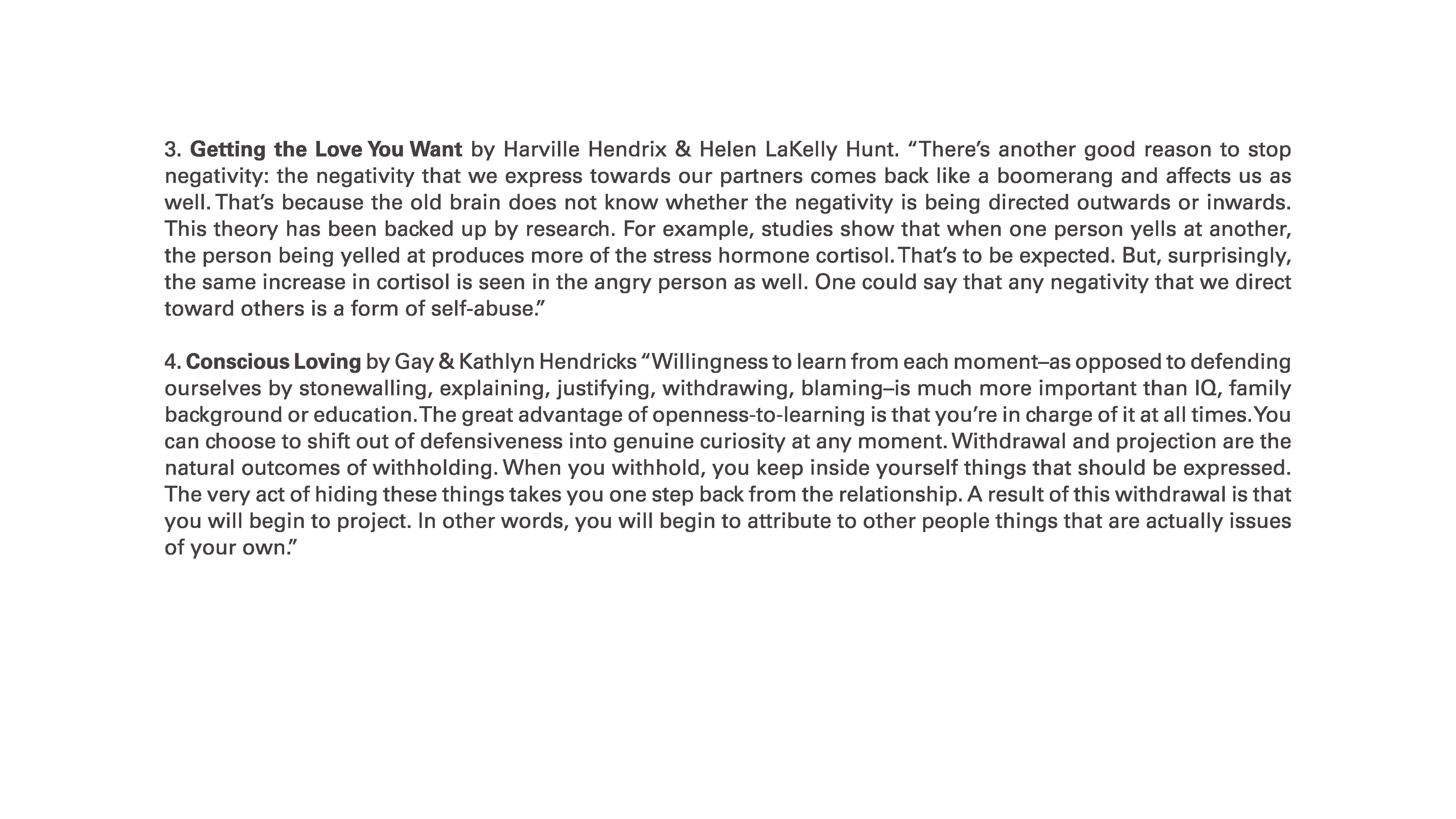
VOYAGE explores the journey one takes to recover from pain, hurt, trauma an heartbreak through the act of movement, vulnerability, and deep reflection. The destination is the process itself that leads the individual towards a place of authenticity with themselves and others, resulting in deeper connections.
The brand uses raw, honest and empathetic tone of voice to relate and connect with its audience. Through its boldness, it will challenge perceptions society holds towards trauma, hurt and pain. The graphics portray a sense of gentleness and naturalness to the process of healing. Slow movement is a symbol of time and patience. Overall, the tone is warm and positive. Use of natural light in all photographs and videos represent how the light can bring out healing in us.
“The wound is the place where light enters.” -Rumi

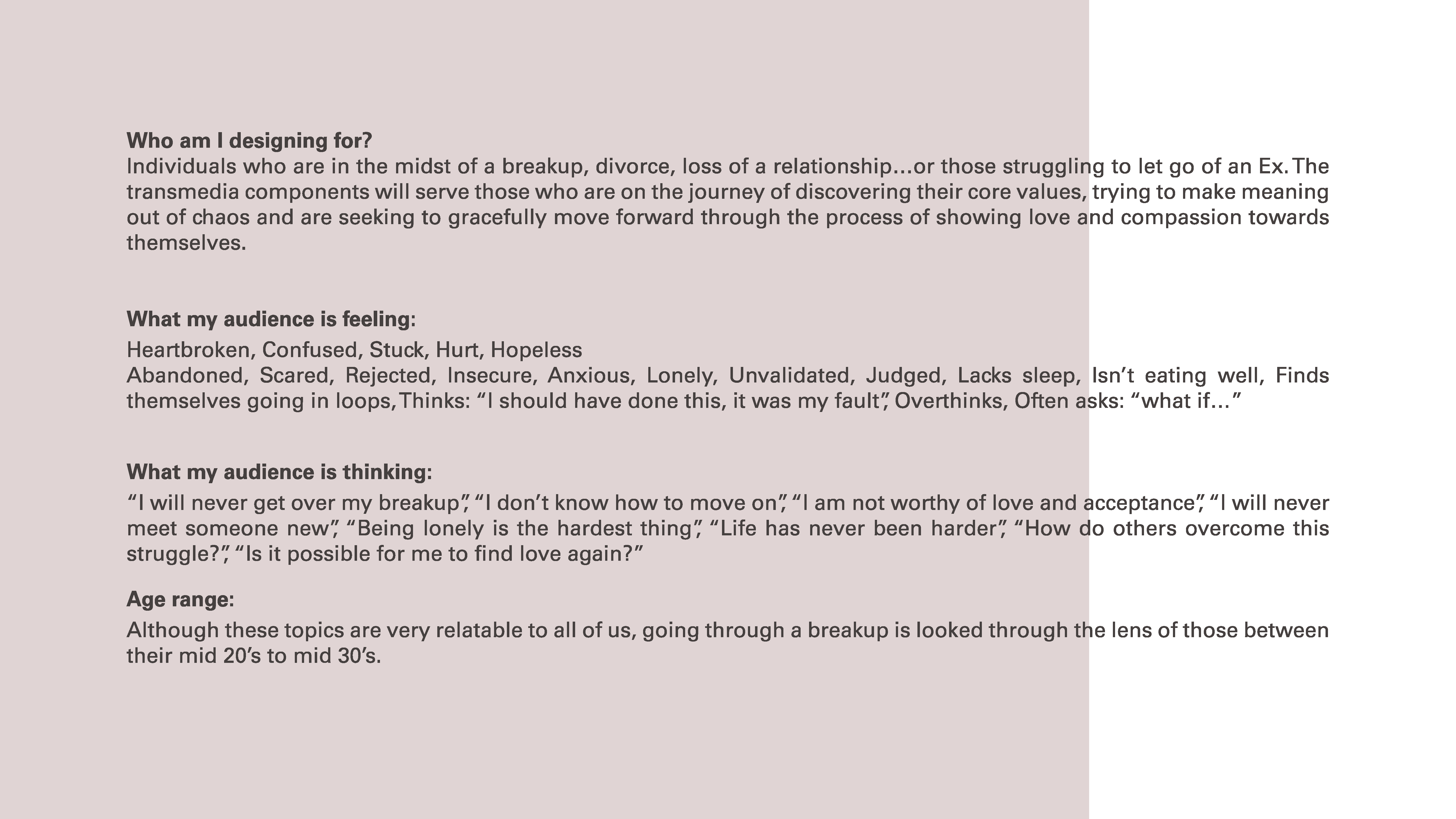
Through a process of user research and user testing I gained insights into the form of the campaign, the most effective media and the most effective language and tone to use throughout the services offered by VOYAGE.
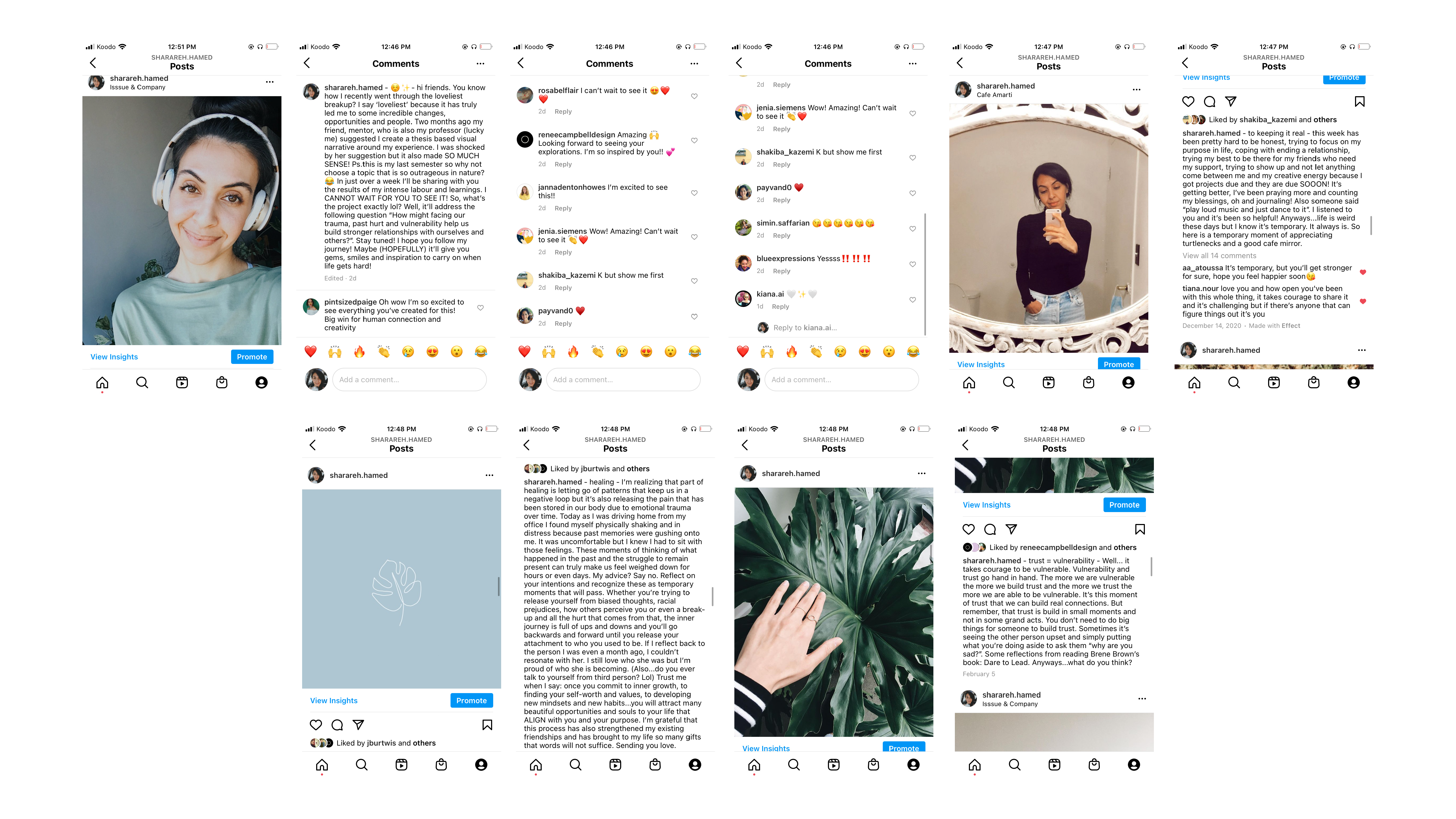
Conversations rooted in connection and empathy!
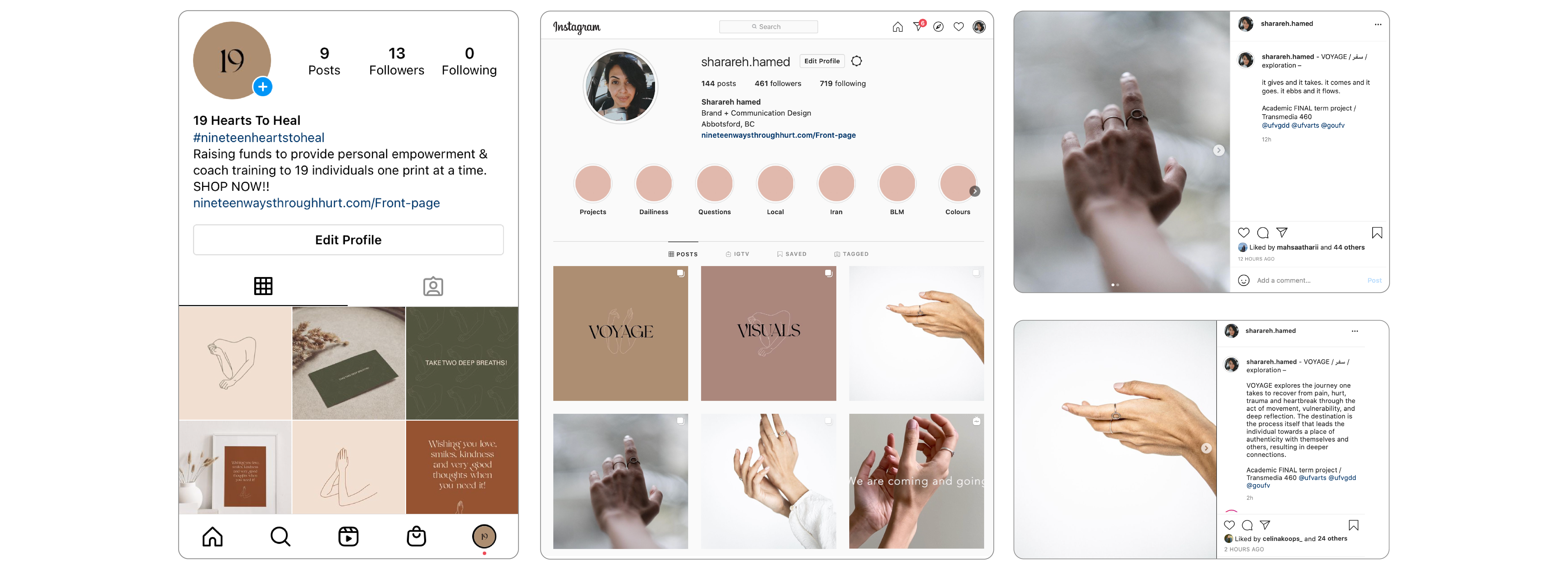
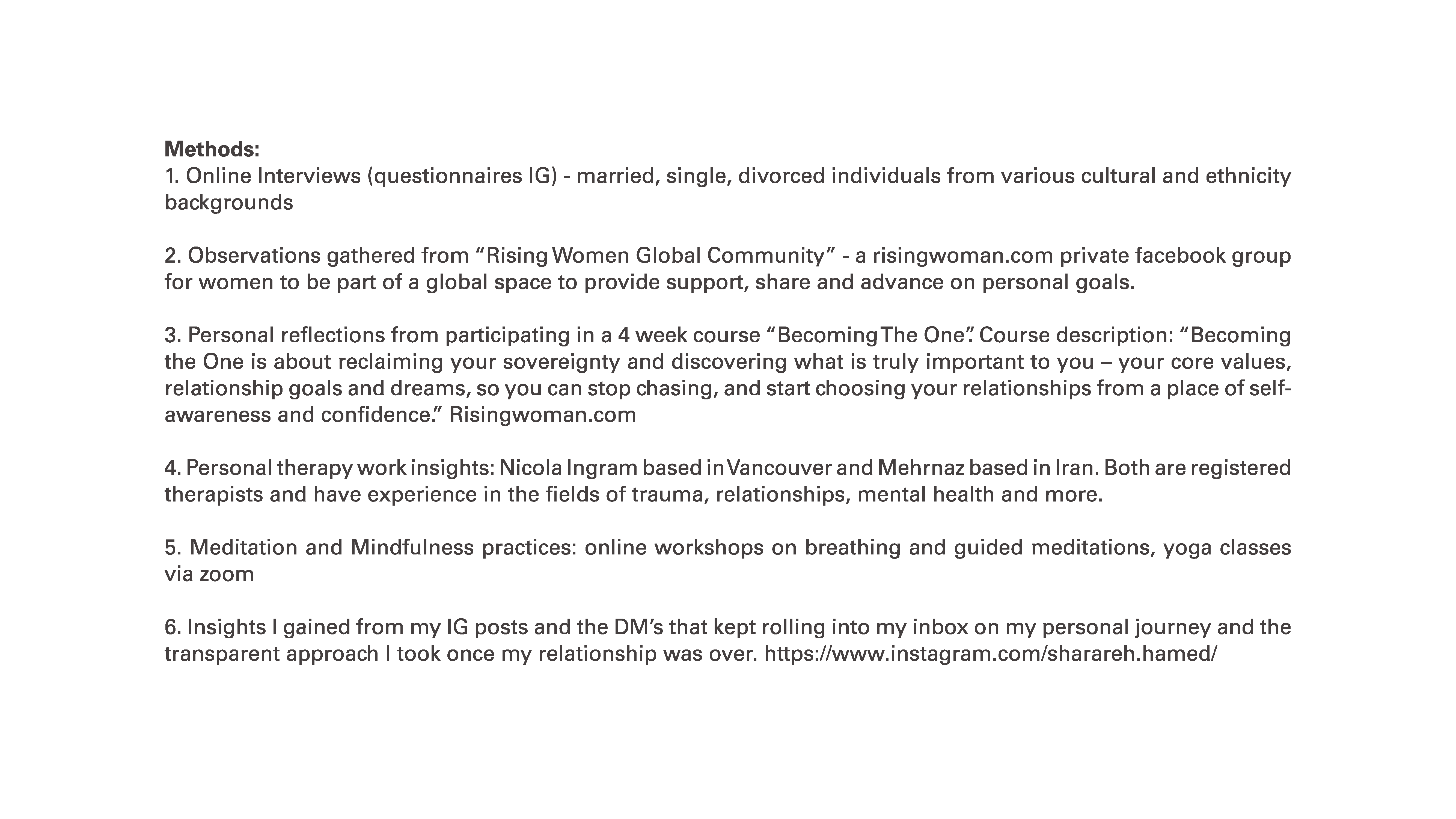
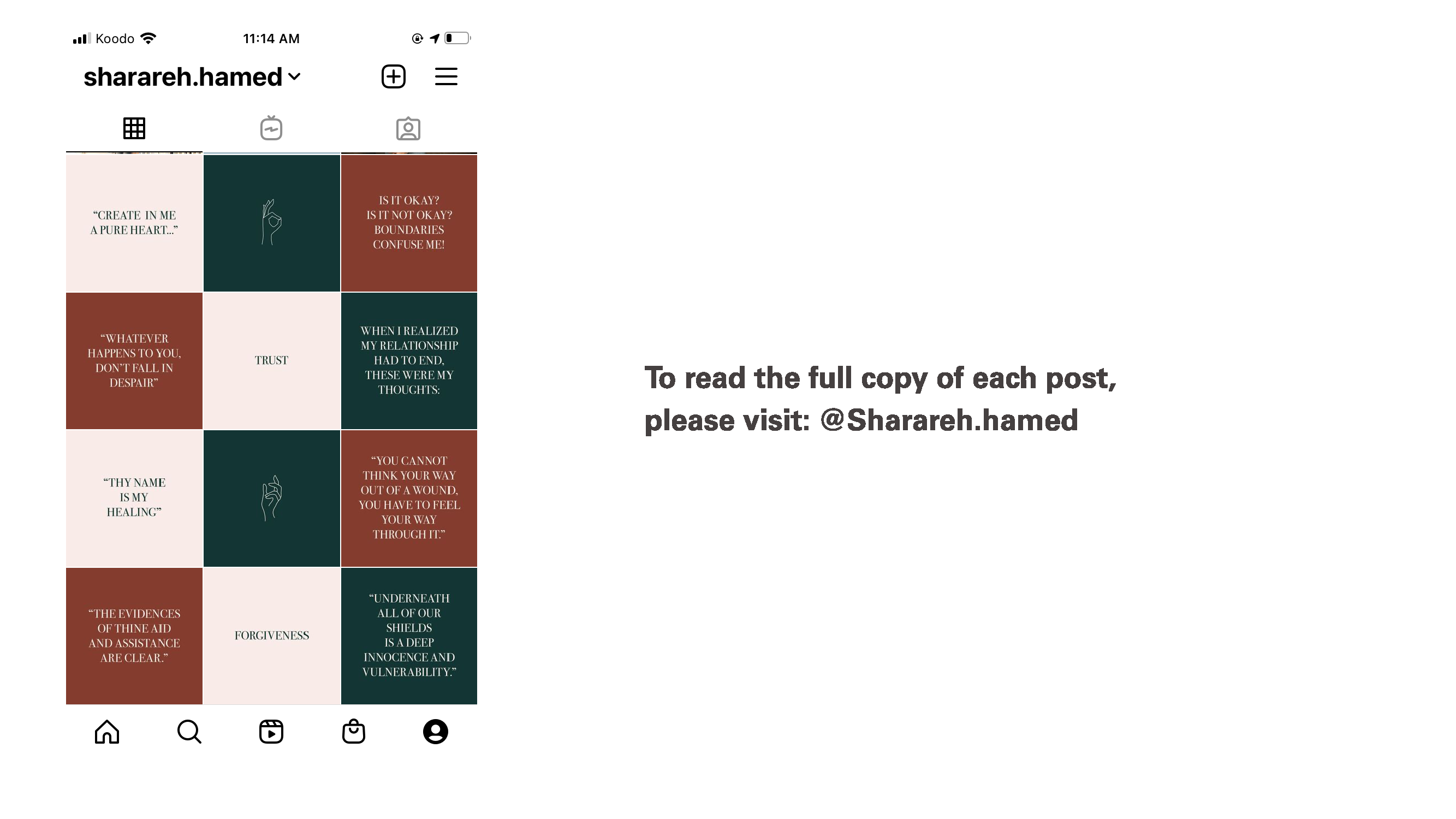
︎︎︎ Media: Instagram
Conversations rooted in connection and empathy!
︎︎︎ Media: Instagram

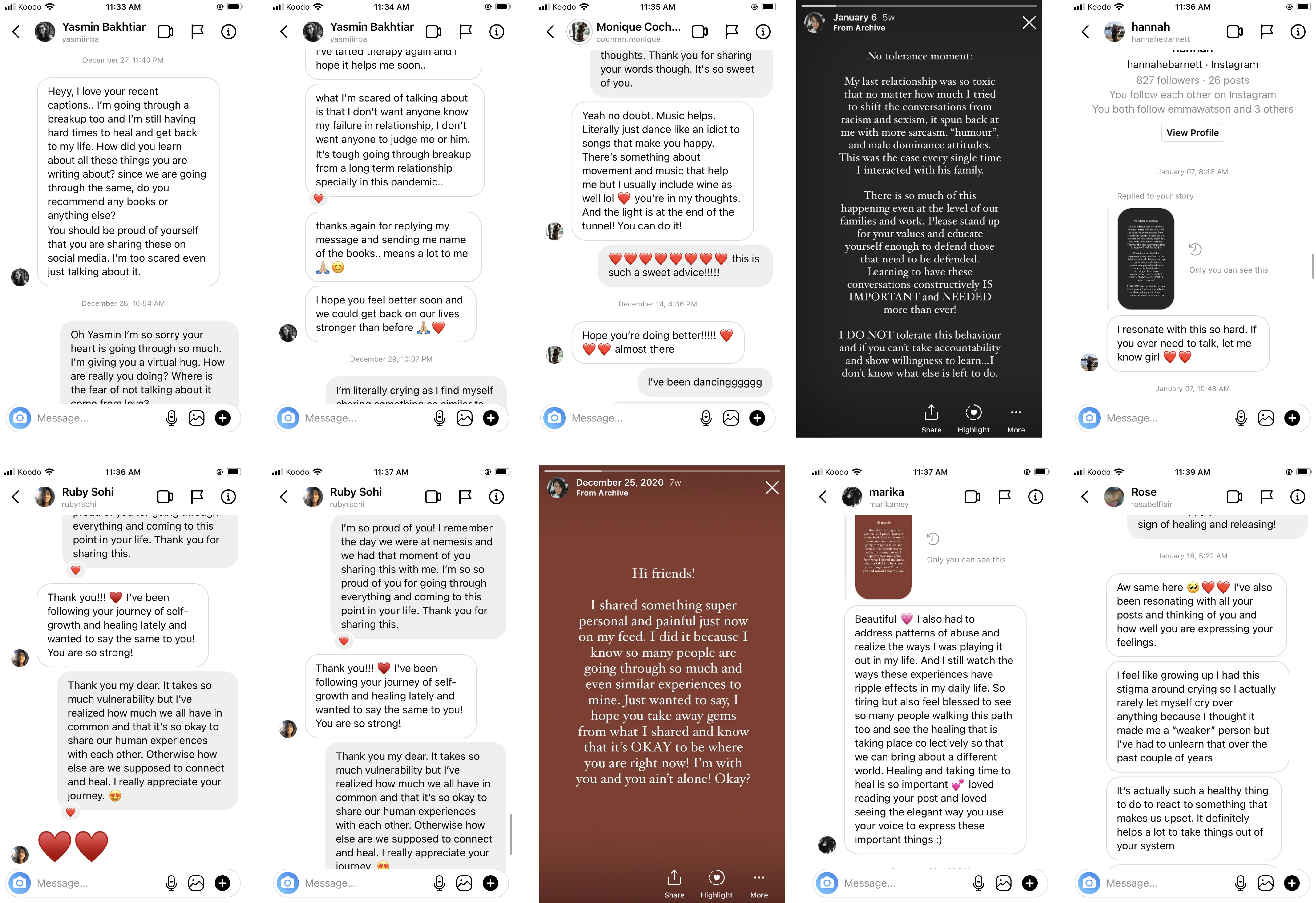

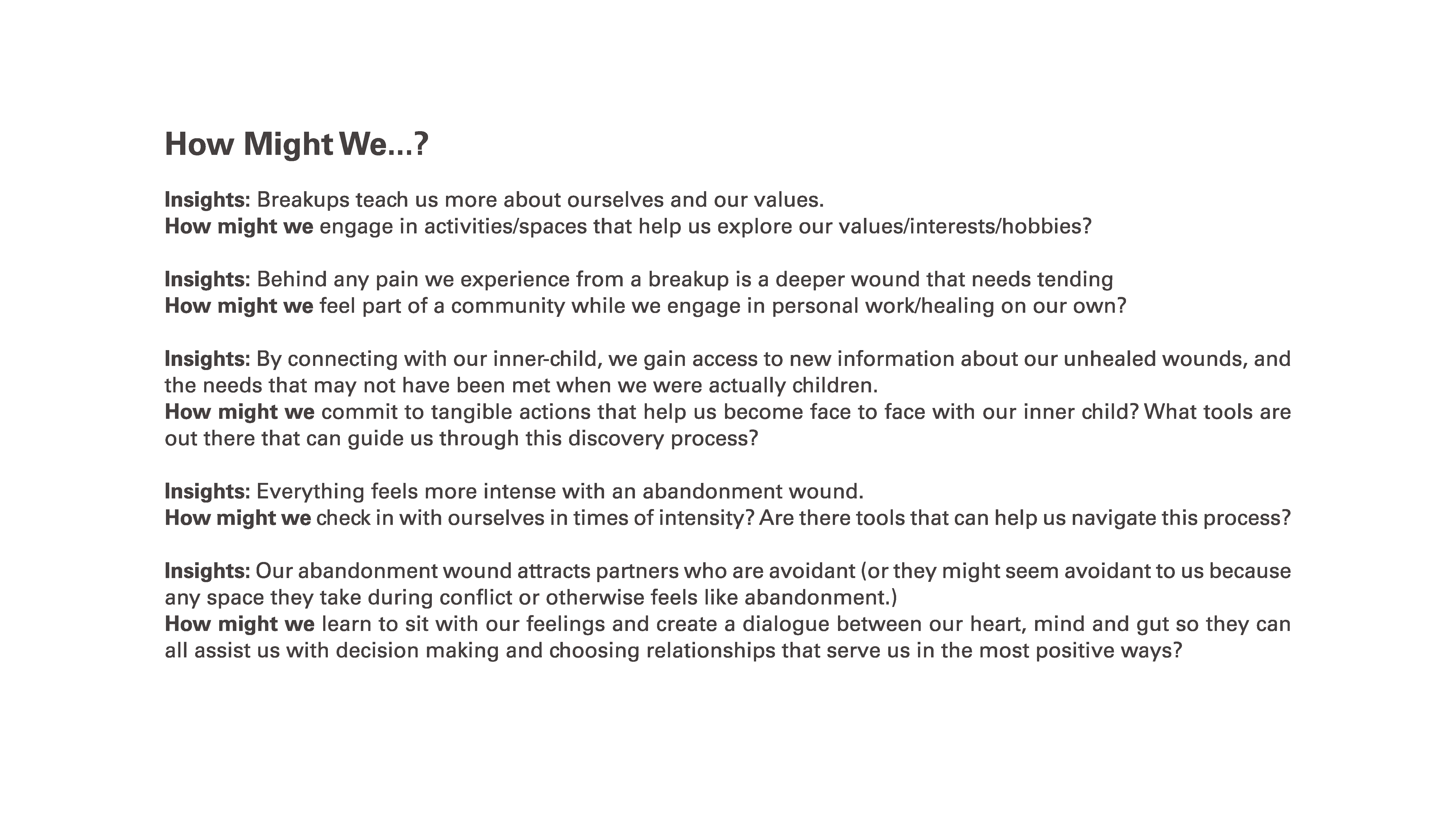
Insights:
Social media masks life's complexities, highlighting only happiness. Sharing my struggles led to a shared realization: vulnerability is stifled by shame. Out of 30 responses, 25 affirmed shedding tears that week, revealing our commonality in facing challenges. Amid pain, we unite in our journey to grow. Heartbreak spurs growth for some, while others battle despair. Yet, our yearning for connection endures. Supporting each other through challenges is a profound privilege as we navigate diverse paths toward progress.
Social media masks life's complexities, highlighting only happiness. Sharing my struggles led to a shared realization: vulnerability is stifled by shame. Out of 30 responses, 25 affirmed shedding tears that week, revealing our commonality in facing challenges. Amid pain, we unite in our journey to grow. Heartbreak spurs growth for some, while others battle despair. Yet, our yearning for connection endures. Supporting each other through challenges is a profound privilege as we navigate diverse paths toward progress.

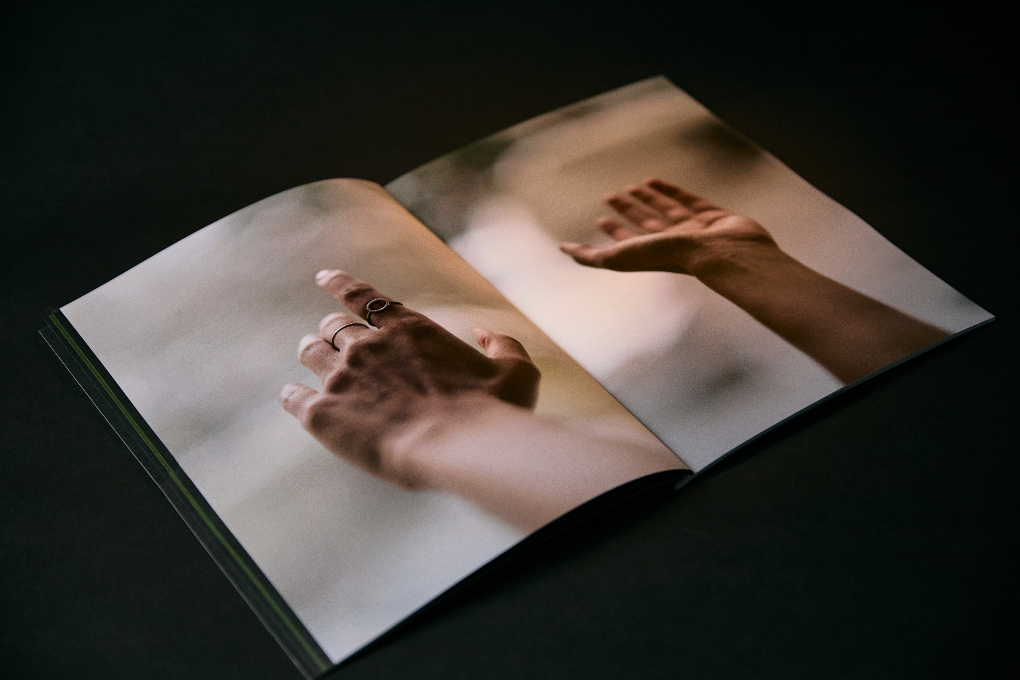
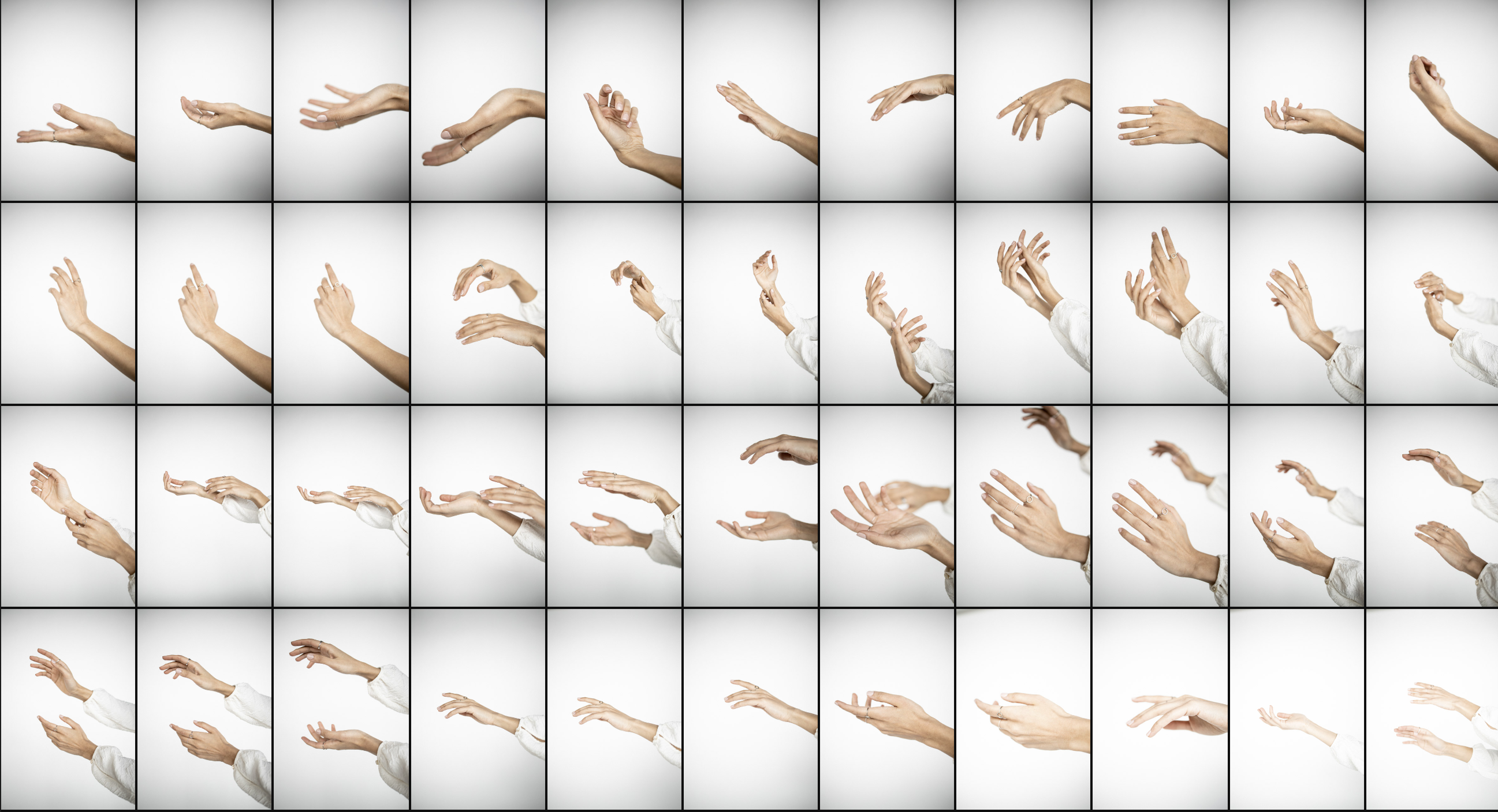
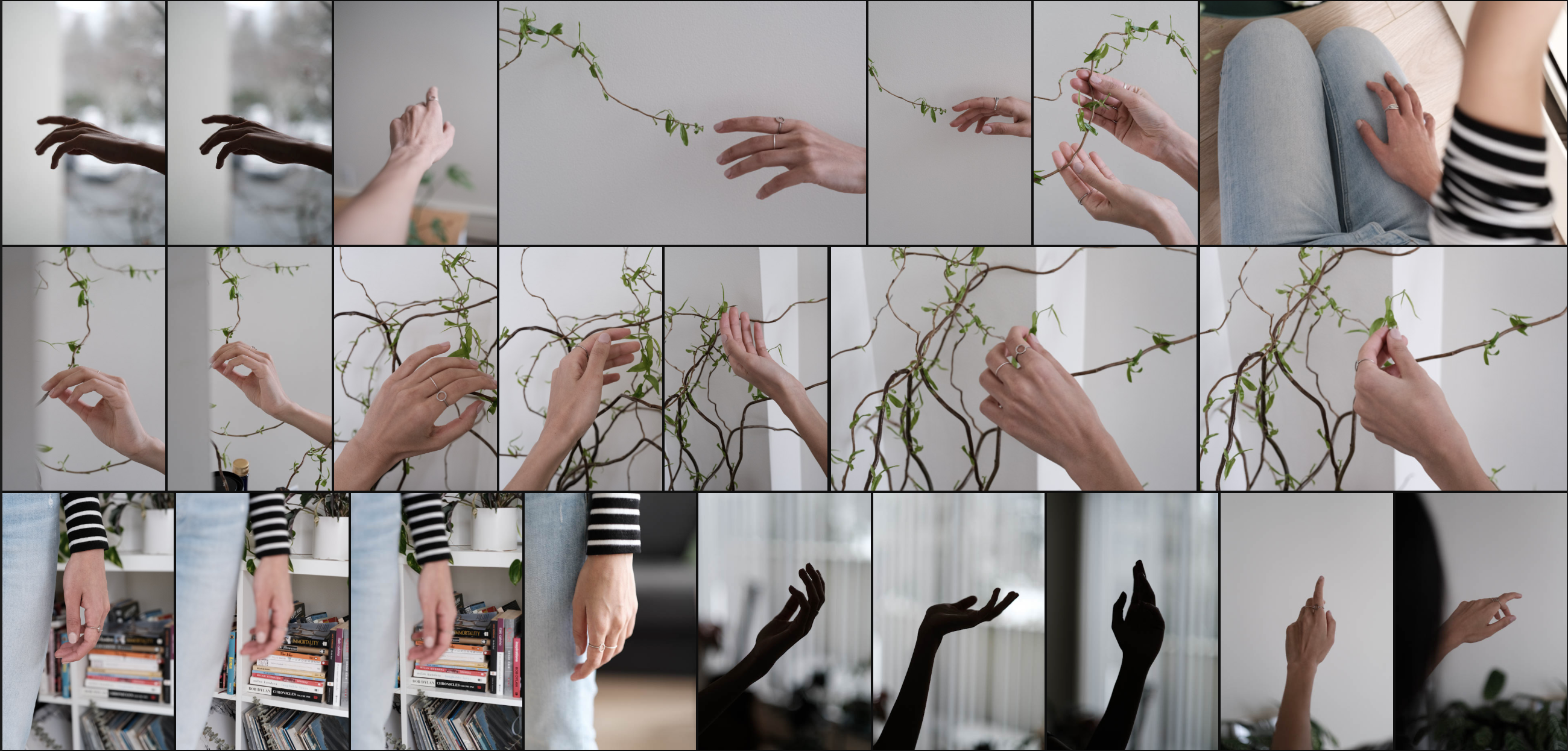
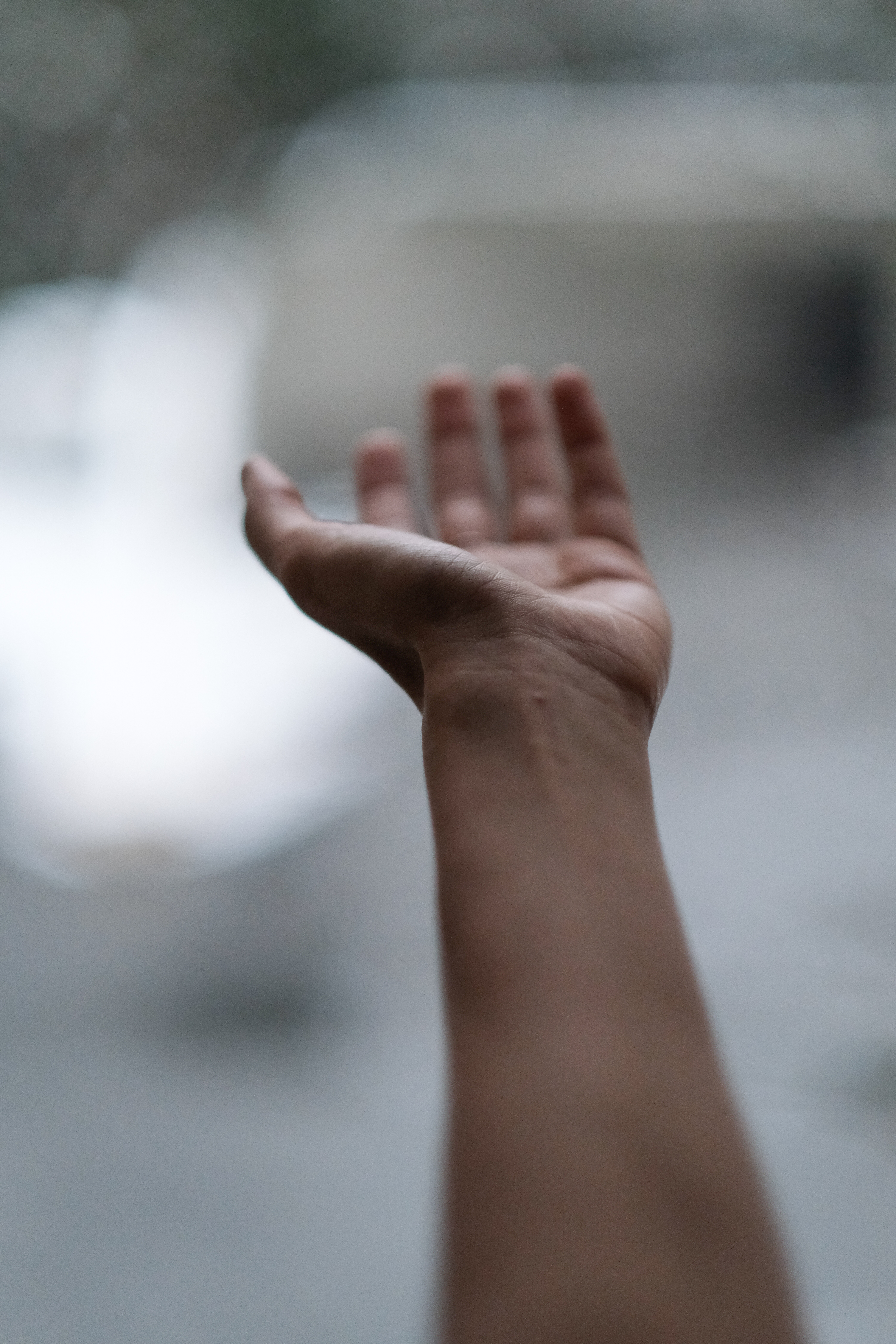
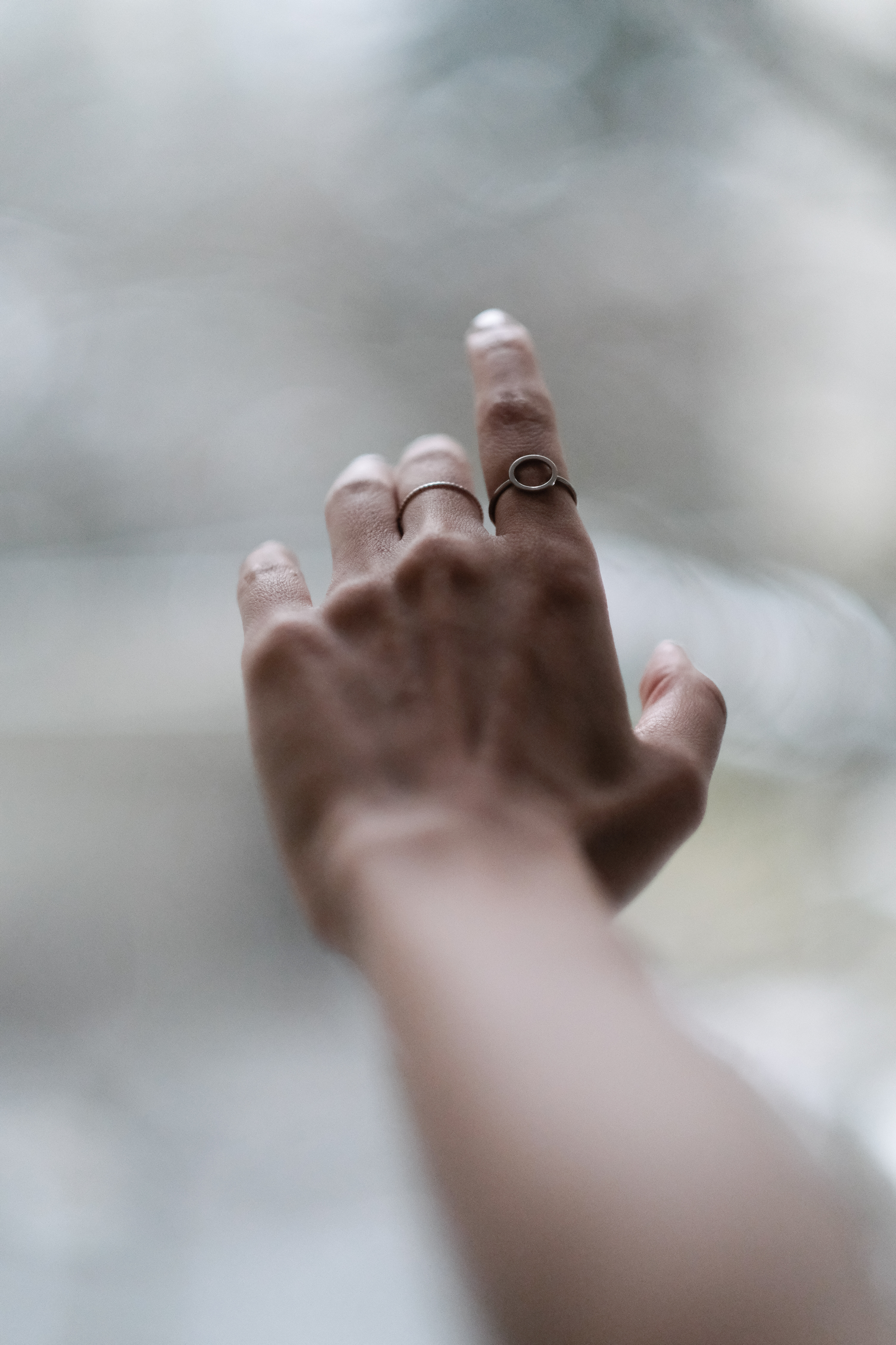
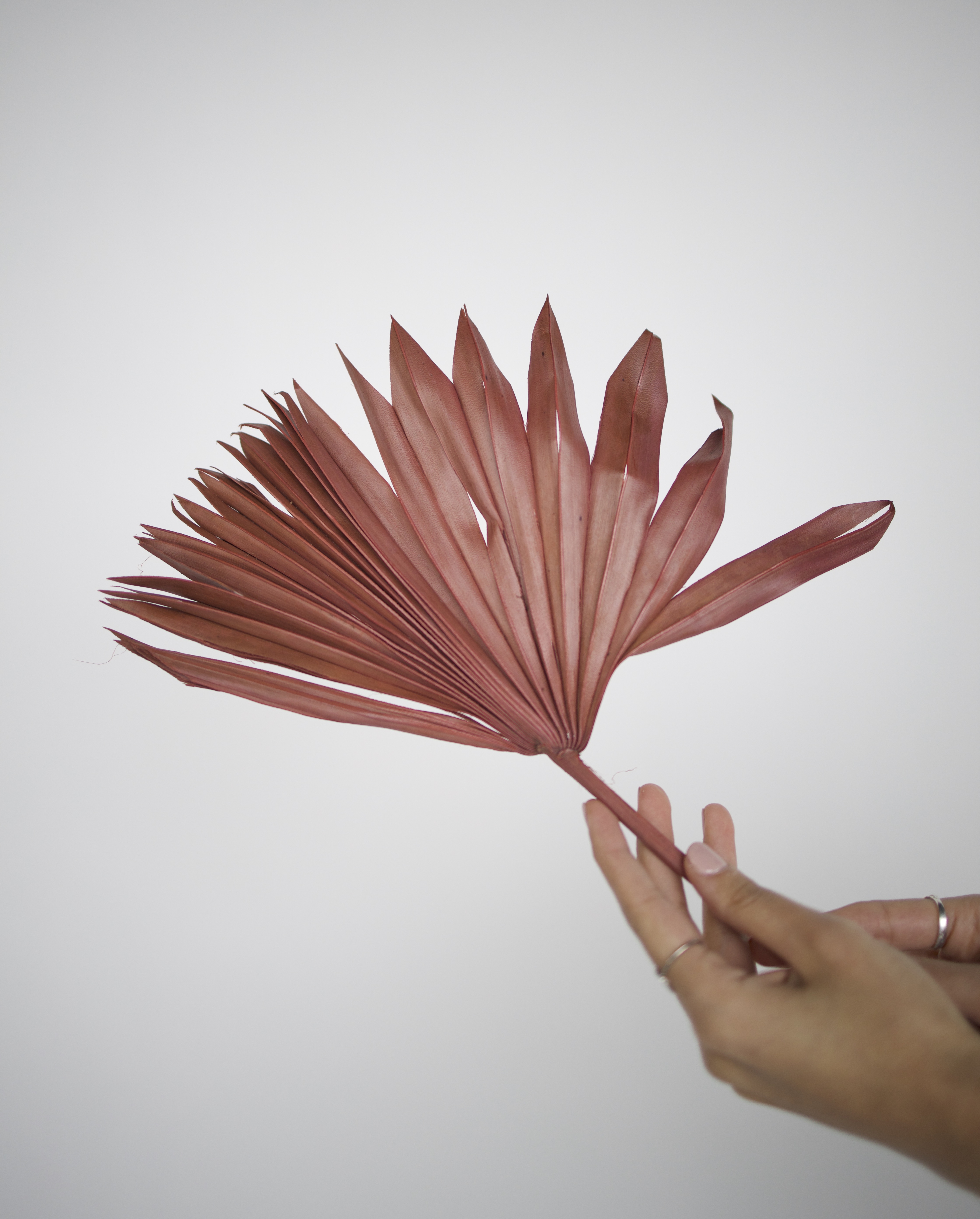
Visual Inspiration & Photographic Exploration:
It all started from where I sat as I opened up to my therapist...taking notes of my body language
It all started from where I sat as I opened up to my therapist...taking notes of my body language





Vision:
Part of this project raised funds to support 19 individuals with free therapy sessions. Best way to help ourselves is by helping others.







Summary: Case study poster
It gives and it takes. It ebbs and it flows.







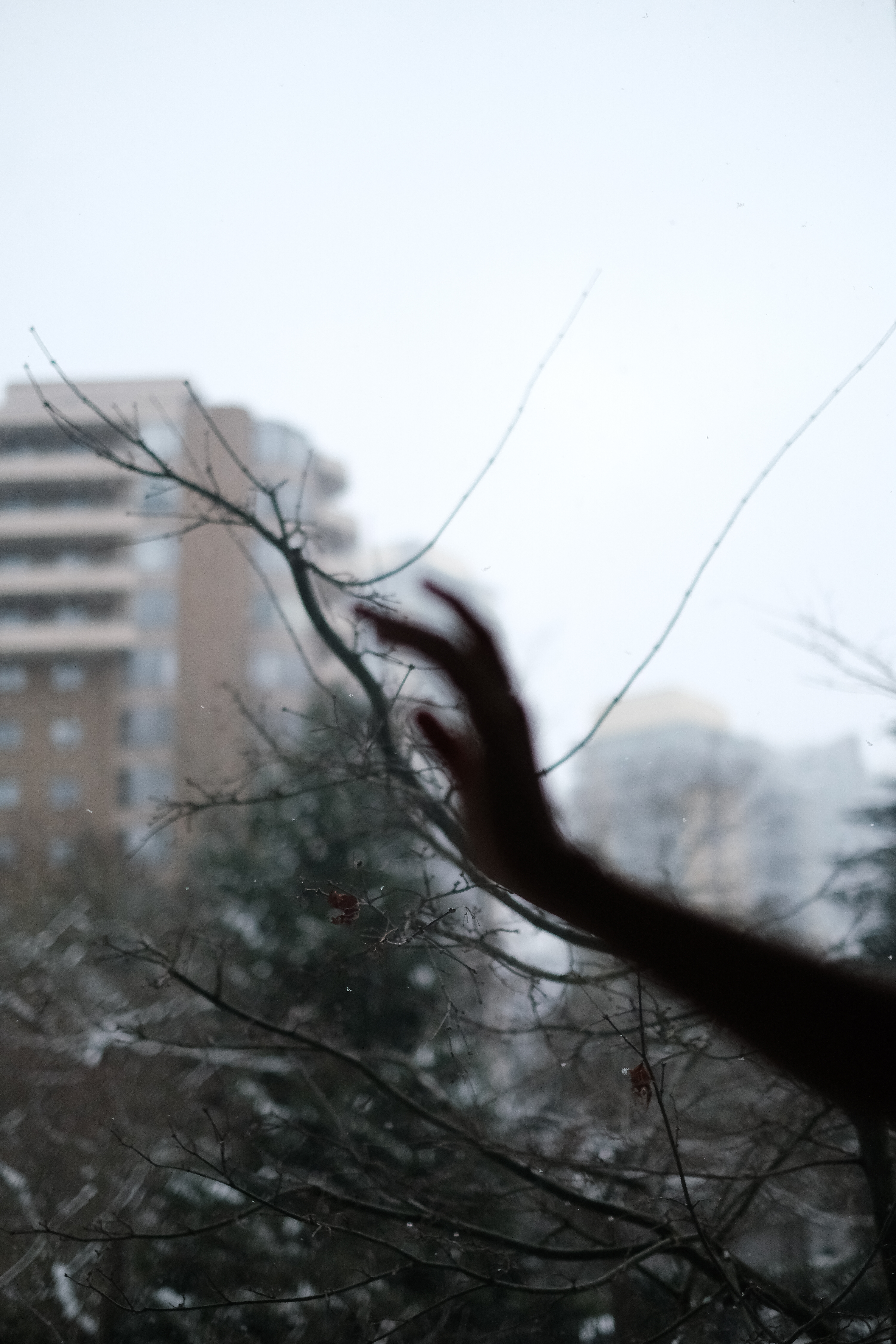

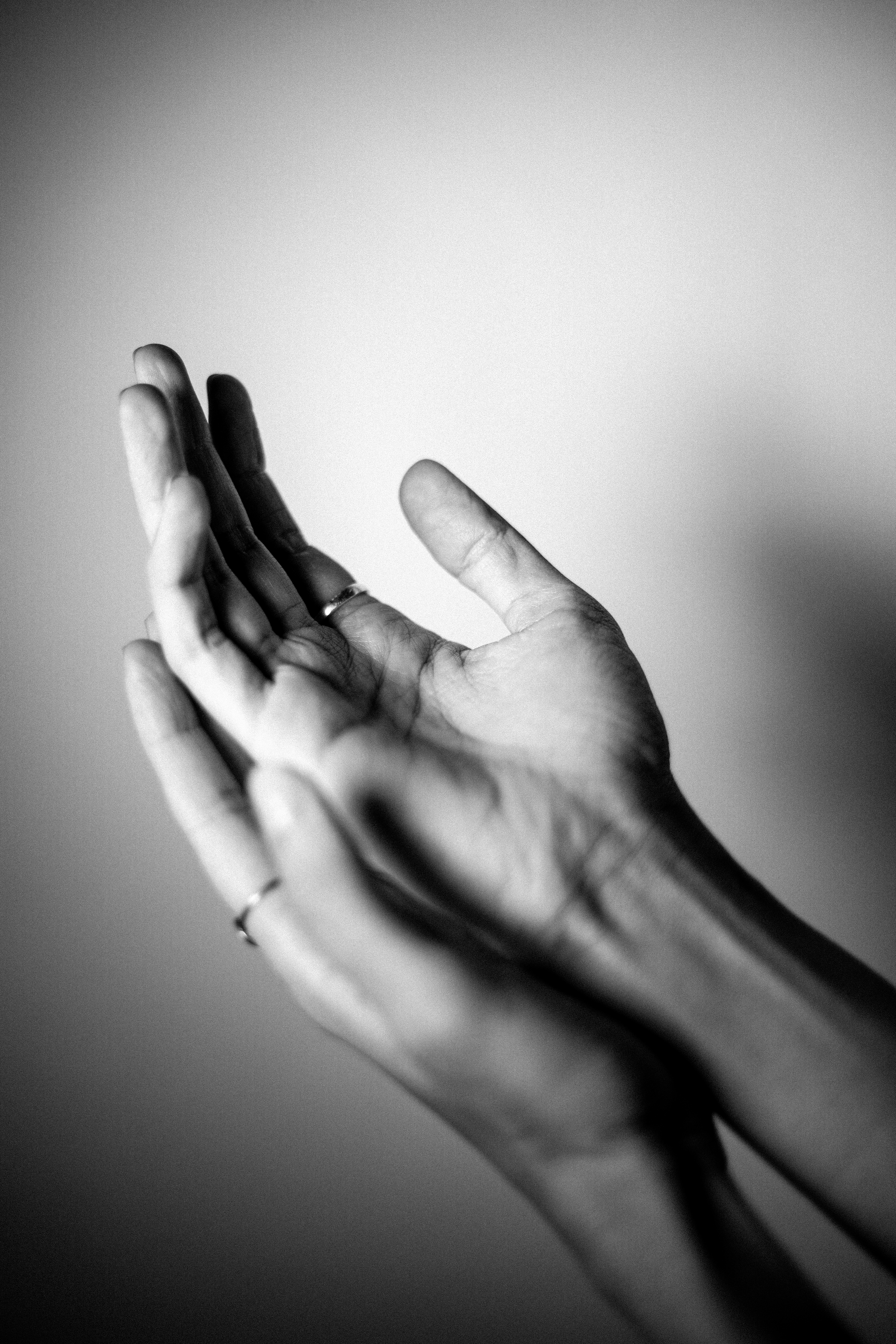


︎ View Research + Creative Brief ︎︎︎ Swipe




















Role:
+ Creative Director
+ Copywriter
+ Lead Researcher
+ UI/UX Designer
+ Name construction
**Concept developed
by the team**
+ Creative Director
+ Copywriter
+ Lead Researcher
+ UI/UX Designer
+ Name construction
**Concept developed
by the team**
Client:
UFV
Faculty:
Andrew Mckingley
UFV
Year:
2020
UFV
Faculty:
Andrew Mckingley
UFV
Year:
2020
Collaborators:
Celina Koops:
Researcher
Lead Illustrator
UI/UX Designer
Imroze Singh Deol:
Brand Identity
Researcher
Project Management
UI/UX Designer
Celina Koops:
Researcher
Lead Illustrator
UI/UX Designer
Imroze Singh Deol:
Brand Identity
Researcher
Project Management
UI/UX Designer
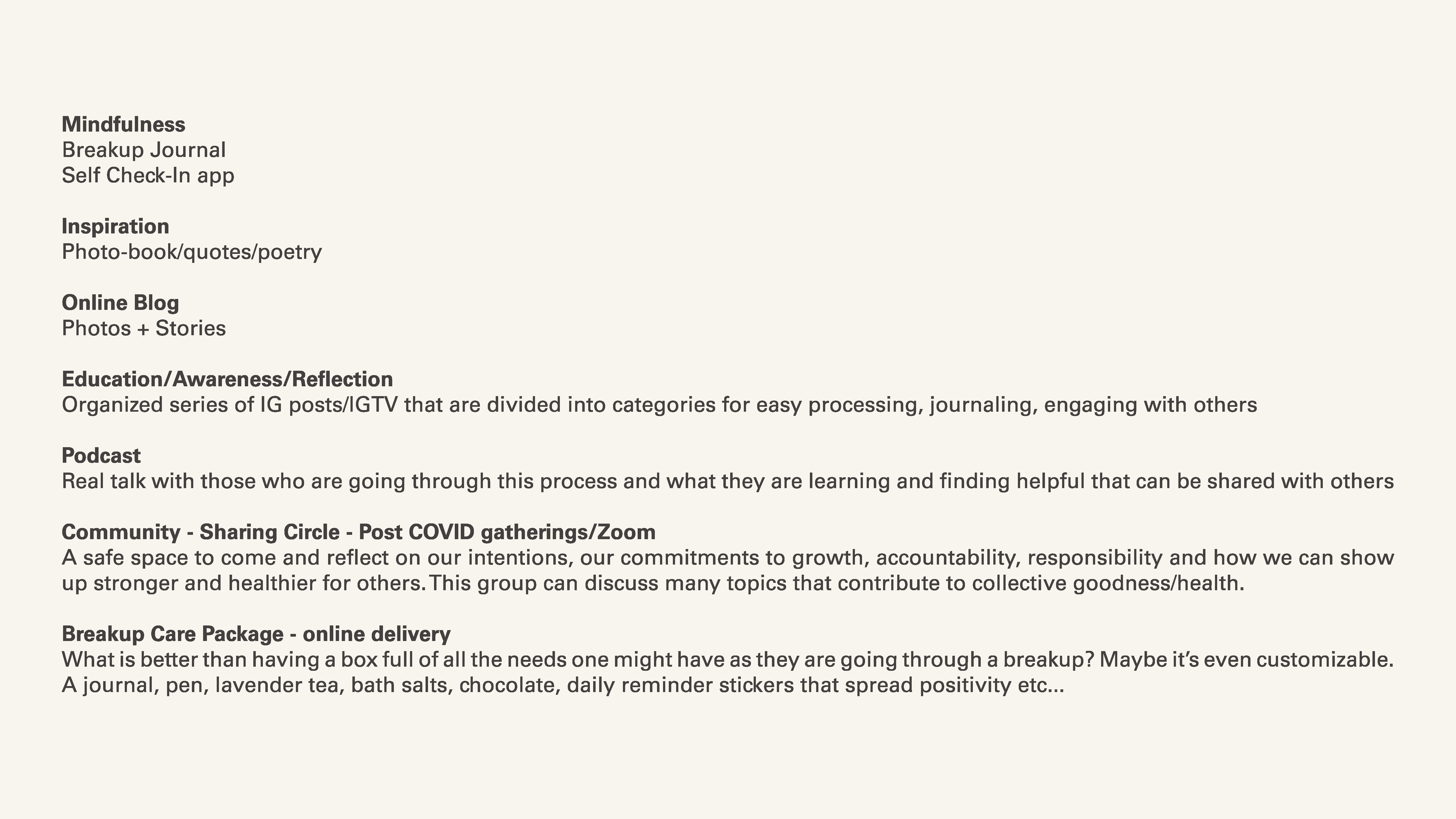
KOLM – Dealing with anxiety on the go.
Kolm is an app to help you increase self-awareness and practice daily mindfulness. It offers guided meditation, exercise, and journaling fully customizable to fit your daily needs.


Project:
+ Research
+ Copywriting
+ Poster Design
+ Hand-cut paper
+ Research
+ Copywriting
+ Poster Design
+ Hand-cut paper
Sector:
Advocacy for Design
UFV
Faculty:
Eric Lee
Advocacy for Design
UFV
Faculty:
Eric Lee
Year:
2019
2019
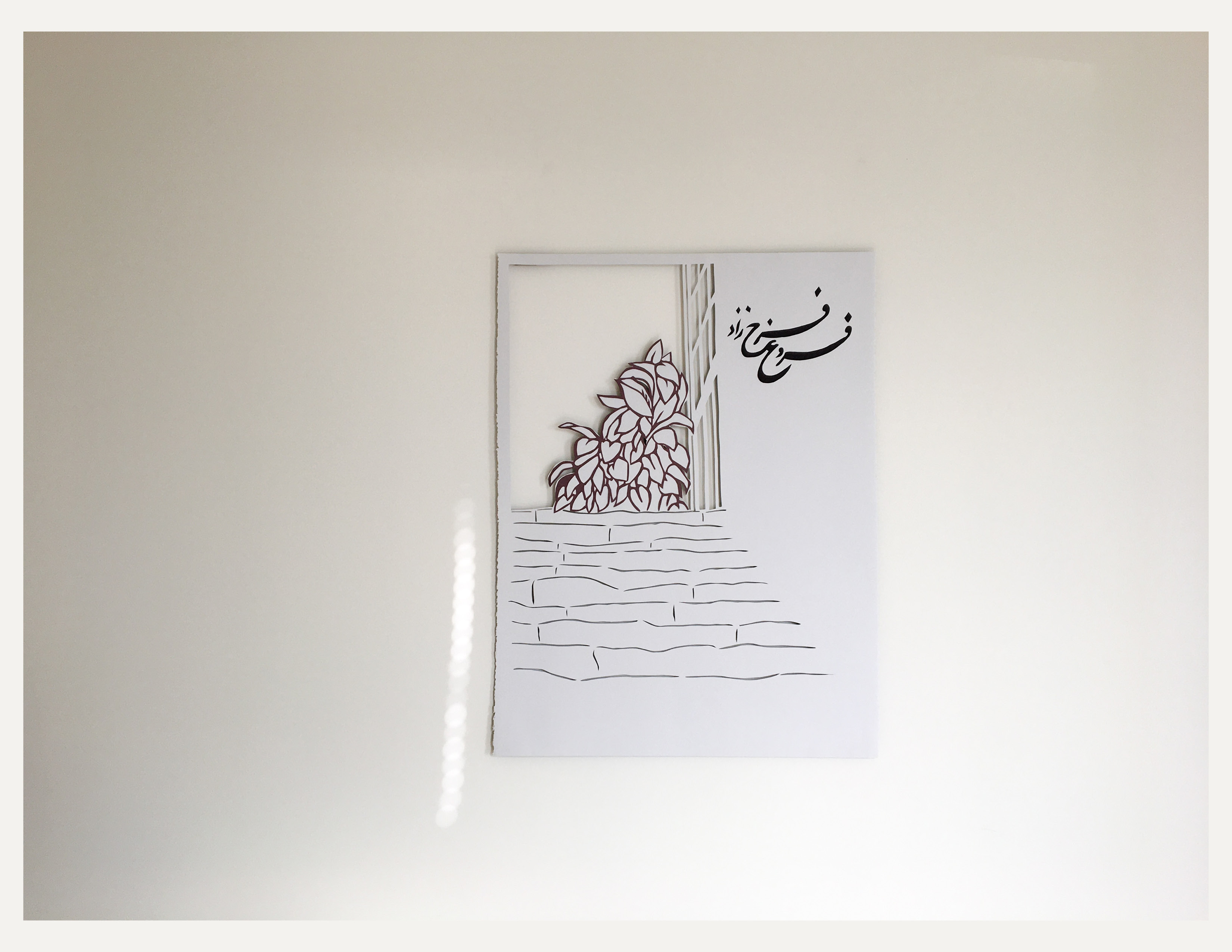
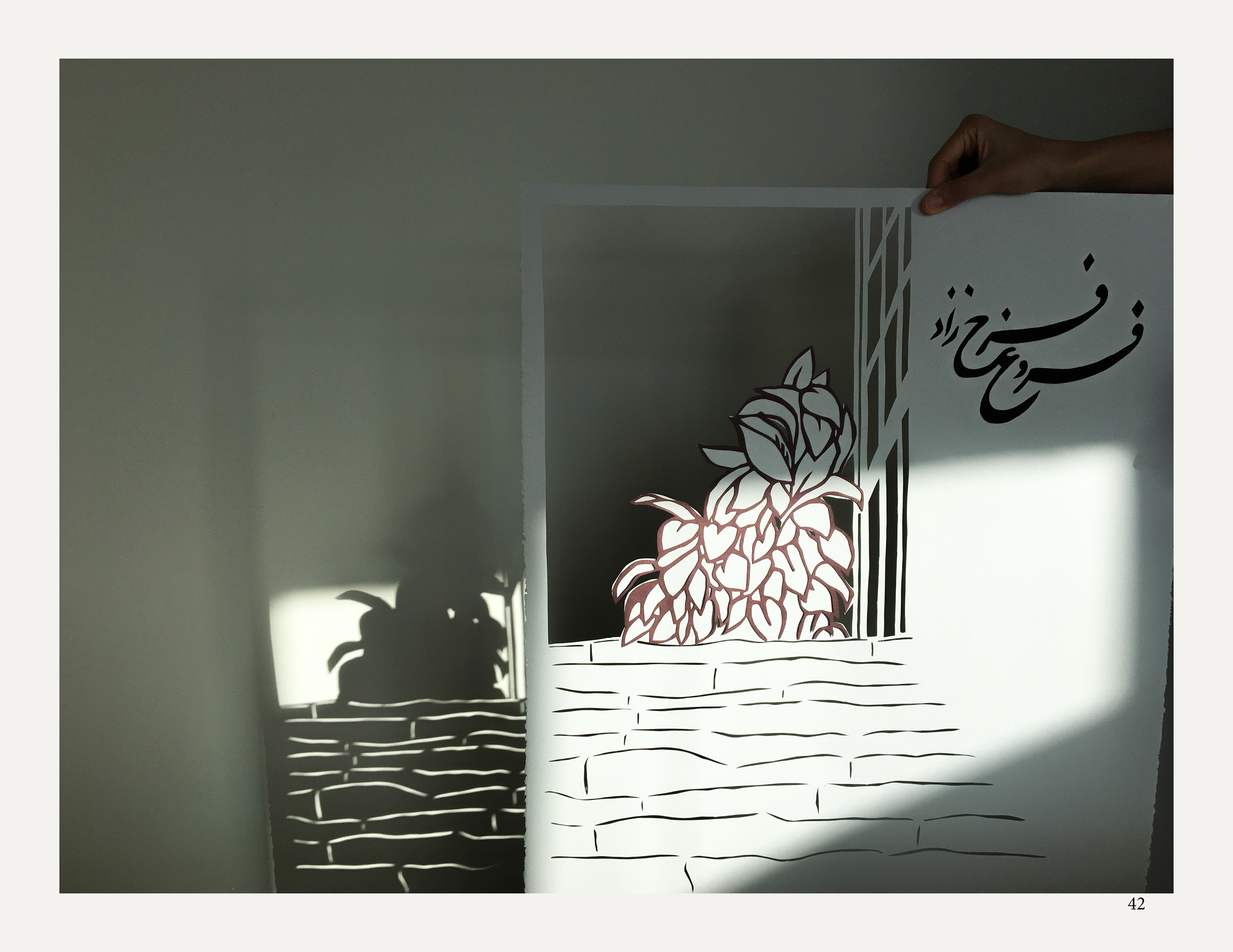
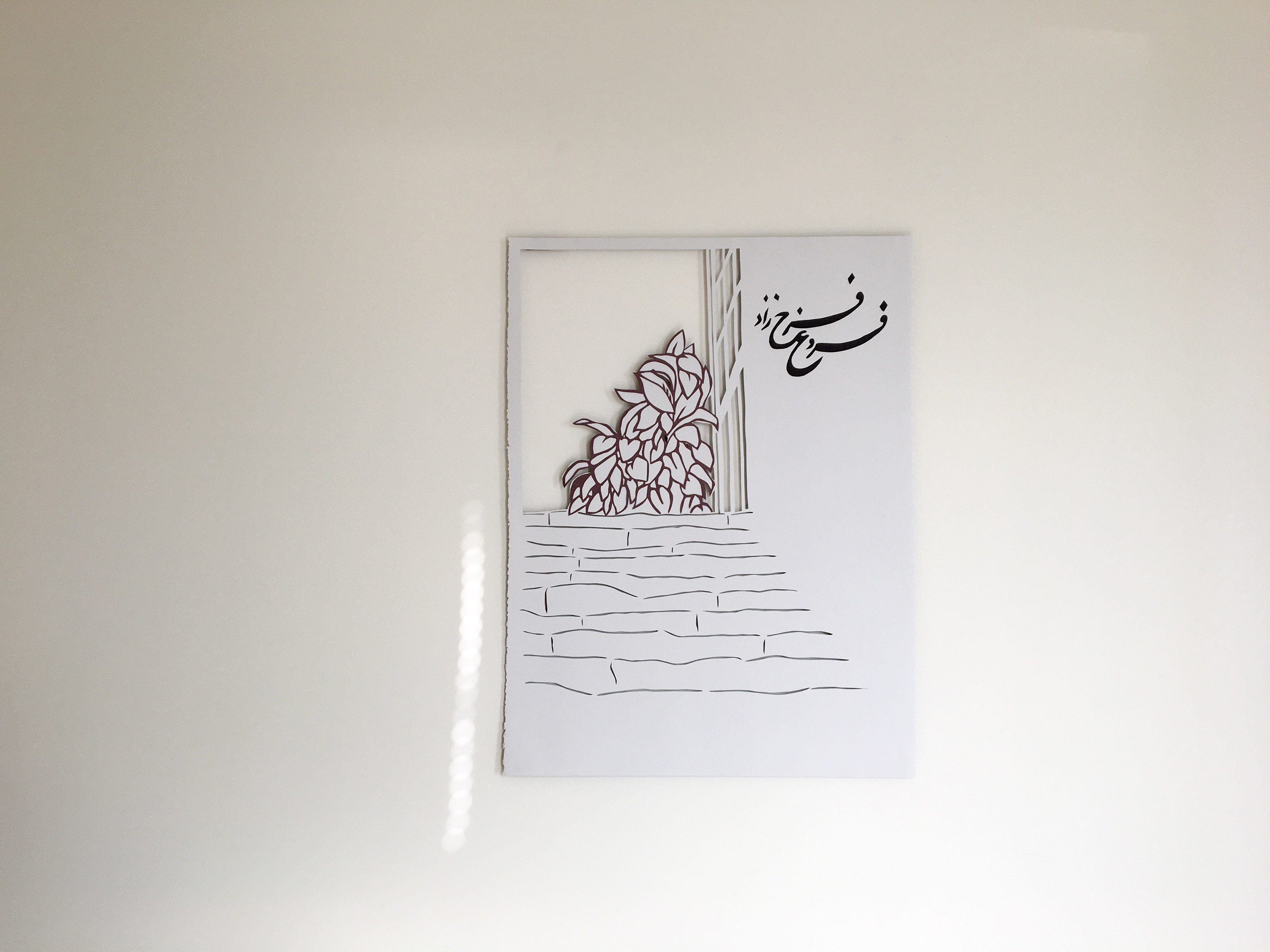
"Window" – The rebel poet of Iran
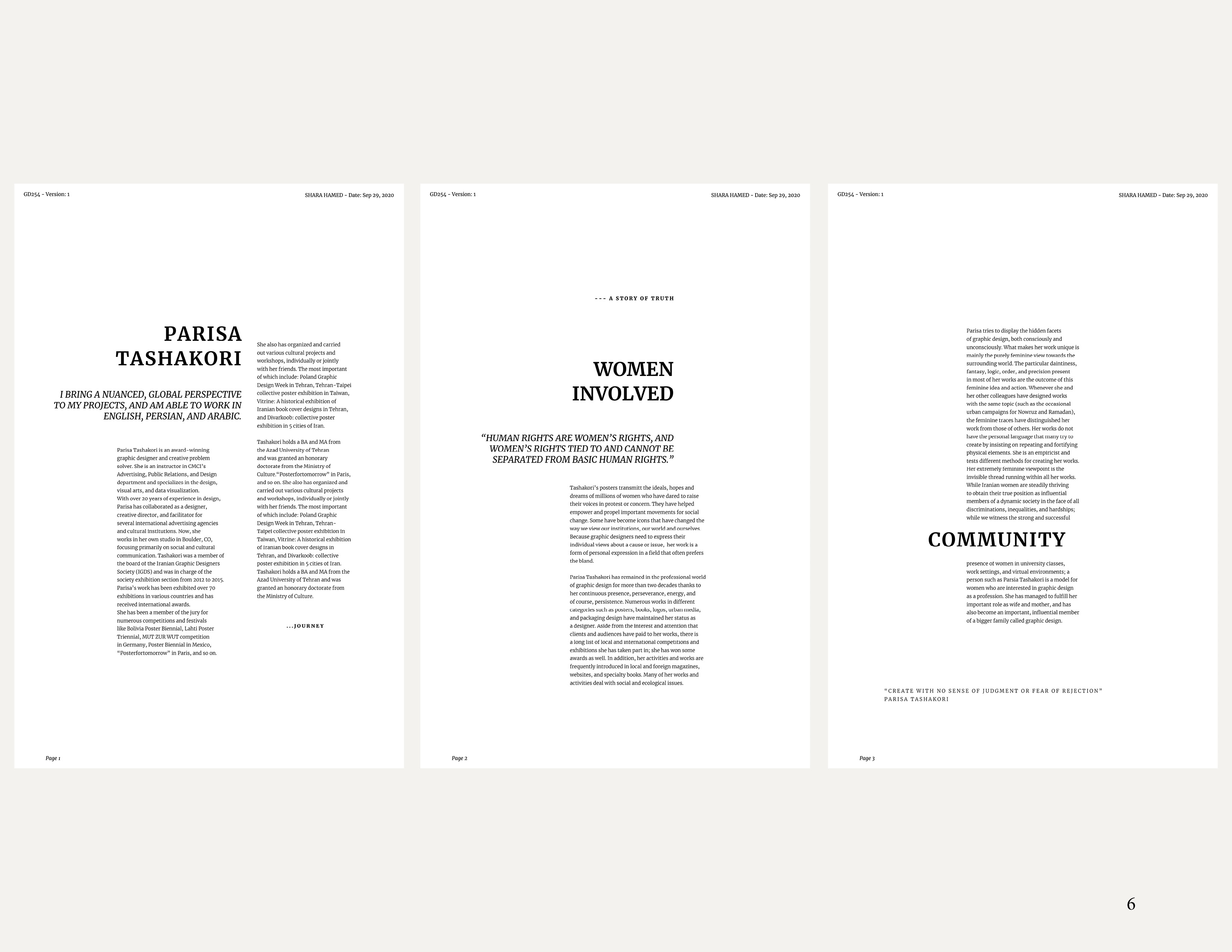
This project exemplifies advanced typographic expertise attained through rigorous research, analysis, and iteration. "Window" (or "Panjereh" in Farsi) aims to explore Iranian women's influence in the art world, culminating in a reflective publication.
Inspiration: Drawing from Forough Farokhzad’s resilience and feminine strength, I've crafted a piece that is visually engaging yet profound. Infused with nature's fluid shapes and the essence of the human heart, I delve into the connection between us and our surroundings. This work intertwines material and spiritual aspects of human existence, blending the tangible with the natural world.
︎ View presentation [research included] ︎︎︎ Bottom of the page
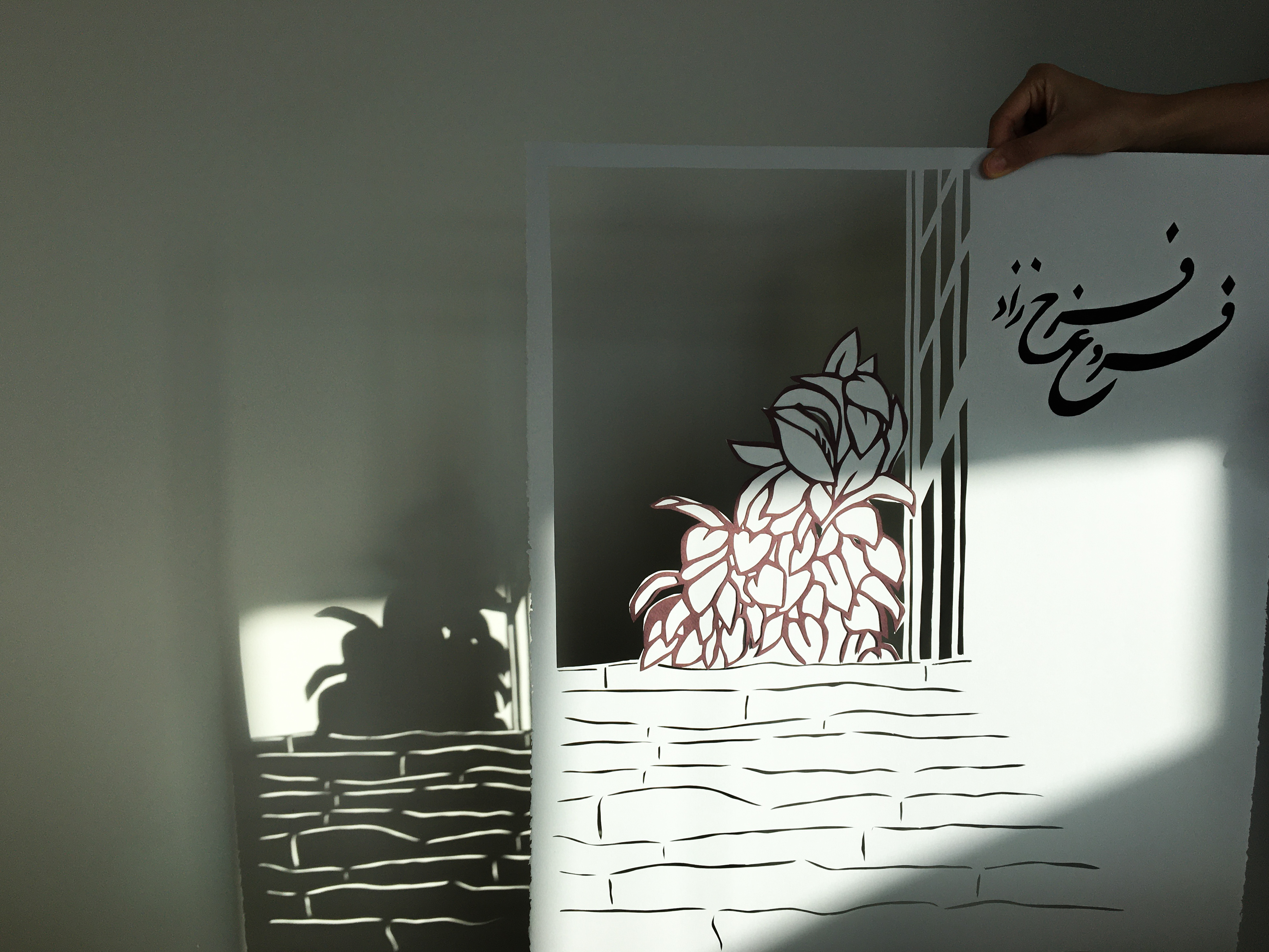
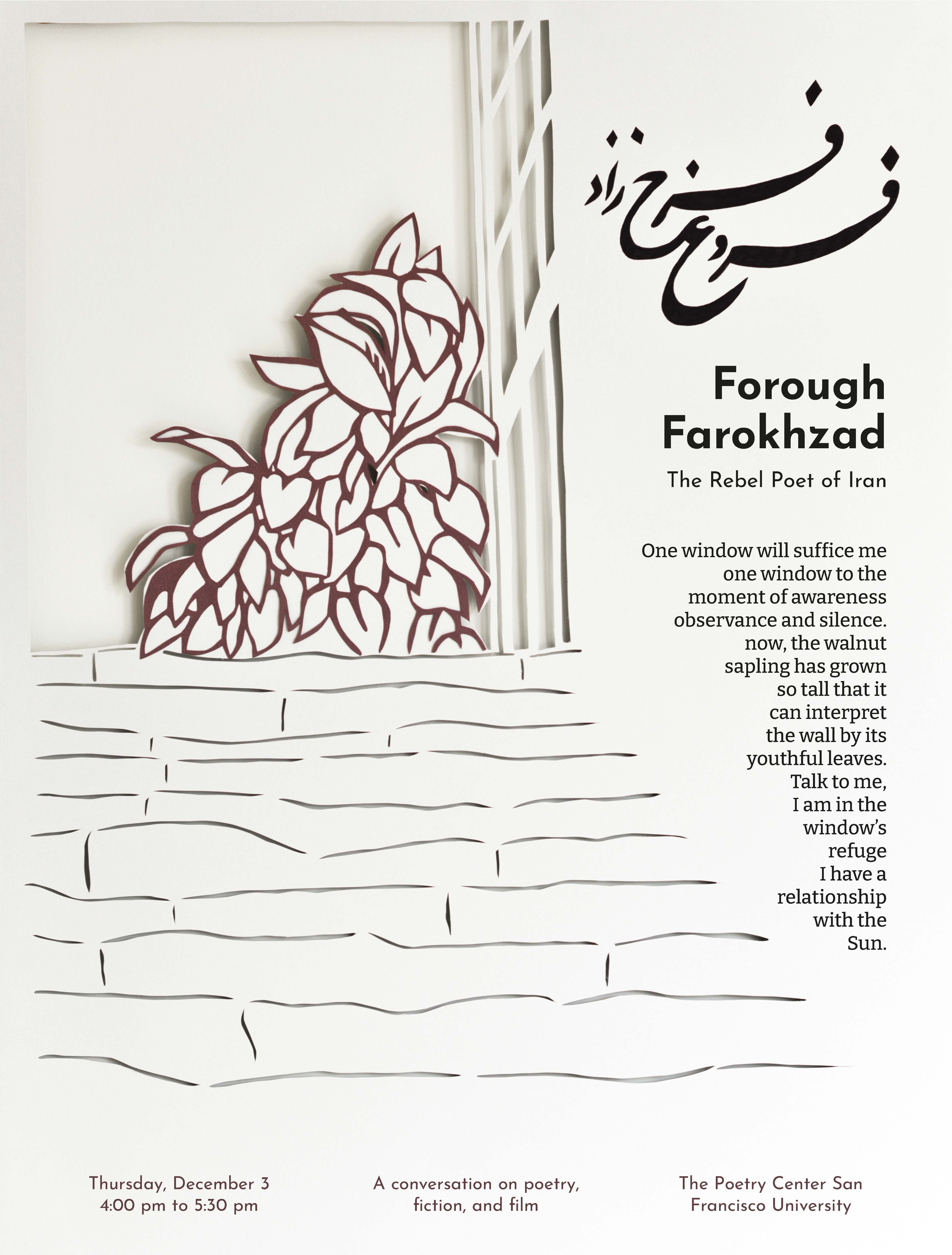
Process:
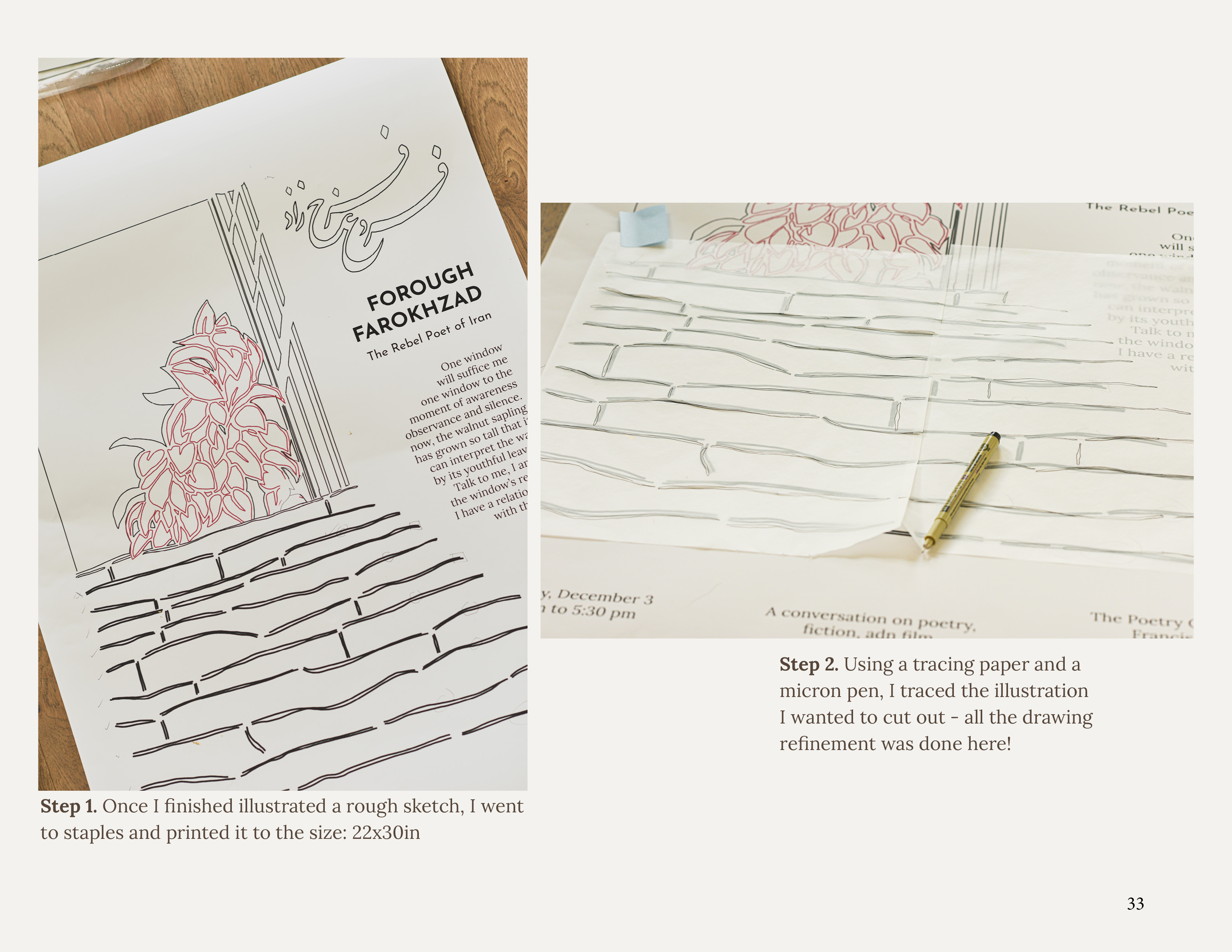
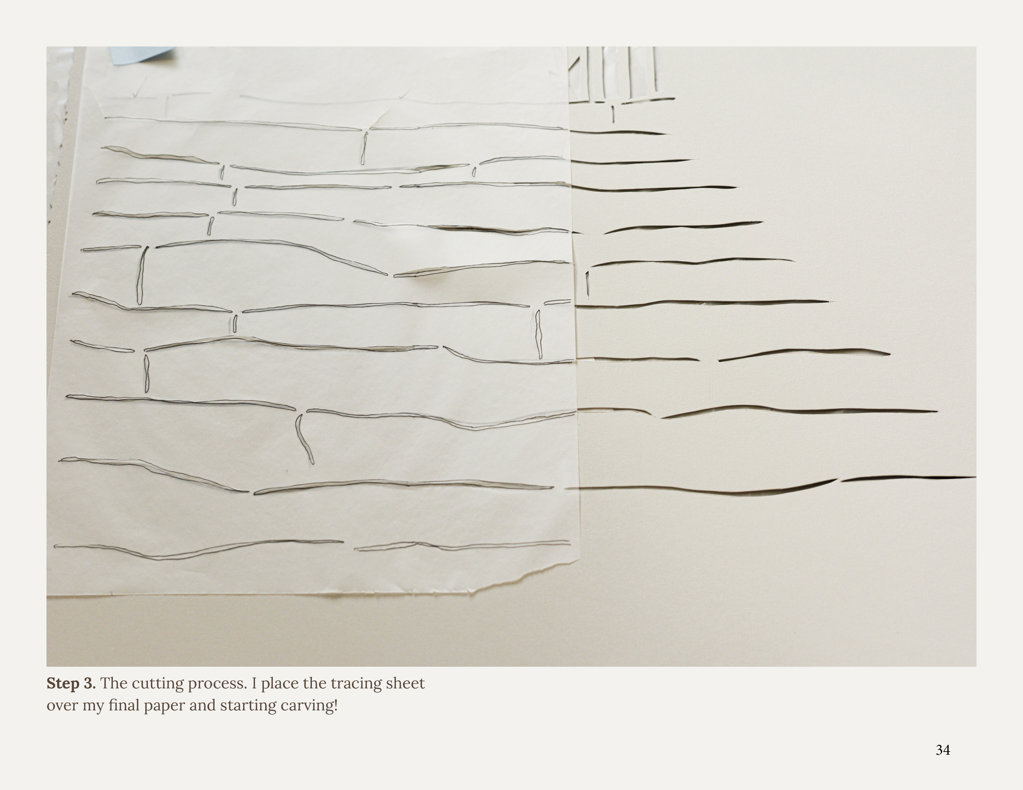
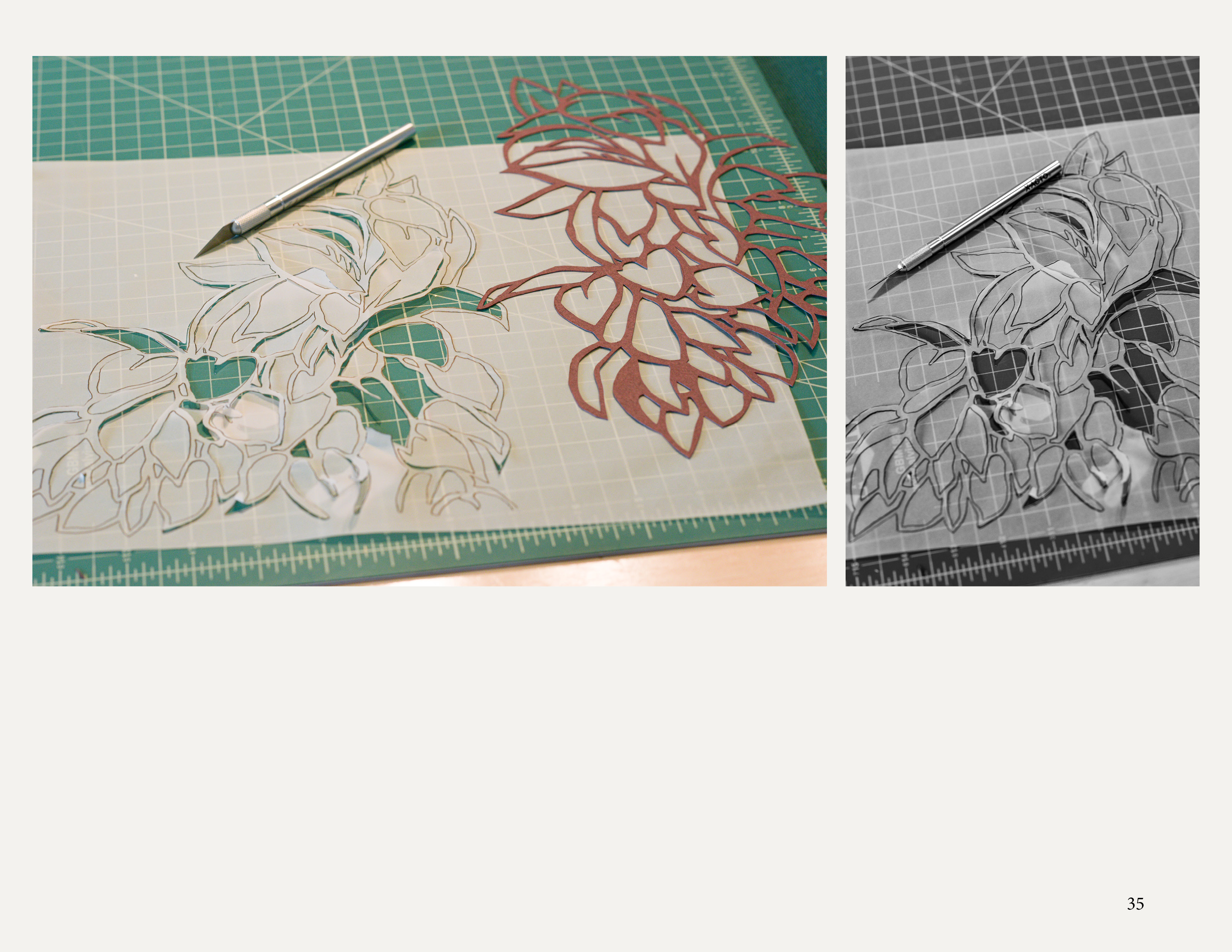
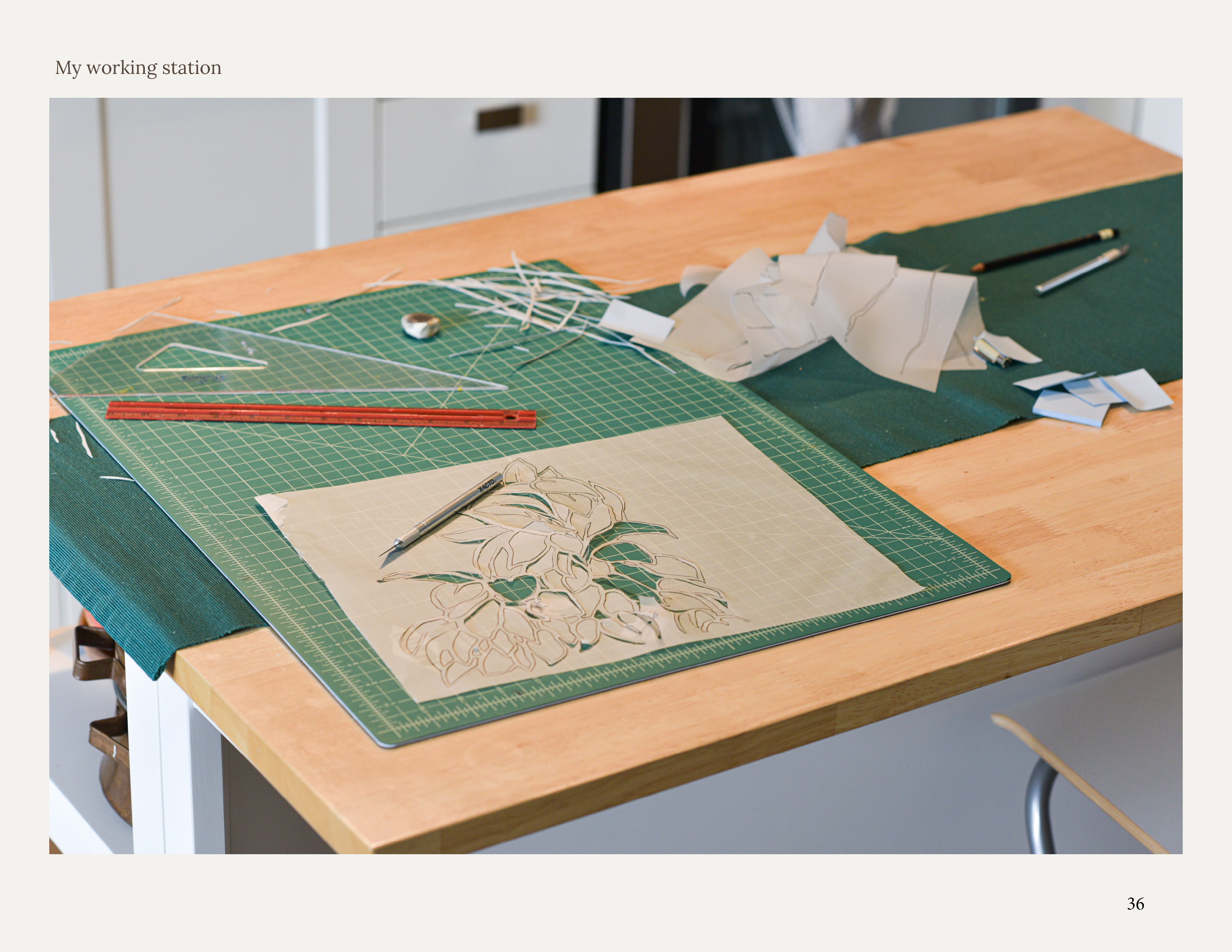
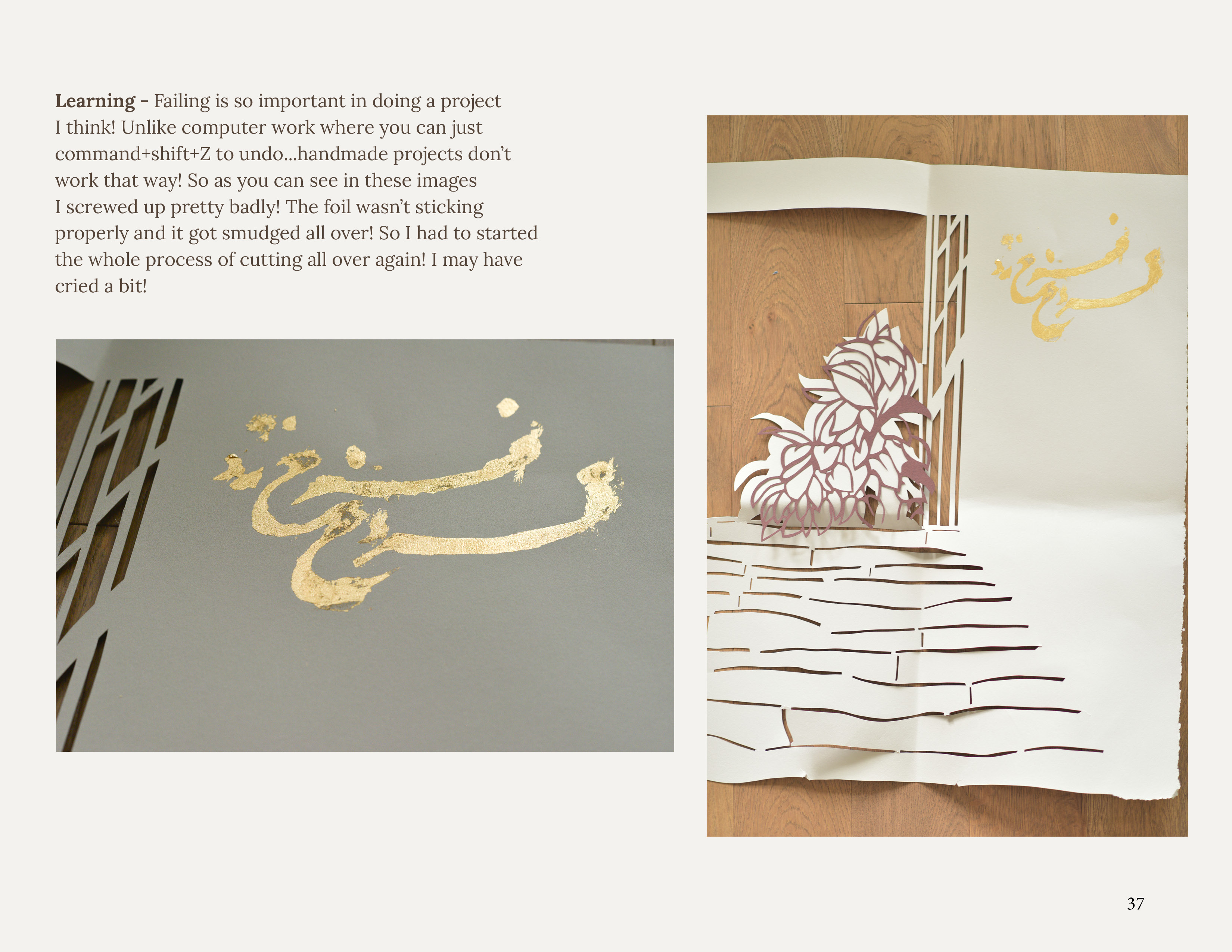
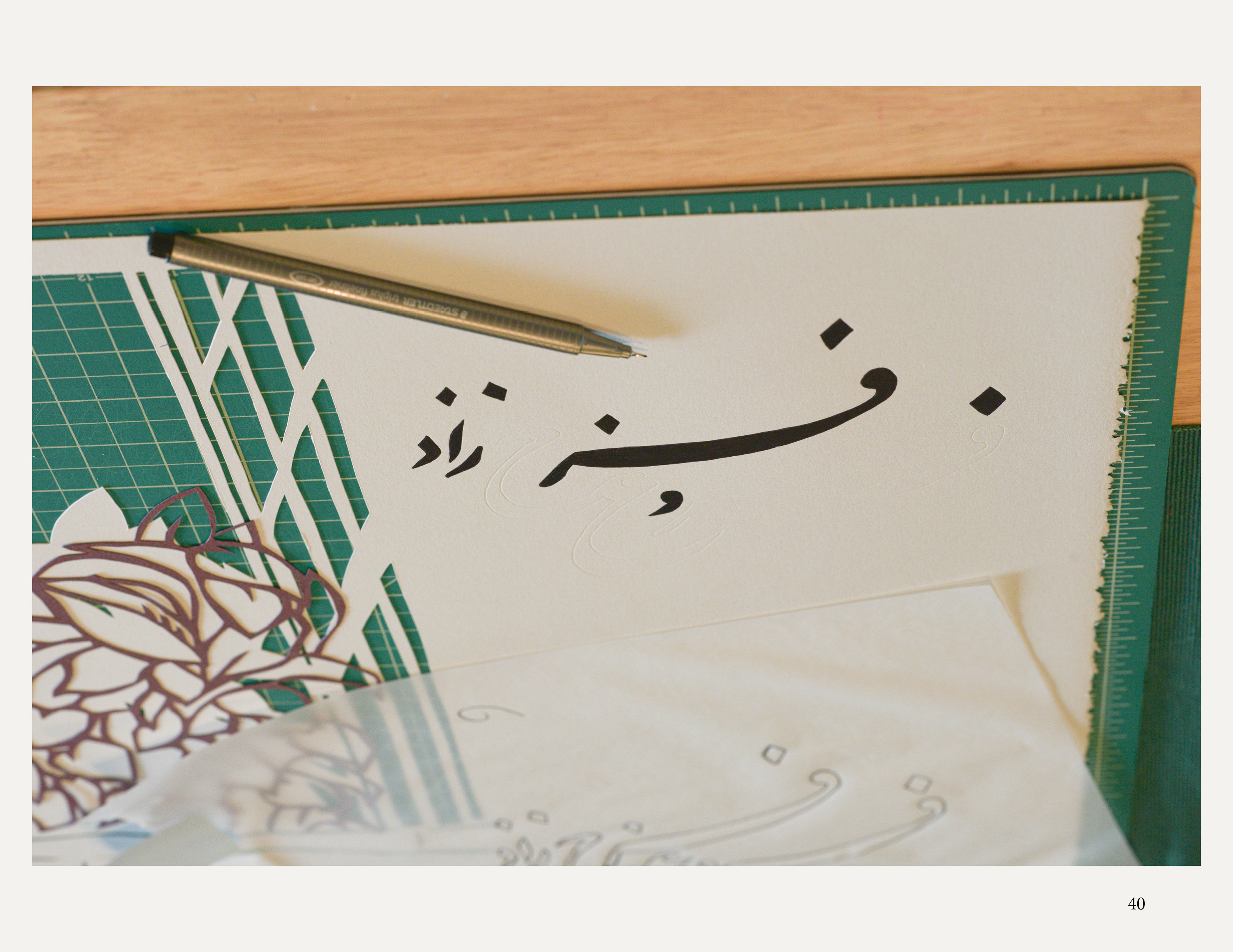
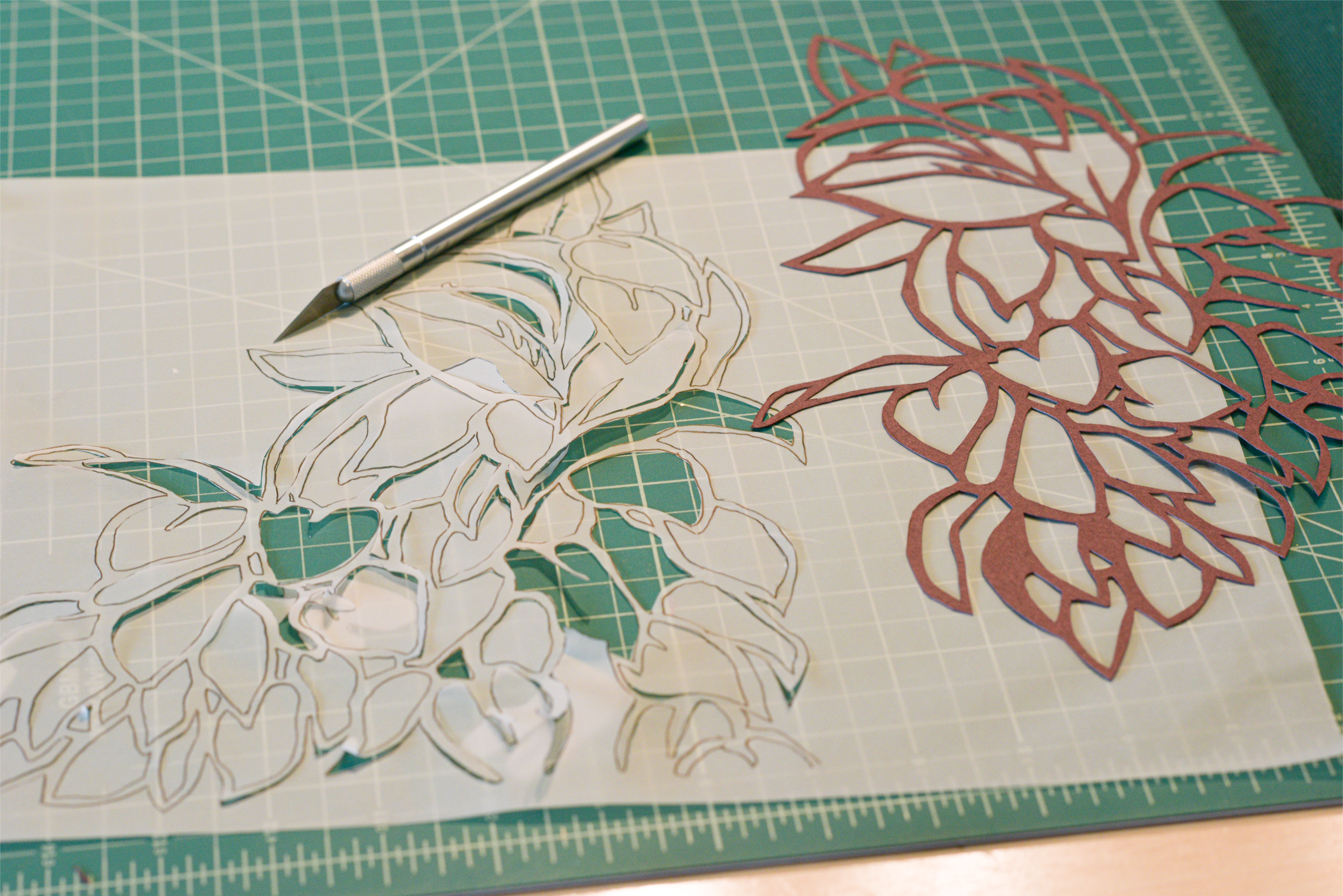
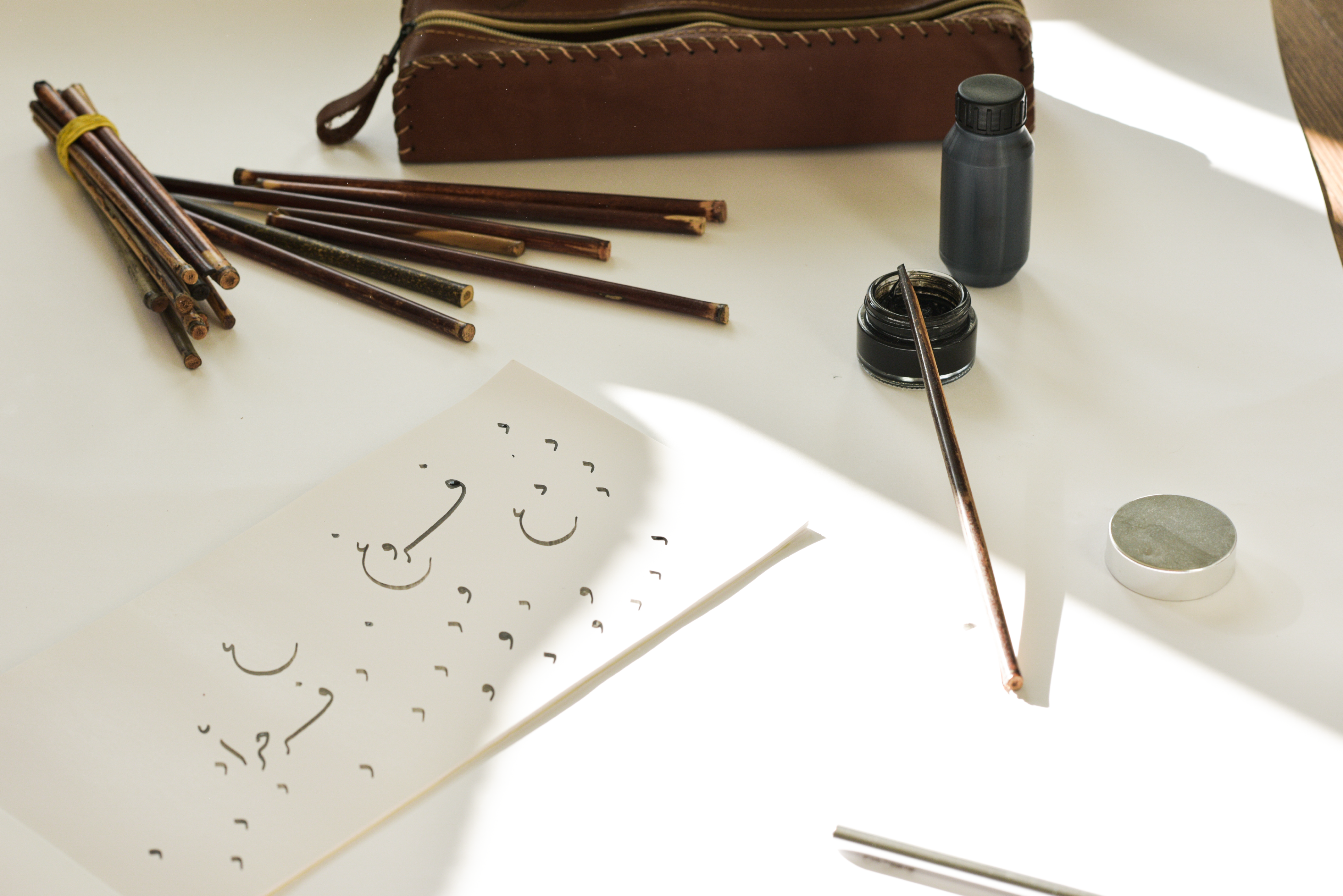
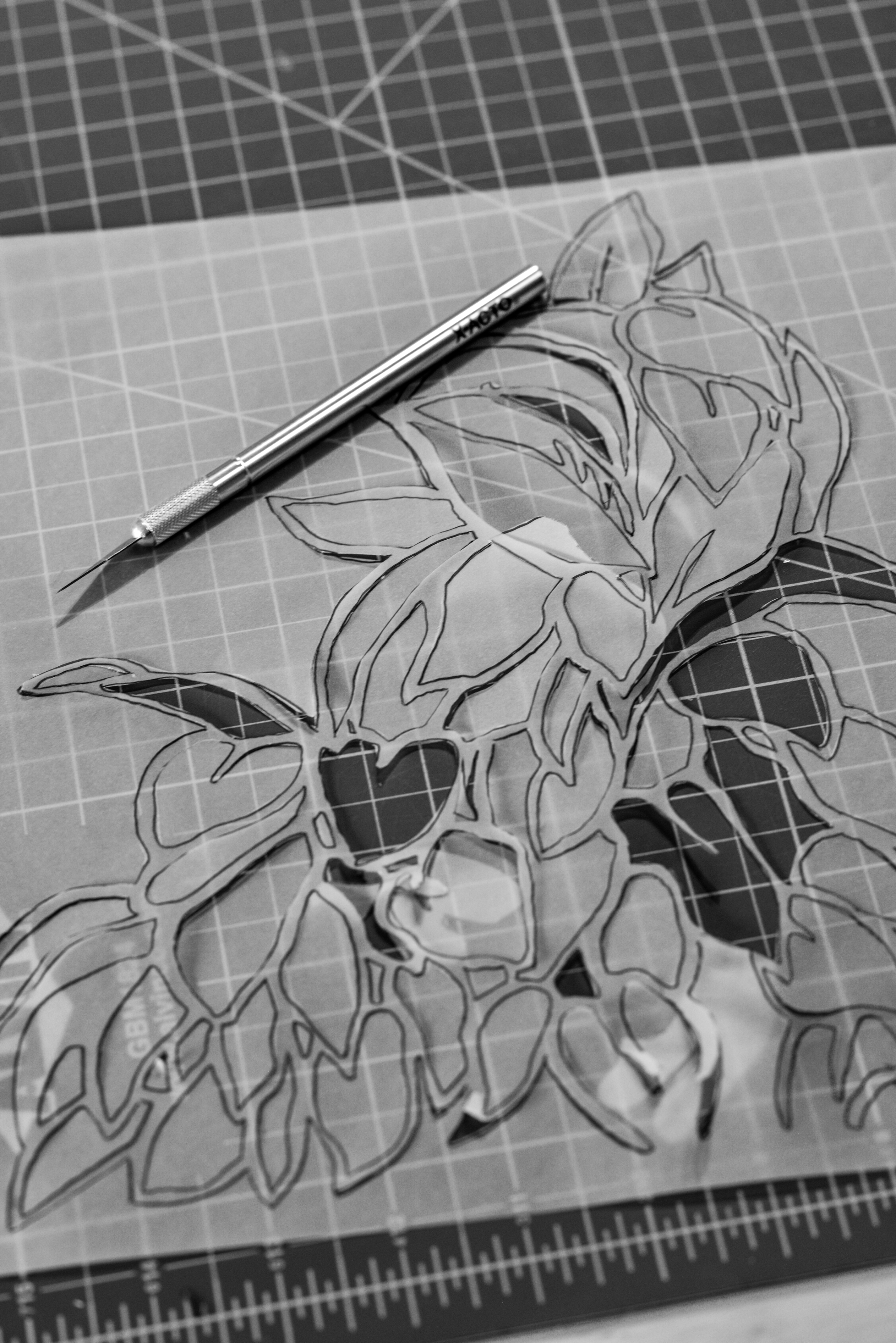
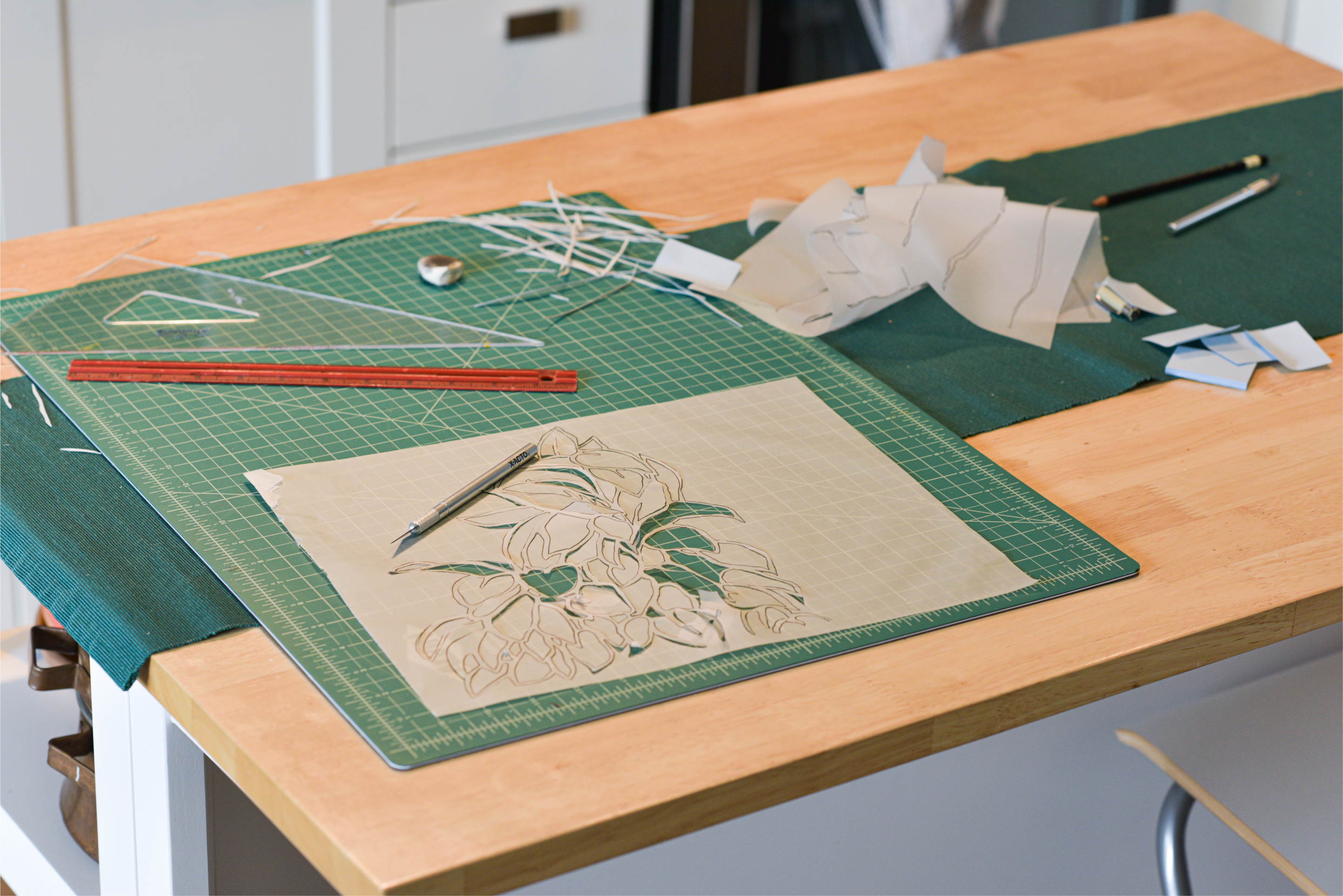
The creation of this illustration on a 22”x30” handmade cotton paper was a labor-intensive process, consuming over 25 painstaking hours. This timeline, however, doubled due to an unexpected setback – my initial attempt to incorporate a gold foil leafing technique resulted in unfortunate failure. The adhesive failed to bond properly, leading to smudged foil.
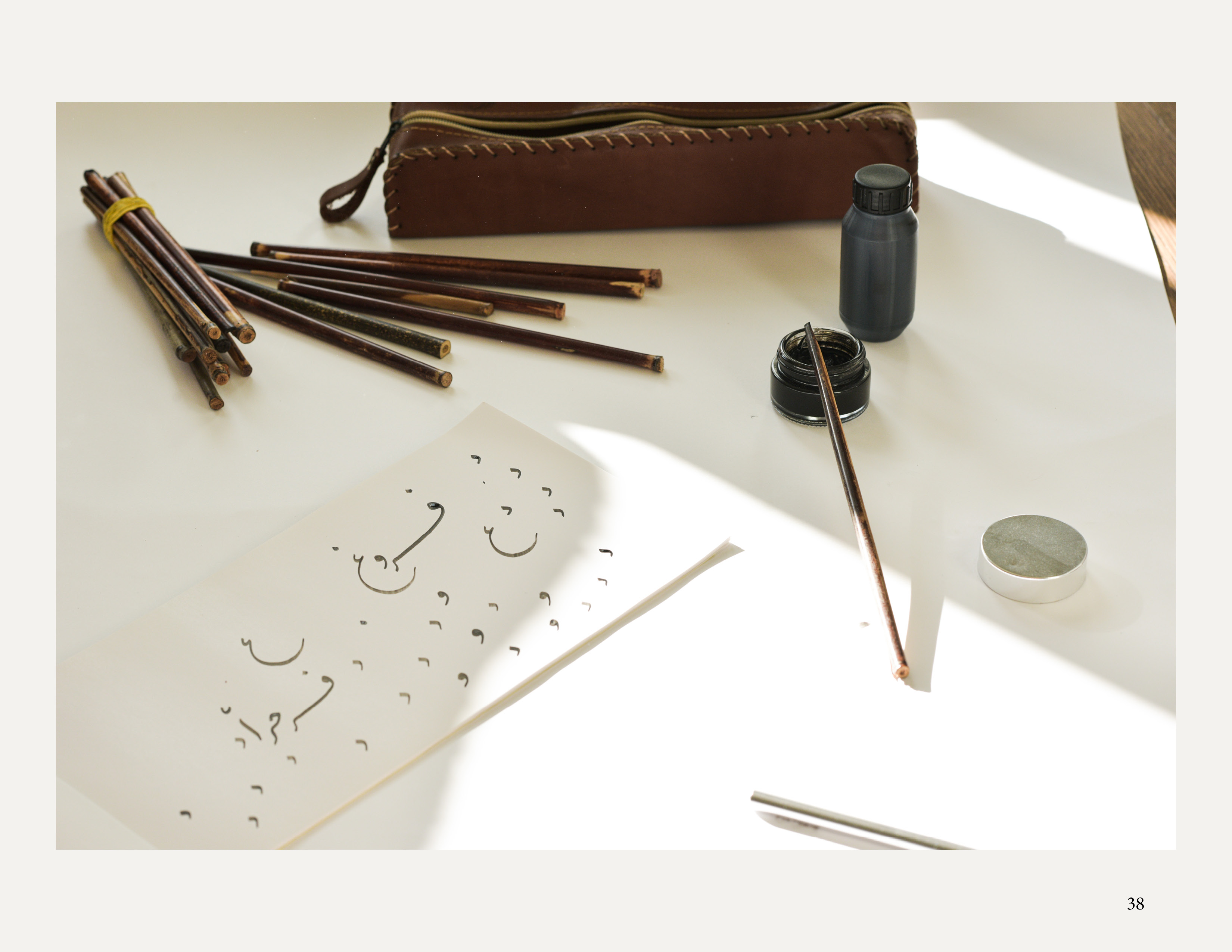
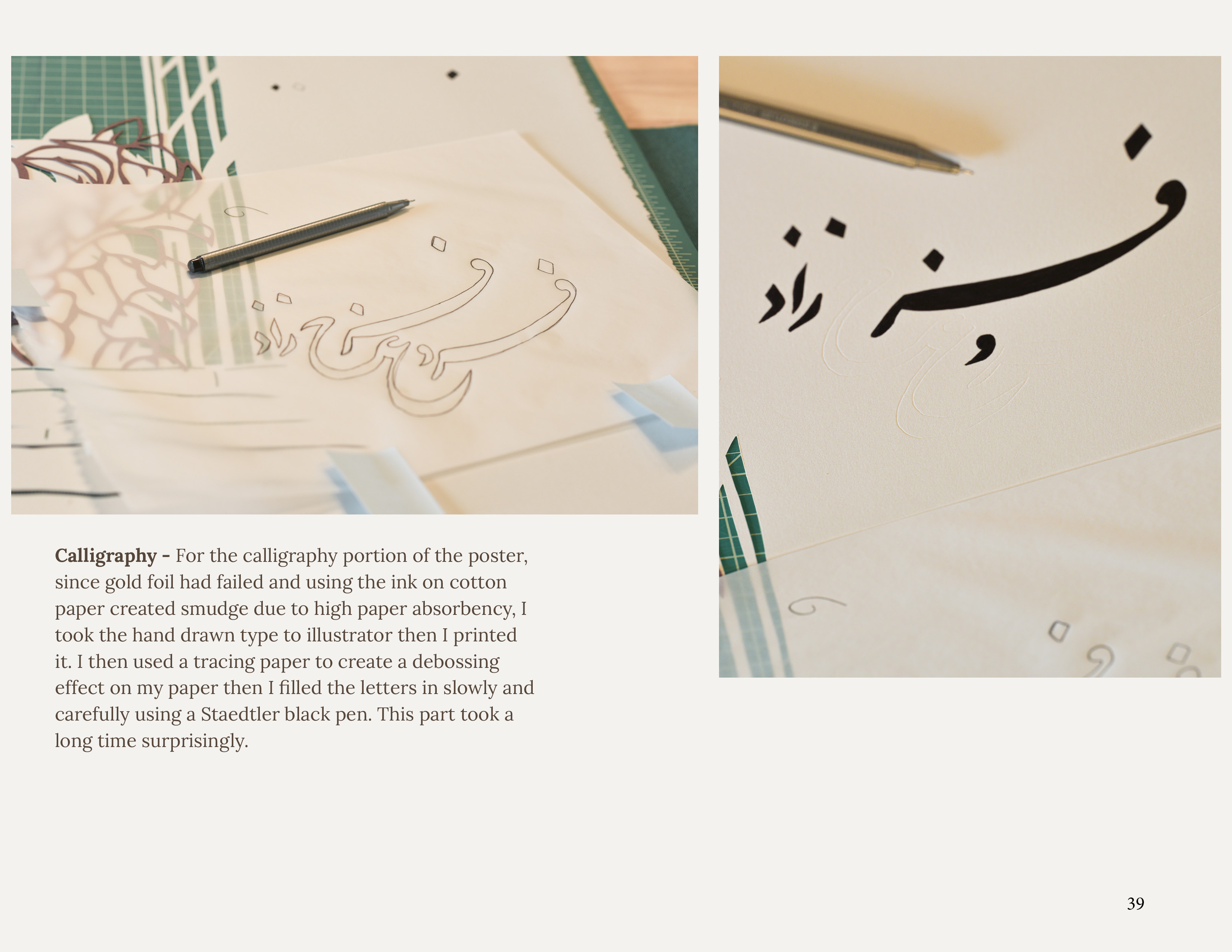
Amidst a moment of frustration, I made the decision to start anew, acquiring fresh paper to embark on the illustration once more. Although I relinquished the initial allure of the gold leaf, opting instead for conventional calligraphy ink, I pressed on. By the day's end, my fingers were almost numb from the precision required to wield the X-acto knife and meticulously cut, ultimately leaving an indelible imprint on the artwork.
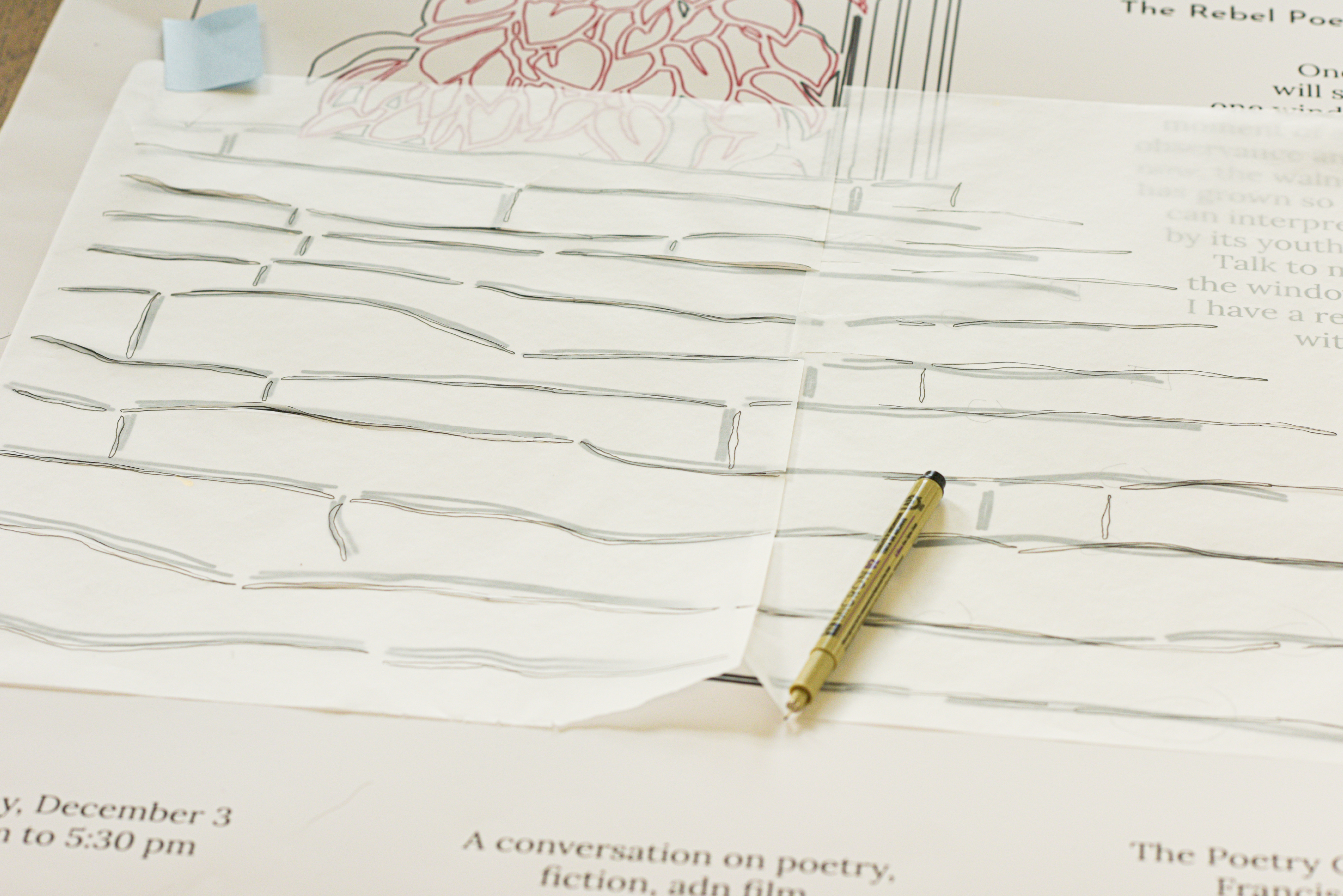

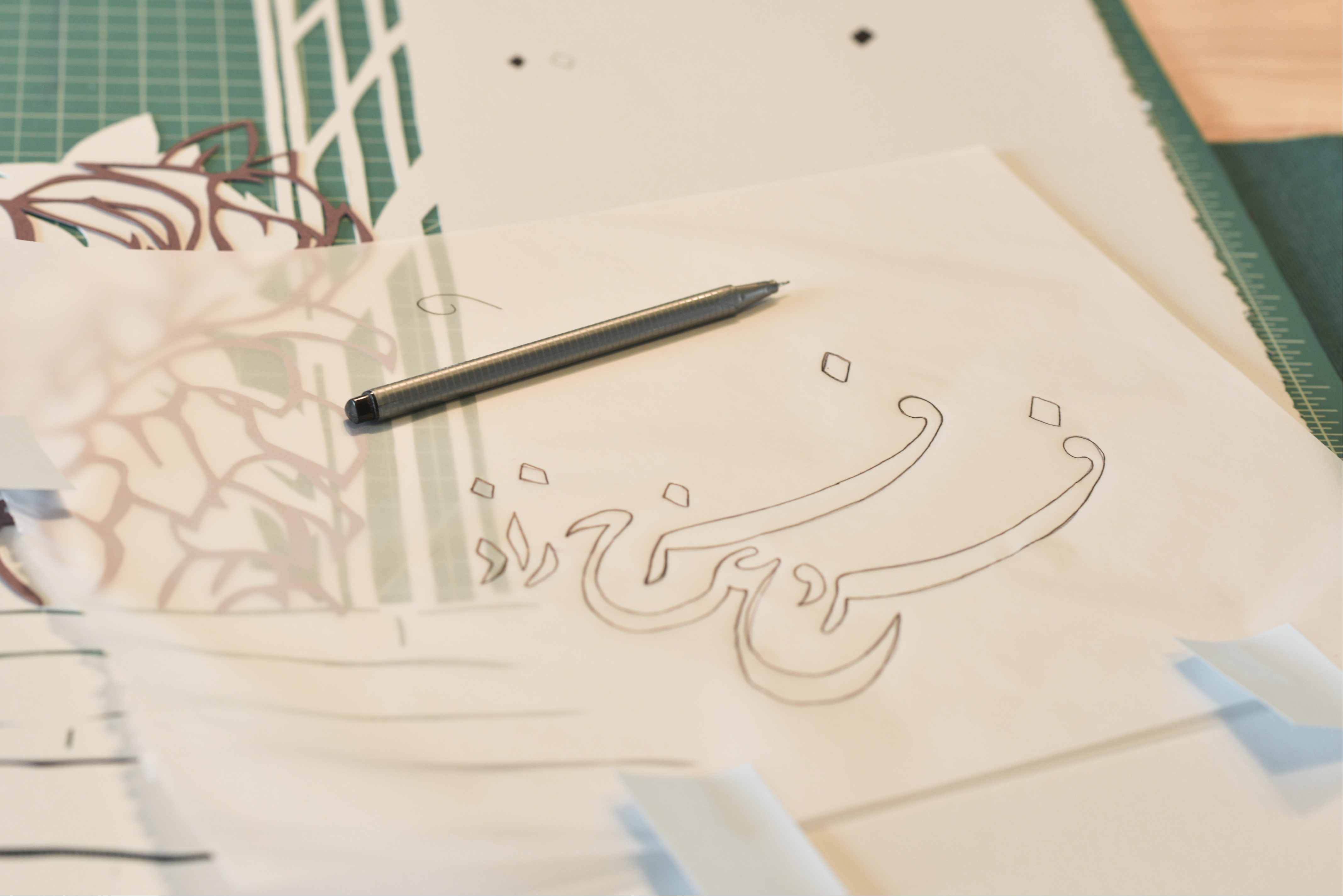



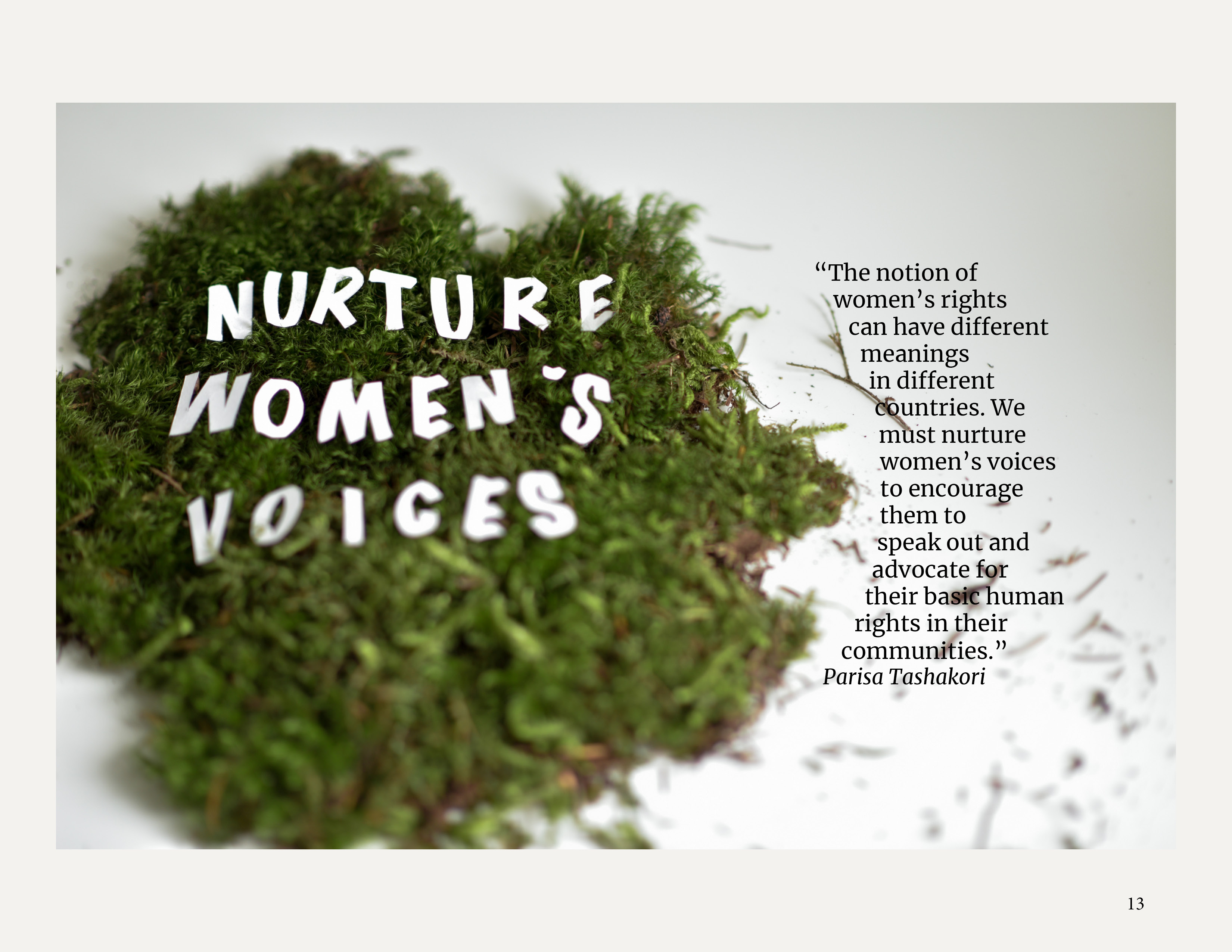
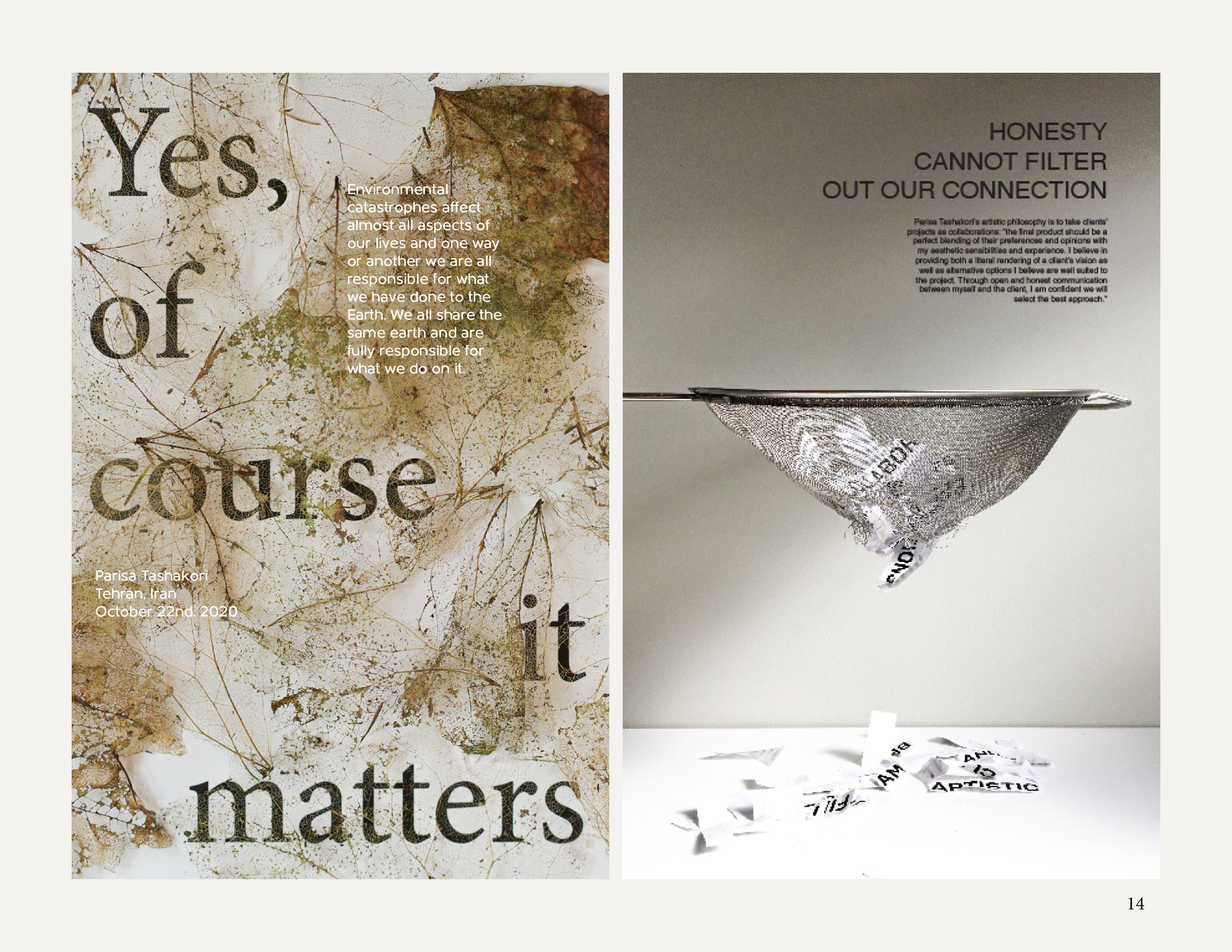
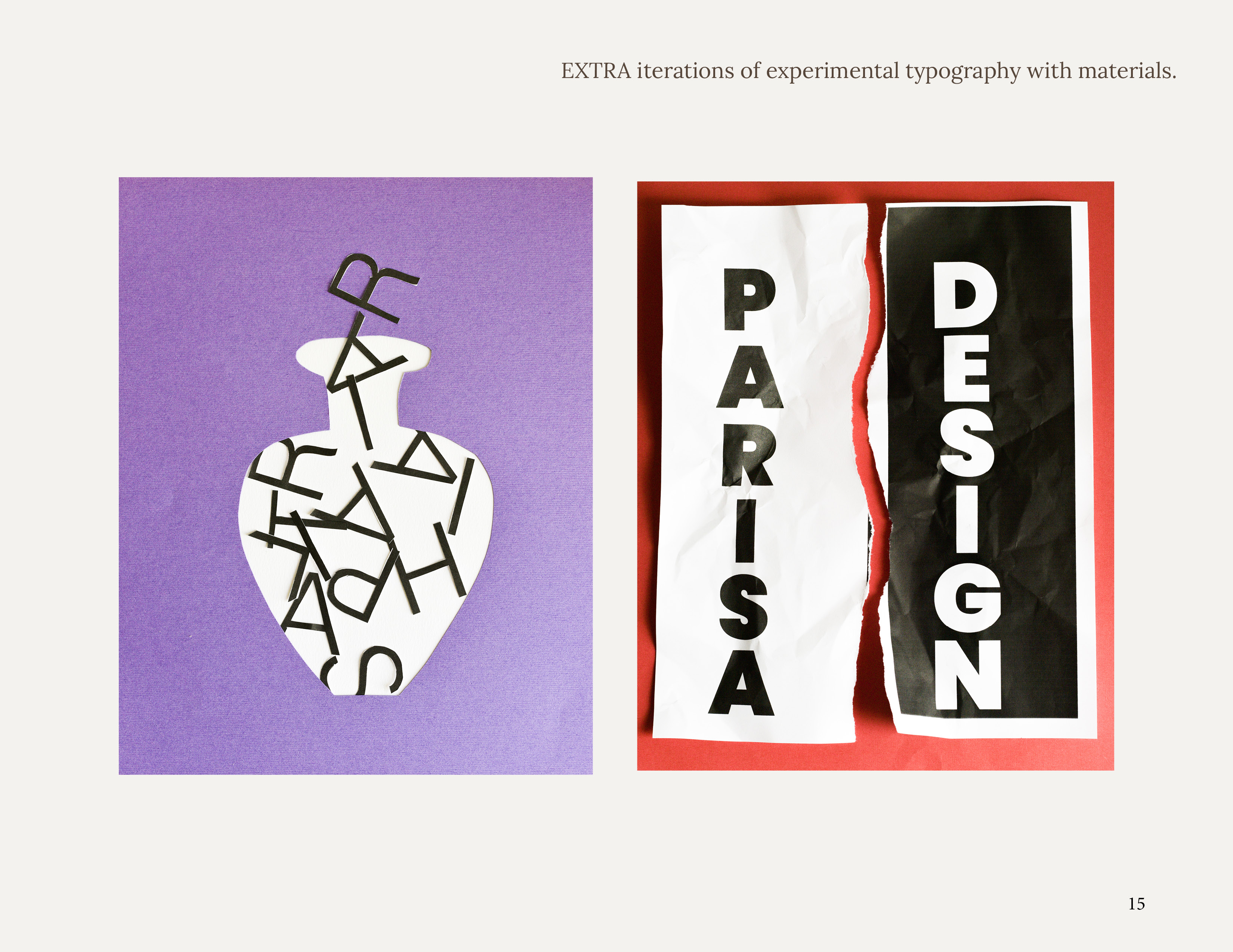
Tangible Material Experimentation:
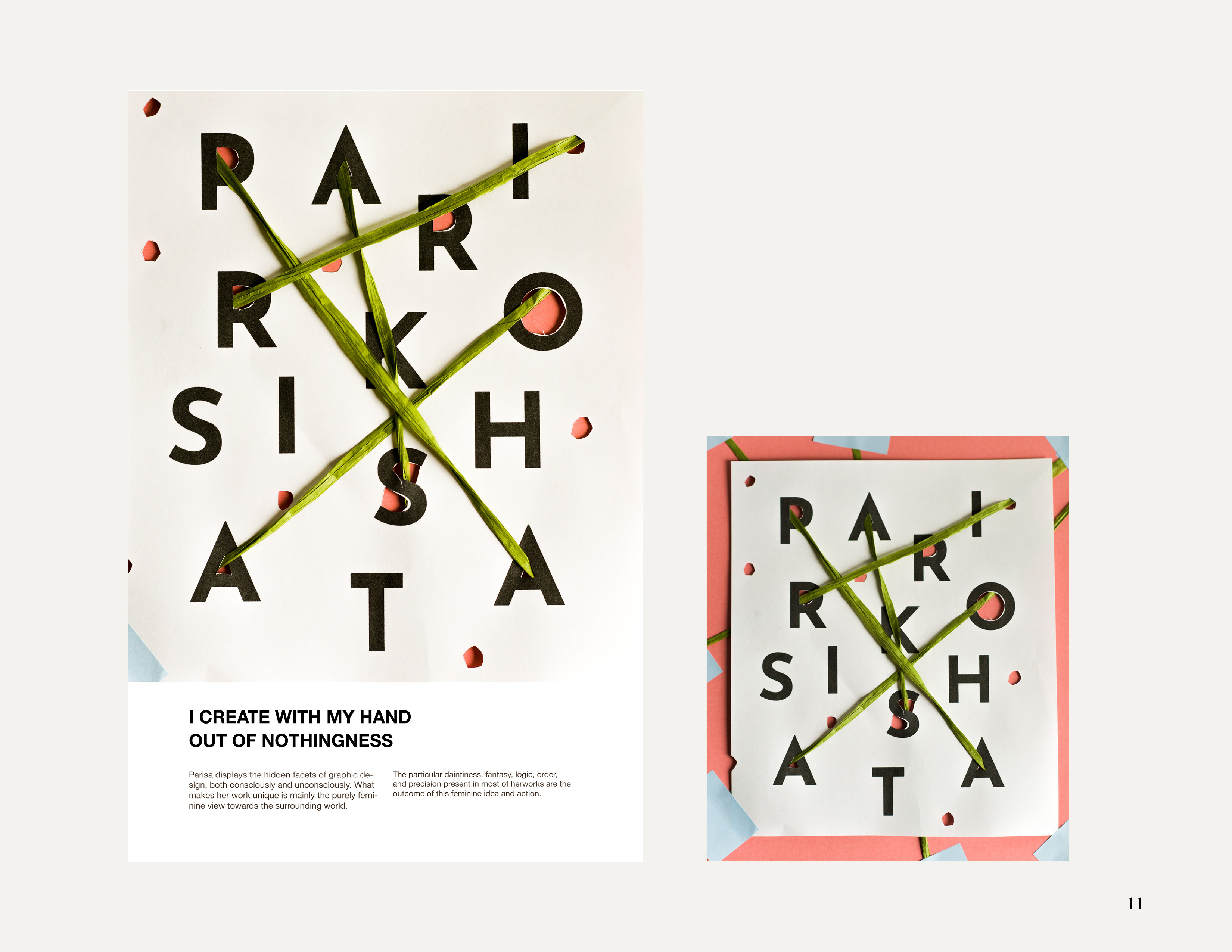
To explore typographic principles using tactile materials.
Duration: 90 minutes
Materials used: leaves, moss, ropes, rinser, paper

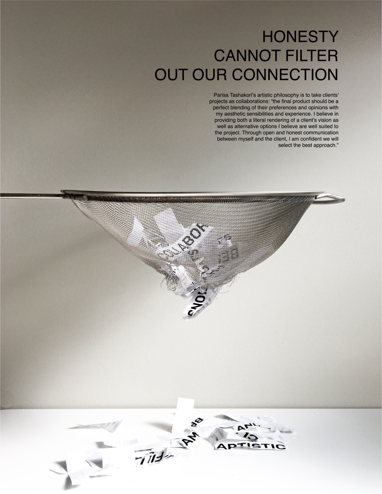

Digital Experimentation:
To explore typographic principles using digital techniques.
Duration: 20 minutes | Work in B&W only


︎ View Research Dcoument & Presentation ︎︎︎ Below
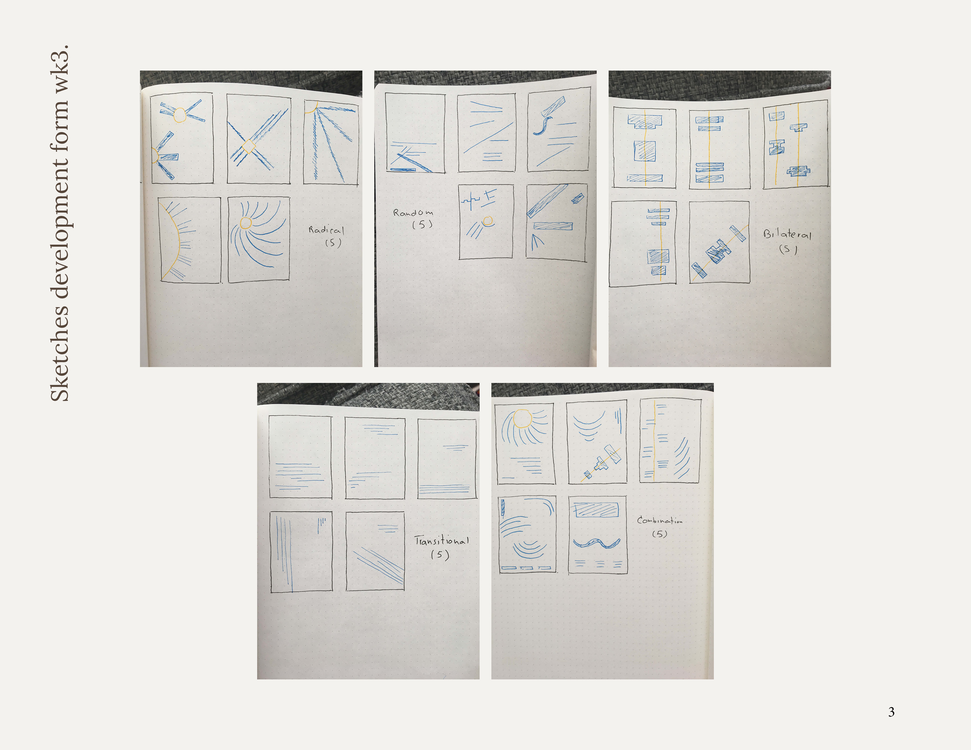
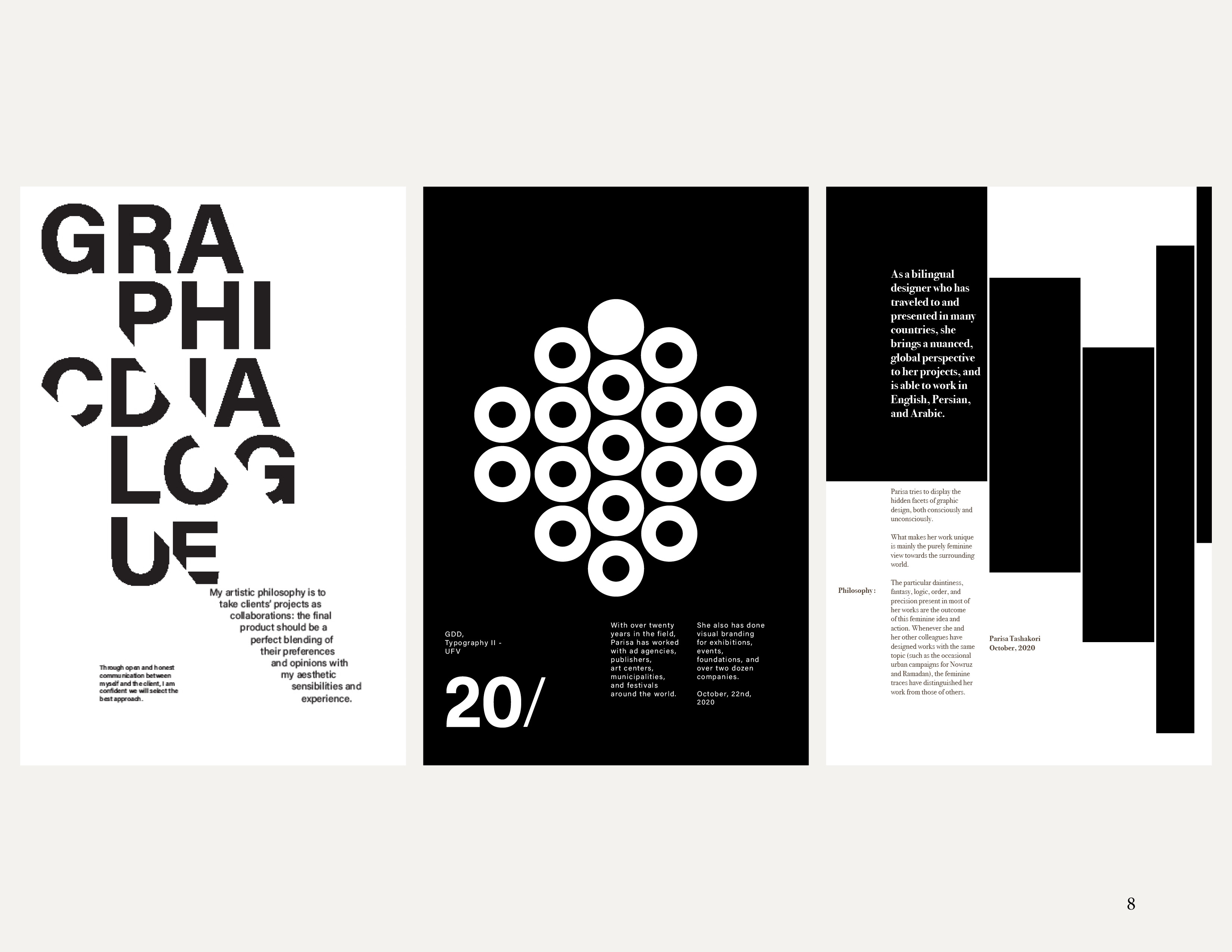
Parisa Tashakori seamlessly melds ancient artisanal wisdom with contemporary tools, platforms, and communication methods. Her work radiates a joyful, positive, and kind-hearted energy, effortlessly turning the exploration of intricate themes into pure pleasure. Parisa fearlessly addresses pressing societal matters with boundless creativity, distilling complex subjects into easily digestible insights, whether she's unraveling the meanings of injustice or advocating for women's rights.
Her daring, unapologetic honesty and profound courage have captivated me, serving as a wellspring of inspiration for my own artistic journey. My aim was to forge a visual concept that, while simple, transcends the boundaries of media and intellectual confines. To achieve this, I ventured into uncharted artistic territories, experimenting with diverse typography styles, and embracing graphic design with insatiable curiosity – values and attributes that Parisa has ignited within me through my recent immersion in her work.
Furthermore, this poster pays homage to a Persian female poet who shares qualities with Parisa: Forugh Farrokhzad. A bold and immensely talented poet, Forugh defied conventions, offering profound revelations about the inner worlds and desires of women. Her poetry, rich in emotional intimacy, sparked controversies and challenged societal norms. Parisa's connection with Forugh's poetry book cover served as my bridge to these two remarkable women, both of whom continue to inspire and push boundaries.
